Ethics
The wallpaper is very pretty, but plain, it lacks luster, it looks one of those 'official' wallpapers from her website, not that she has any like those, just a reference

, anywho, a bit more color here and there would've made it better.
5.5/10
JellyFish72
I love the eggs, but the whole box to the side really distracts from the main focus, which, IMHO, should be the eggs, maybe a lighter area would've looked much better. The font bothers me a bit as well, a much simpler text would've worked wonders.
6.5/10
LAQ
Even though it isn't really my style, it's very pretty, eerie even, the top right side does bother me a bit however, it seems a bit out of place, but I understand you tried to make an area for icons, it just wasn't executed as well as it could've been. I love the font though, it works well with the image

7/10
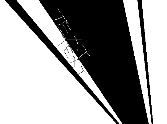
moogie
I love the colors in the background
, very well chosen, however, the edges could've been more parallel, it seems a bit off. Other than that great job.
9/10
Neko
It's so mesmerizing! I like it a great deal! However, it seems the color and the image conflict. A lighter color, or perhaps a bit of editing on the images part would've worked wonders.
8.75/10
Pixa
Somehow, you managed to make something that seems like it took all of 10 minutes, but you made it work. It looks good, the overlapping 'a' and 'i' and the scanlines all work well together
8.5/10
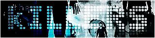
YesItIsh
Wowza, very well done, it looks very shabby, chic! It looks very edgy, and rough, I love it! The thick scan lines work well
Good job.
9/10
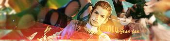
Zilary
It's so preeeeeeeeeeetty! You did very well, I love the vector-esque look to it. It's eye candy
9.5/10
Sorry! ACT's tomorrow, I've been studying religiously

Wish me luck! For those of you waiting for my PPT Idol judging's I have 2 to go!
President of the Sugarinii/Tasha fan club.
Sugarinii's soulmate... since 1991!


