Week 2 Grading:
Round Note: I personally think most people did a very good job this round.

The icons look fabulous.
DM was on fire!

I like how you changed the colors and such, it is paler and more pleasing to the eye. The text works nicely, and is placed well. The faint background you added works nice and doesn't detract attention from the buildings. I'm not too quite fond of the star under the text, I would have preferred something else is used to fill up the empty space. I.e. small tiny text, other brushes, etc. I'm not too fond of the border as well, I think you should have either left it blank or just use a solid color (like the color of the border at the top of the icon). Try working with gradients more often.
-
8/10
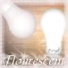
Ethics

This is very simplistic and very pretty! The colors are marvelous and the text works very nicely with the icon. Good choice of image, too! The gradient sky behind the flower works very well and acts nicely as just empty, negative space, not taking attention away from the flower. The whole graphic has a nostalgia feel. The icon is also very, nicely sharpened and clean, which makes it just that much more attractive. The whole icon draws attention to the flower, as it stands out very nicely. Very nice job!
-
9.5/10
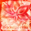
JellyFish72
I'm seeing some nice improvement.
The whole icon is a little messy, to me, though. This kind of image is a little hard to work with as a graphic, but it's good as a standalone image. The colorfilter you used was a nice touch, and I like the mini text. I'm not so sure about the main text though, but I don't think it detracts from the image. I would also get rid of the border, as I think it seems a bit thick and this graphic would benefit without a border. Like I told DM, try playing around with gradients in your icons.
-
8/10
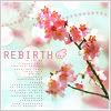
kentieness

I think this is also a big improvement from last round! I love the way you colored the image, and the gradient and such. However, my favorite thing about this icon is the text. You did a wonderful job with it! Personally, though, I think the transition from purple to blue in the gradient is too sudden. I haven't used PSP 7 in a long time, but try editing the gradient so that it fades over a larger area. When you're selecting gradients, and in that window, if there are two arrows (they look like X and +) in the center of the square that shows the current gradient, drag those until you're happy with the effect. Although, this function may not have been implemented until later versions. -
9/10
Kidwaiy
First of all, I don't think the image you chose was very good at all. It's not easy to work with and rather... dull. The border is creative, but it's too thick for an icon and rather unappealing. I would rather have just a normal border. The text and the stuff behind the text doesn't quite work either. However, good job for trying brush variances and other tools. It's really a shame, though, because I thought the background (what I can see of it) was very good. -
5.75/10
Kitten Medli

This icon is nice with the colors and the cool texture over it. However, the biggest, biggest, biggest downfall of this graphic is the text. The black and white colors did not fit at all. I think this icon would have been a lot better, if the text's fill had not been black, but instead a pleasant orange. A different font could have benefited this icon as well. -
8/10
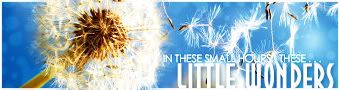
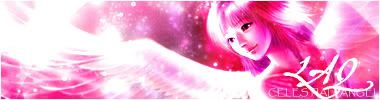
LAQ
The effects on this graphic is lovely.
However, the problem is, the original image looks very, very, very pretty.

Although, I am glad that you did enough to the icon to make it your own, instead of "Ripping" off of somebody else's artwork. The border and the text work nicely in this graphic, the border is unique and pays off. However, I feel like the color of this icon is a little too monotone and saturated, and you're kind of pushed into a corner graphic-wise because there's not much more you can do. When something like that happens, I recommend you go with some of the blend modes that doesn't require an addition in contrast, like Lighten, Darken, Multiply, Screen, and sometimes if used correctly, Difference and Exclusion. (Although I know GIMP doesn't have exclusion). Other than that though, the graphic is still very pretty and aesthetically pleasing.
-
8.5/10
moogie

I absolutely adore this graphic! The colors are fantastic, the color wash-ish effect you did, works with the image perfectly and compliments everything else nicely. The little circles of light at the bottom is subtle, but contributes to the overall icon very nicely. The text works nicely and doesn't distract from the focus of the icon. Another great thing about this icon is that it's crispy clean! It's very nicely sharpened and it just adds to the already very gorgeous graphic. The graphic is very nicely nostalgic. Superb, excellent job!

-
10/10
Neko
First of all, I really like the crisp, cleanliness of this icon. The colors work very effectively and the image just gives off a radiant, sharp, very appealing feel. The icon is very pretty, although I have just a few tiny tiny concerns. First of all, I think the little circles in the background could be toned down just a little bit. Secondly, I think there might be too much little tiny text under the main text.

The bottom left corner, wouldn't hurt, I don't think, to be left empty. Other than that, though, another excellent job!
-
9.25/10
Pixa
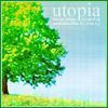
Very nice colors. The icon seems a little bit over-contrasted, though, despite not appearing to be so. Watch out for for those little sharp color ridges around the trees. I suggest, however, to lighten the sky and tree via something like screen. Also, in my opinion, I think the text should have been lower, so that it looks like the text is "sitting" on the grass. Also, personally, I would remove the faint texture put over the icon. It adds a sort of messy, unruly feel to it. I don't know why, but your icon seems dull, yet over-contrasted at the same time. -
8/10
PK

It was a good idea, but it wasn't executed in the most appealing way. =\ First of all, I don't see any point in cutting the quill out. Because the original image's background was fine, and suited the quill, and it didn't look unnatural. You could have worked with the original image just fine, but the glow and the sharp cuts (I.e. top right corner, and the tip) make this quill look very awkward. Plus, you replaced the background with an almost unnoticeable cloud render. The line leading to the text looks very awkward and... squiggly, if you will. Try using the pen tool, and stroking the path it makes. It will create a much, much smoother, more appealing path. Lastly, and this is just a small one, I don't really see the point of having a black outside border. Perhaps a darker brown would have suited the icon more. -
6/10
sigh_driven

I really, really dislike the text in this icon.
I think it's very out of place, and that this would have been a much, much, MUCH better icon if you didn't have the text go vertically like that. What I would suggest for text is simply a simple font, perhaps in all capitals for a more sophisticated look (I recommend Georgia) in a lighter brown and placed on the "horizon". Also, I'm not too quite fond of the effect you did over the Eiffel Tower either. I think if you had just enhanced the colors, or did a more subtle effect... The icon had potential. -
5.5/10
spiral_star

Let me tell you that, the image you picked was very, very, very hard to work with. I'm actually surprised the icon turned out as it did. However, next time, I think you should pick a better image. Although this icon didn't turn out bad, I think it could have been much better. Back to the icon, however, I really like how you did the rainbow subtext, and I thought that was rather appropriate and effective. A problem I have is that the skittles have a lot of JPEG compression noise on them, and you can fix this with one of Paint Shop Pro's noise removal tools. (Perhaps JPEG artifact remover?) -
7.5/10
YesItIsh

This is actually a really hard icon to rate. I'm sort of on the fence on this one. The odd effects seem strangely appealing, but messy at the same time. First of all, I don't think you should have contrasted the fruits anymore. Seeing as how the image you picked was a very artistic one, and the contrast was already well-established. Secondly, I think that one of the diagonal stripes should be going the other way. (The way the light was hitting the fruit in the image). I do rather like the text, however. -
7.75/10
Zilary

Very cute idea.
Just a few tips and pointers though. If you're going for this particular advert kind of effect, with how you were doing your text, I suggest making your icon as crisp clean as you can. I'm not too fond of that faint grid texture over the cow. Also, possibly the biggest downfall of the icon, is the border. It seems way too harsh and dark for the icon, and because there's no overlay anywhere else, the border looks odd. I think a simple, 2-pixel white border would have worked much better, or even no border at all! The text is cute, though, and fits the icon very nicely.
-
7.75/10