For those topics one could describe as the forum equivalent of a twinkie. Word games, forum contests and giveaways are all the rage here.
Sun Oct 16, 2005 8:53 pm
Insane Plushie
I can't say I'm particularly fond of the colors you chose...It's not all that eye catching. The text blends in too much with the image, the the purple border looks too solid against the 'smoothness' of the image.
Pixa
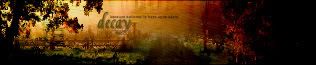
It's very pretty considering how simple an image you used. I love the red border, and the swirls are a nice touch. I think there maybe should've been some swirls in the top half though. The text also looks somewhat out of plact. The text color is too pale and washed out against the beautiful red and yellow shades.
DM was on fire
I like this one. Simple, but I found it rather eye catching. It was a good image choice. My main problem is with the word 'diverse'. He's getting poked in the eye with the 'e'.
Neko
It's way too washed out with the effects, and it looks like you used an image of bad quality because of it. I can't say I'm fond of the diagonal lines in the top part, and the text needs to be solid black to make it stands out. Also, usually that small text is completely unreadable...but I can pick out a few words in this one. Not a major thing, but with lj icons usually it's either readable or completely unreadable.
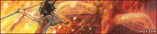
Nikita
Very nice. It has a good sort of 'dreamy' quality to it, and I like the placement of everything in it. Good background, and even though I'm usually not fond of the unreadable text, it works here.
WIS
He looks a little strange in this icon, probably because of the odd angle he's sitting in in the original image. The text doesn't stand out enough either. There needs to be just a little more contrast between the text and the background.
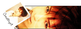
Amethyst
I like the slight colorizing of the image. The cutout is sort of cool looking, but I think it's a bit too much and throws the icon a little off balance. I like the placement of the text.
Neko, Insane Plushie
Tue Oct 18, 2005 3:51 am
I rather liked the percentage grades...
Amethyst: This one really looks too plain to me, the only part that I actually find creative is the cut-off corner and the oblique text. 78%: C+
DM was on fire!: I'll make mention of the e running into his face, but I think it's rather minor to how unbalanced the text looks, the spacing isn't even and I find it quite distracting. Otherwise, this is alright, but I think you should have fixed the yellow tinge to the picture, especially since the text is pure white. 88%: B+
InsanePlushie: This is an interesting look, it rather reminds me of a blacklight microscope, but there's definitely not enough contrast for this to be as dramatic as it could be. 79%: C+
Neko: Mmm, there's a big difference in color saturation between the girl and the background, and that's really distracting. I'm not especially fond of all the pattern overlays, they're all very distracting. 79%: C+
Nikita: This one is very nice. I think you did an excellent job touching up the picture and highlighting different points. The only thing I don't like is the color shift in the background behind the word "beauty," it makes it rather hard to read. 94%: A
Pixa: This is very pretty in its simplicity. There are a few little extraction issues, some white left over in the top left corner. I think you should have tried something else for the background, the ribs of the leaves look more like marble than anything nature-y. 91%: A-
WIS: I think this one is too dark, it's hard to see any of the details because the shadows are obscuring everything. The bright white section of the shirt at the bottom is really distracting among all the dark, this icon really just needs better color balance. 83%: B
I vote out InsanePlushie and Amethyst.
Wed Oct 19, 2005 4:51 pm
Silja wrote:I don't like how "diverse" is literally poking him in the eye.
Toby probably doesn't either.
Marissa wrote:I rather liked the percentage grades...
Me too.

But, when you said the spacing was uneven, I'm not quite sure what you mean.
Thu Oct 20, 2005 10:12 am
Insane Plushie: The image you've chosen is, to me, pretty challenging to use and I think you've done a very sound job in making that look like what your text suggests, "Ice Queen". It's not really lacking anything, but needs somethin that sticks out that says that you're better than anyone else. Love the brushes (brushes?) you used on the icon and the font choice.
Pixa: Awesome; love this very much so. I really like the background you did for this icon and I love where the swirls are. Very, very pretty. Even though the text may be sticking out a little, but other aspects covered it well.
DM was on fire!: "Diverse" pokes into the person's eye >< And I don't know about you, but it seems really plain. The effect is good, but there's just some effort lacking. I know that people do put a lot of effort in this, but to show it is very difficult. I think you've done a good job making it look smooth and balancing the colours, but like InsanePlushie, you need something that tells us that your icon is better than that.
Neko: First thing first, I really don't like how there's a white blur ove the person's face, and everything seems so random. I do like the idea of having blur, then cutting things out though, it's a new technique that you've brought out and I feel that it's effective, but just not on the LJ icon. Other than those, I like your font choice and your choice of colour, it suits the image very well. (I actually like your flower one better though =P but nevermind).
Nikita: Pretty! I love the colours you chose for this and the text is in a very good place; the tiny text is also well placed to fill up the space, yet not cluttering all over. However, the face of the character might be a little too red.
WIS: I like the border and the effect you put on the image is matching to the background. It really doesn't have much to it though.
Amethyst: XD I like the text! you've done a pretty good job readjusting the colour and brightness of the face, well done. There doesn't seem like much is going on in this icon, but the effect is pretty good. I do feel, however, that maybe the cutout is not needed?
Sorry about short comments, is SO tired.
My votes go to: InsanePlushie, WIS
Sat Oct 22, 2005 6:25 pm
Insane Plushie and Neko cannot participate in this round.
Congrats to all of ya that have made it to this final round. Because of majority, you will be making....
A set. (Who would've ever thought?

)
You have four days. And as usual, there are no other specific requirements, except for the obvious restrictions that the dimensions of the av and sig cannot go over PPT limits.
Sat Oct 22, 2005 9:01 pm
Good luck, everyone! Thanks to the judges and Flame for working hard to organize this, it's been an honor competing against such talented people.
And a very special thanks to Bratja for getting stuck in my head and giving me inspiration^^;;
Original image:
http://img.photobucket.com/albums/v31/l ... 59/380.jpg
Program used: Photoshop Elements
Sun Oct 23, 2005 5:14 pm
I'm--I'm--I'm--
*runs around like a mad woman*
(In other words, I'll get a set to ya by Wednesday)
Sun Oct 23, 2005 6:02 pm
Duuuuuude. DM's in the final round. Congrats to her. ^^ And everyone else! Do expect to see me in 8 if I'm not too busy.
Sun Oct 23, 2005 9:58 pm
Congrats to everyone who made it this far!
Image: http://www.housetv.org/imgs/laurie_ward.jpg
Program: PSPX
Last edited by
WIS on Tue Oct 25, 2005 12:28 am, edited 16 times in total.
Mon Oct 24, 2005 10:36 pm
Original: http://www.animegalleries.net/albums/us ... terfly.jpg
Program Used: PSP7
Good luck Pixa, DM, Amethyst and WIS. :)
Last edited by
Nikita on Mon Oct 24, 2005 11:42 pm, edited 1 time in total.
Mon Oct 24, 2005 11:07 pm

*prods*
Mon Oct 24, 2005 11:14 pm
Pixa wrote:
*prods*
You forgot Pixa! =o
Nikita, your link doesn't show the image, but is it this one?
http://www.animegalleries.net/albums/us ... terfly.jpg
Nice set though. =]
=o you're using the set I made for you a long time ago...
Mon Oct 24, 2005 11:40 pm
Omgosh Pixa! Sorry...I thought there was only 4 in the last round. Well Good luck to Pixa as well. :)
And thanks for that link WIS.
(and yup...I'm using the set you made :) It's so pretty)
Tue Oct 25, 2005 12:21 am
Whoo! I'M FINALLY DONE!
If anyone's interested...
Clicky!
Btw, my sig is .98 kbs over the limit... X_X hope that wouldn't matter.
...
Transparency is only visible in firefox... =[
Tue Oct 25, 2005 7:43 pm
WIS wrote:Whoo! I'M FINALLY DONE!
If anyone's interested...
Clicky! 
Btw, my sig is .98 kbs over the limit... X_X hope that wouldn't matter.
...
Transparency is only visible in firefox... =[
Don't worry about the file size. I won't kill you for it.
As for the transparency, could you please save your av and sig as.gif files and post them here? That way I can actually see for myself how well the transparency works.
Powered by phpBB © phpBB Group.
phpBB Mobile / SEO by Artodia.