Fri May 04, 2007 4:06 am
bluZ comes to the rescue!!!!!
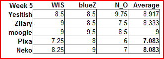
YesItIsh
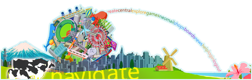
this is very pretty, and colorful, the rainbow navigation bar is very creative. but i think you should have done more with the image. i think the scanlines were not necessary because it kind of ruins the simple and cleanness of the graphic.
[8.5/10]
Zilary
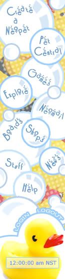
it is very attractive because it is very simple and clean, but not the point of plain, the yellow and blue creates a good contrast. one thing that bother s me is the bar which "Login" and "Logout" are located. i think the color would be better, if it was like the other bubbles, a bit more lighter and softer.
[8.5/10]
moogie
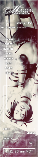
very pretty, very appealing, very well designed, text is great.
however, i am not a fan of the 2 lines with arrow ends behind the navigation menu. i think they kind of distracts you away from the text, i think it would have worked better, if the lines were dotted, instead of solid.
[9.5/10]
Pixa
the colors go together nicely, the text is well placed, but i think the image is a bit overdone, its a bit distracting, and the main focus is not really apparent, i suggest toning it down a bit.
[8/10]
Neko
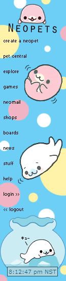
OMG KAWWAIII~~
anyways, i do like this nagivation bar very much, i would use it in a heart beat, its very clean and simple, the colors work great together, and the images are well placed as well. but i think you could have done more with the text, its a bit too plain.
[9/10]
YesItIsh
this is very pretty, and colorful, the rainbow navigation bar is very creative. but i think you should have done more with the image. i think the scanlines were not necessary because it kind of ruins the simple and cleanness of the graphic.
[8.5/10]
Zilary
it is very attractive because it is very simple and clean, but not the point of plain, the yellow and blue creates a good contrast. one thing that bother s me is the bar which "Login" and "Logout" are located. i think the color would be better, if it was like the other bubbles, a bit more lighter and softer.
[8.5/10]
moogie
very pretty, very appealing, very well designed, text is great.
however, i am not a fan of the 2 lines with arrow ends behind the navigation menu. i think they kind of distracts you away from the text, i think it would have worked better, if the lines were dotted, instead of solid.
[9.5/10]
Pixa
the colors go together nicely, the text is well placed, but i think the image is a bit overdone, its a bit distracting, and the main focus is not really apparent, i suggest toning it down a bit.
[8/10]
Neko
OMG KAWWAIII~~
anyways, i do like this nagivation bar very much, i would use it in a heart beat, its very clean and simple, the colors work great together, and the images are well placed as well. but i think you could have done more with the text, its a bit too plain.
[9/10]
Sun May 06, 2007 8:31 pm
Judging time ends in about 8 hours. =\
Sun May 06, 2007 10:33 pm
Sorry I was so late! I'm so busy 
YesItIsh
I love it! The scan lines are cool, IMHO. It adds to the creativeness of the graphic, I feel like you really separated yourself from the competition with this. Or at least you definitely stuck out. I like the navigate as well, and as for coding it, more props to you!!! The only problem I have is that some of the 'links' seem a bit bigger or unaligned with the rest of them, other than that, great job! - 9.75/10
Zilary
Ooo pretty! It's very cute, and minimalistic, but the text doesn't really work for me, it's nice and all, but it just doesn't really work well for me for some reason, I think it has to do with the whole work-a-bility of the sidebar as a whole, if I were to want to click games I might click Pet Central on accident or something like that. And the logout/login links seem like the odd ones out of the bunch seeing as they are both 'un-bubbled', and they don't follow the same scheme the rest of the sidebar had. - 7.5/10
moogie
It's pretty, it's nice, but it isn't really 'original'. I like the text, and scanlines and such. The arrows take away from it a bit. The text is a bit small, IMO. - 8.5/10
Pixa
There's definitely <i>too</i> much going on, the text is too light, the image is overdone, and all of that make it too distracting. - 6/10
Neko
The whole thing is way too plain. Sure, it's cute, but it looks pixelated, the text looks a bit plain, and all of it looks as if minimal effort was put in, even though I know you probably worked on it a lot. - 7/10
Mon May 07, 2007 5:14 am
Round 5 Results:
Unfortunately, Pixa and Neko are eliminated.
Congratulations to moogie for receiving the highest score this round!
FINAL ROUND
Congratulations to moogie, YesItIsh and Zilary! They have all made it into the final round of PPTGA.
For this final round, you will have to make two graphics!
Assignment No. 1
- Create a set
- Default PPT size restrictions. (400x100, 80x80)
- No limit on size kb-wise.
Assignment No. 2
- Create an Icon
- 100x100 Pixels
- You may not use the same images you used for the set.
Good luck to all the remaining contestants, and congratulations for making it this far!
The assignments are due May 17th
Last edited by WIS on Mon May 07, 2007 10:33 pm, edited 1 time in total.
Mon May 07, 2007 6:44 am
will there be a duedate for these graphics?
Mon May 07, 2007 10:33 pm
moogie wrote:will there be a duedate for these graphics?
Oops, sorry, added.
Tue May 08, 2007 5:00 am
o___________o This was unexpected. XD
Tue May 08, 2007 6:53 am
*cheesy smile*
Tue May 08, 2007 9:10 am

Tue May 08, 2007 12:49 pm
Psst, moogie, the source for your icon is a link to reply. 
Tue May 08, 2007 5:55 pm
WIS wrote:Psst, moogie, the source for your icon is a link to reply.
WELL THAT'S WHERE I GOT IT FROM!
EDIT: Fix'd
Wed May 09, 2007 12:38 am
Looks like I'm out! Good luck to the rest of you!
Mon May 14, 2007 11:01 pm
Ack!! AP tests!! TT^TT
Anyway...
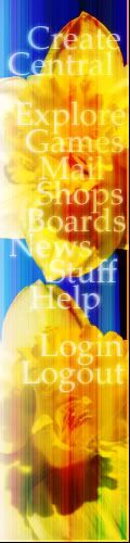
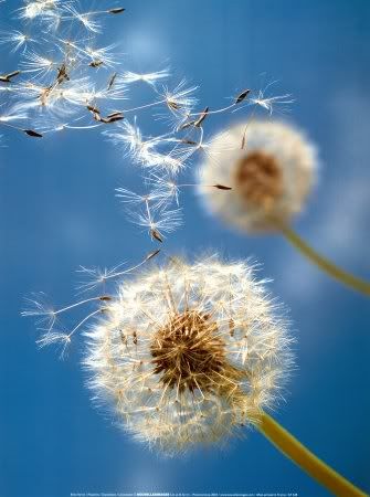
Assignment No. 1: Set

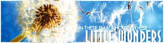
Source:Dandelions
Program used: Photoshop 7
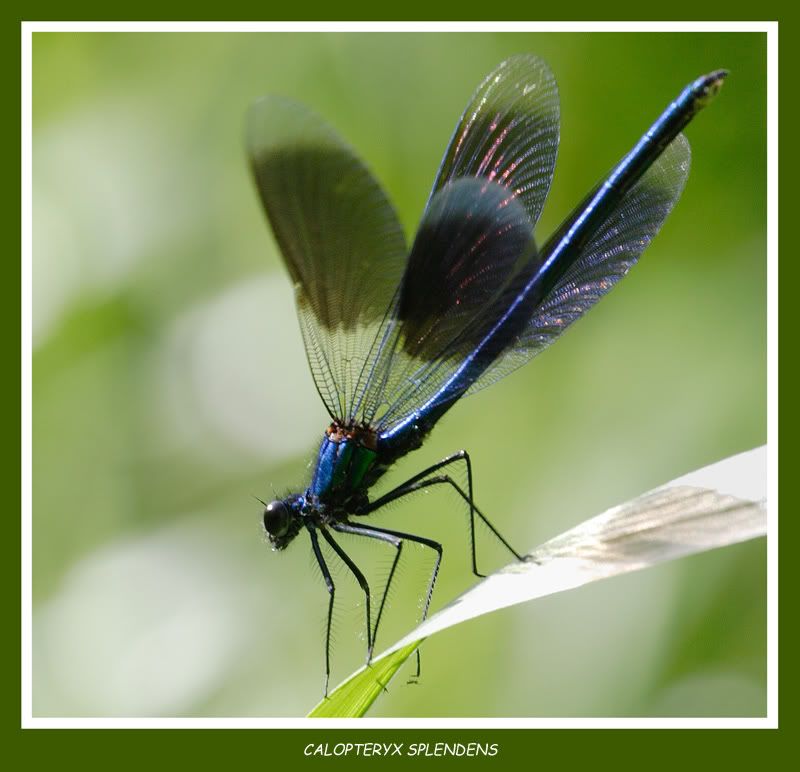
Assignment No. 2: Icon
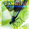
Source: Damselfly
Program used: Photoshop 7
Blehh...I may change my icon later....
Anyway...
Assignment No. 1: Set
Source:Dandelions
Program used: Photoshop 7
Assignment No. 2: Icon
Source: Damselfly
Program used: Photoshop 7
Blehh...I may change my icon later....

