I apologize for shorter ratings and such- school has started again, and I have lots of things to do. But I will continue to do this the best I can with the time I have- I guarentee I will not quit on this.
Amythest- Very nice- I only have one problem with it. And that's the color you used for the text animation. It's just too... bright. I personally think it would look just fine without any animation. I love the rest of the set, though- the blue looks very nice and matches completely. The fonts are just fine- and other than that animation problem, I see nothing wrong with it whatsoever.
Shifty- Definitely not your best. First off, I REALLY dislike the image work you did- only use a glow if you really need something to show up well. And in this set, you don't really need something to show up that much- the image would show up just fine without it. As for the text on the avatar- I don't think you needed to border it- it's just too large and chunky, and distracts the eye away from the image. As for everything else, I can deal with it.
Koku- Only one problem with this one- the text is a bit hard to read. As for everything else, I love it and there's no use commenting on everything, because I love it all.
Paola- Nice job! I love all the colors- they match perfectly. The main text font looks very good in the signature- no problems with any of the other pieces of text, either, except for the subtext. The only problem I have with the text parts is the subtext- it's just a bit hard to read. Other than that, I like it- good job.
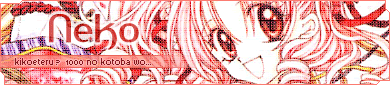
Neko- Love it. There isn't anything more to say.
Neopets Addict- Just a few problems. First off, though, I really love the colors. The match really, really well. I love the background, too- again, it matches really, really well and it looks as if you spent more than two seconds on it. I have just a few problems with it- all of them about the text. First off, the avatar text. Too chunky. Second off, I don't like how you made the signature main text cut in to the subtext displayer. It just doesn't look quite right. I would move it up a bit more. And my last problem is the subtext displayer itself (the band you have the subtext on). I would suggest that you make it purple- or you could even add a bit more of a spark to it, and make the band all shades of purple, faded together. You know, the left end of it starts off with a really dark purple, and it fades to be a pale purple at the end.
Quicksilvery1pore- Not your best. At all. This set has the "thrown together in three seconds" look. First off, the colors do not match at all. Second off, the image quality is blurry. Yes, you said you could get better quality by pasting it into your own graphics programs, but the point of this competition is to have good sets without having to paste them into your graphics program or whatever. I think the texture on it is okay, but quite frankly, you could of done much more with this.
PolarBearPop- Very well done, but I think it needs something... more. There's lots of empty space in the signature- I would suggest moving the subtext down and making the main text a bit bigger. Other than empty space, nice job.
Dobbitron- The pixel-i-ness of the image definitely kills the set. It doesn't look like you did a good job at resizing it. As for the colors, they're alright- except for the signature main text. That doesn't match at all- never make the text the color of something not seen in the image. Otherwise, I can pretty much guarantee it's not going to look good.
Optimus- Love. The. Border. AWESOME job with that. No major problems with any of it, except for the subtext. It's too hard to read vertically. A suggestions: Don't use vertical subtext UNLESS the text you want to use is short. Take DM was on fire!'s username for instance. She usually goes by 'DM'. That kind of think would look very nice vertical, but anything over three or four letters usually doesn't. To me, anyway.
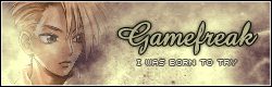
Kyra- Your work in this competition has really surprised me. I thought you were going to make sets with lots of grunge or something- but actually, not doing what people expect only improves your chances in this competition- it proves you can do more than one style. I really like this set- the main font is awesome, as is the background. The best piece of advice I can give to you is keep up the good work.
 Destiny
- The only thing I don't like about this set is the color scheme- I'm not really a fan of brown and purple together. Otherwise, no problems- it looks like you worked hard on it, and it paid off for the most part.
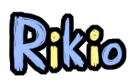
Rikio- Too many cutouts. The eye should be directed towards the image, and instead it's directed towards the extravagent cutouts. The background blends in too much with the image- at first, I had to look closely to see where the image ended and the background began. My best advice: Use. Color. Other than that, I love the main text on the signature, and the colors it uses (it matches with the rest of the set. As for the subtext and avatar text, they're both a bit hard to read.
Apricus- Awesome and a half. I love how you incorperated a bit of the daisy background on the original image into the set. I LOVE the grids you used on the image. Same with the fonts. No problem with this one at all- it's a bit on the plain side, but that doesn't make it any less beautiful.
DM was on fire!- I personally liked your last one better, but there are only a few problems I see with this one. First off- you use purple too much.

Try using a new color- any color will do. As for the fonts- I see no problems with them except I think you should of kept the signature main font a solid color- the white just looks... out of place. No other problems that I see- keep up the good work.
Bluehawaii19- Nice.
The colors look very nice together, and the background is superb. Two problems- first off, the subtext and avatar text are hard to read. Second off, I don't think you should of used black for the signature main text colors. Other than that, no problems.
Squibble- Fantastic set. No problems at all, except that the animation on the signature is a bit jerky. Otherwise, everything is absolutely perfect. My favorite set this round because of creativity and the niceness of it all.
Hellyer- Not your best. It has the "thrown together in three seconds" look. All of the text on the signature (avatar text is fine) is way too hard to read, the background is way too plain, and I think you could of done so much more with this.
My votes go to Hellyer and Quicksilvery1pore.


 >_>
>_>


