Thu Nov 03, 2005 3:51 am
Um, I will assume this is the one you posted.
It's kinda blurry, but its nice. It'd just look better if evreything was more clear and sharp. The border annoys me a little though. But I like sets that use (hiragana?) or japanese text in them, so this gets a plus ;-)
6/10
Rate this set ;D
kinda plain, but I like it


It's kinda blurry, but its nice. It'd just look better if evreything was more clear and sharp. The border annoys me a little though. But I like sets that use (hiragana?) or japanese text in them, so this gets a plus ;-)
6/10
Rate this set ;D
kinda plain, but I like it
Fri Nov 04, 2005 7:20 am
Nice set! I'm partial to warm shades of pink and purple myself.  The avatar has wonderful simplicity to it, which I love. The signature is quite nice also, but the plain font detracts from the appeal a bit. ^_~ Overall, pretty good. 7/10
Rate this wallpaper? Made in about 10 minutes of messing around.
http://img459.imageshack.us/img459/2308 ... per2cb.png
Original Image
Thanks!
Rate this wallpaper? Made in about 10 minutes of messing around.
http://img459.imageshack.us/img459/2308 ... per2cb.png
Original Image
Thanks!
Fri Nov 04, 2005 2:56 pm
Norrel ~> It may be a bit plain or simple, but it still looks great. I like the whole soft and glowing effect of everything like the text.
I like the purple and pink color in your background. This set seems so angelic.
The avatar is interesting, but I can't totally tell what is in it. Is it her hand? I think I would have more purple and pink in the avatar, too.
7.5/10
.......................
LAQ ~> Wow, 10 minutes?! O: Shocking! It would take me at least 30 minutes to an hour for a design.
Your wallpaper looks great! I really love how you drastically changed the original image. At first, I was wondering how much editting you could do in 10 minutes. :3 But whoa. The orig. image is icy, cold, and stiff. In your wallpaper, it's so warm, colorful, and soft. You warmed up the girl's hair and face.
And the font you used is nice and fitting, not like block thick font. ^^
Heh, I got nothing bad to say about this wallpaper. n_n 10/10
Tue Nov 08, 2005 10:14 pm
LAQ - Wow that is awesome, and only in ten minutes is nuts! I love Narnia. I can't believe you turned Jadis into such a, well basically human and truly queen like character...especially since she is very inhuman tyrannical ruler, and in that wallpaper one can't tell that her element is the ice...not sure if that was what you were going for though...
A possible idea for another narnia wallpaper could possibly involve having Jadis' icey character and blue colors on the left and fade them into Aslan's yellowy warmth and mane...or vice versa. That would look really cool!
10/10, if that is what you can do in ten minutes, what would take you an hour?
Rate my set?

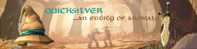
It is my first one so any pointers and other ideas about how to improve would be nice, thanks!
A possible idea for another narnia wallpaper could possibly involve having Jadis' icey character and blue colors on the left and fade them into Aslan's yellowy warmth and mane...or vice versa. That would look really cool!
10/10, if that is what you can do in ten minutes, what would take you an hour?
Rate my set?
It is my first one so any pointers and other ideas about how to improve would be nice, thanks!
Fri Nov 11, 2005 4:14 pm
Quicksilver- That's great for your first one. Heh, I remember what my first one looked like... it wasn't that good. I like the border around the avatar, it looks really good. The blue text doesn't look so good on the signature, though. I can see where you got the color from, but I think the brown would have looked better there. You should give the signature a border, too- it would look great if it matched the avatar's border. :)

Ratings? Header for my website... about 15 minutes worth of work.
Ratings? Header for my website... about 15 minutes worth of work.
Fri Nov 11, 2005 6:11 pm
Bangel - I haven't seen any graphics of yours in a while...it's very good. However, the font is really hard to read. I love Violation, but it's very hard to read when it's on Overlay or is at a somewhat low opacity. It took me 4 minutes or so just to know it was MICROSOFT Paint Tutorials, not Megatron Paint Tutorials. XD
Quicksilver - Your first set, now? I'd have to agree with Bangel, my first set wasn't all that swell either. The sig really needs a border, because that's one of the most important parts of a set. Also, the border on the avatar is kinda pixelly, but you can't do anything about that. Other than that, amazing set for your first time!
----------------------
I made this set for Hugs for Hawk Nelson the other day, and would like some ratings.


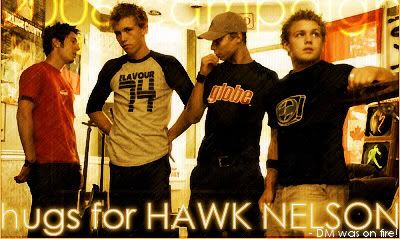
Original image: http://www.purevolume.com/hawknelson/photos/14095
(NOTE: the sig is cut in two different ways. The top takes you to hugsforhn.t35.com, and the bottom heads to tinyurl.com/dxcat, it displays the right way in InvisionPro Board, as seen here)
Quicksilver - Your first set, now? I'd have to agree with Bangel, my first set wasn't all that swell either. The sig really needs a border, because that's one of the most important parts of a set. Also, the border on the avatar is kinda pixelly, but you can't do anything about that. Other than that, amazing set for your first time!
----------------------
I made this set for Hugs for Hawk Nelson the other day, and would like some ratings.
Original image: http://www.purevolume.com/hawknelson/photos/14095
(NOTE: the sig is cut in two different ways. The top takes you to hugsforhn.t35.com, and the bottom heads to tinyurl.com/dxcat, it displays the right way in InvisionPro Board, as seen here)
Tue Nov 22, 2005 1:38 am
DM: Nice images. The text seems to be a little hard to read (especially the white stuff saying DM, DM was on fire). Some characters seem to appear on bold, while M is waaay too thin. You could probably fix this by making the entire thing bold, or getting a decent antialiasing pass on it.
The "hugs for HAWK NELSON" text should be just a little further away from the left and right borders of the image -- it's a bit hard to find it's starting / ending point. Compress it a bit horizontally?
Overall, it looks awesome.
---
Rate my Fable set? I do realize that the reflection theme is not clearly visible, but compressing the avatar even further would have been iffy at best.


(Perhaps the biggest challenge was compressing the signature image -- jpeg lost text color, gif didn't have enough colors and png was over the size limited. Ended up despeckling part of the image to get rid of noise.)
The "hugs for HAWK NELSON" text should be just a little further away from the left and right borders of the image -- it's a bit hard to find it's starting / ending point. Compress it a bit horizontally?
Overall, it looks awesome.
---
Rate my Fable set? I do realize that the reflection theme is not clearly visible, but compressing the avatar even further would have been iffy at best.
(Perhaps the biggest challenge was compressing the signature image -- jpeg lost text color, gif didn't have enough colors and png was over the size limited. Ended up despeckling part of the image to get rid of noise.)
Tue Nov 22, 2005 1:44 am
I really like the avatar there Hunter... possible adding a pixel border could make it even better. Maybe a black one for the outside, then a smaller white one. You could even add a few grey gradiant lines below the bottom black border to make it look 3d.
The avatar sig, maybe made the text stnad out more by duplicating the text, moving it behind the front text layer, and then move it one to the left and one up. Then change the font color of the background text to a lighter colour, 2-3 shades lighter than the front colour.
The avatar sig, maybe made the text stnad out more by duplicating the text, moving it behind the front text layer, and then move it one to the left and one up. Then change the font color of the background text to a lighter colour, 2-3 shades lighter than the front colour.
Fri Dec 02, 2005 8:38 am
I agree with Shoyru Lover, some kind of border could be nice- possibly gold? It's a little stark, but I'm not sure what would help- maybe some faded text or a border to tie the two together more?
Still, I really like it as a set, and the reflection theme is very apparent, I think. I love the warm, vibrant colors.
Any opinions on my current set? It's my very first one, as well as being my first experiment with animated gifs, so I only sort of know what I'm doing. I was going for a classic video game feel, but I'm not sure if the icon and sig are too visually different.
Sun Dec 04, 2005 4:36 am
Hmm, it's okay for your first one, it's ok. But...
PRO
The animaton in sig
The sig itself
CON
The av and sig no match
The text in AV is bad
The picture in av is blurry
-------------------------------------
Can anyone rate my current?
PRO
The animaton in sig
The sig itself
CON
The av and sig no match
The text in AV is bad
The picture in av is blurry
-------------------------------------
Can anyone rate my current?
Sun Dec 11, 2005 11:43 pm
I'm very new at this (this is the first siggy I have ever made). I decided I was really bored today and wanted to try something new. I'm only using MS Paint and I've only read a little bit online (including an old thread here at PPT). Here are two versions of a signature I have made. Please feel free to make as many constructive criticisms as possible 
Version 1:

Version 2:

Version 1:
Version 2:
Tue Dec 13, 2005 10:00 am
mayan: version two looks much better, the text standing out give the signature a better look. the whole thing looks sort of boring though, there isnt really a focal point and the font you chose doesn't really go with the vibe i get from the image, perhaps try a less out there font? maybe century gothic?
---
please rate this set:


---
please rate this set:
Thu Dec 15, 2005 5:45 am
mayan ~> I think I like your 2nd version with the white border/outline around the text. The outline is good, but the white may be too bright. The sig is muted and smooth so the title would have been nice if it followed the same idea.
I don't really like the font, but it kinda reminds me of the antlers in the sig. ^^;;
The border you have is good, but the left side is missing the white line.
moogie ~> Nice set. I like the different angles/parts of the picture you chose to feature. Makes me kinda curious about the full picture. ^^
I like how you did the border. It's neat how there are few colors used, too. n_n I like how the subtext is part of the border...kinda. It's different.
I can't tell how much you played with the image though and how you editted it to make it unique from the original. If you drew that picture yourself, that's a different story. ;3
Mmm, I don't like how the "g" in your name got cut off in the sig... Eh, minor. Nothing you could do but use a different font. But I like that font. -^^-
Thu Dec 15, 2005 2:36 pm
moogie wrote:mayan: version two looks much better, the text standing out give the signature a better look. the whole thing looks sort of boring though, there isnt really a focal point and the font you chose doesn't really go with the vibe i get from the image, perhaps try a less out there font? maybe century gothic?
---
please rate this set:
Very good, but what would be cool is if the fingers came outside the border on the sig? But other than that its fantastic! Its a really good simple geisha set.
------
Please rate this one, I just got rachel to do the image from some text which is taken from the movie fightclub (if you've seen the movie you'll understand


Thanks
Fri Dec 16, 2005 12:23 am
Eh? Nobody ever rated mines :-/


Im serious, yall did'nt forget me or something....did you?
ZORG
The set is very plain, not alot done. The text on sig is bad, the quality looks weird, and the border makes it even look MORE PLAIN.
Only thing I really like is the av... :-/
4.5/10
Im serious, yall did'nt forget me or something....did you?
ZORG
The set is very plain, not alot done. The text on sig is bad, the quality looks weird, and the border makes it even look MORE PLAIN.
Only thing I really like is the av... :-/
4.5/10