Tue May 23, 2006 9:57 am
militia wrote:
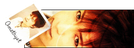
can someone rate my newest atm?:

I liked the siggy before this one much better.
What's the reflection on the helmet supposed to be of? I kind of like the picture but the idea itself kind of puts me off. It looks slightly scary to me. ^_^;;
The colors used contrast oddly with earthy tones and gray then the sharp orange in the center.
I'd give it a 6/10 because it gives me a headache to look at. But if it didn't then I'd give it a 8.4/10.
Wed May 24, 2006 12:27 am
Keylia wrote:militia wrote:
can someone rate my newest atm?:
I liked the siggy before this one much better.
What's the reflection on the helmet supposed to be of? I kind of like the picture but the idea itself kind of puts me off. It looks slightly scary to me. ^_^;;
The colors used contrast oddly with earthy tones and gray then the sharp orange in the center.
I'd give it a 6/10 because it gives me a headache to look at. But if it didn't then I'd give it a 8.4/10.
idk what the reflection is supposed to be of, the render came that way...
i did have some trouble wit the colors, thanx for the comments tho
ima work on it in a lil bit...
Thu Jun 08, 2006 1:05 am
mayanspypilot wrote:

I really like how you made the background with the stars. The image a bit too white to match the amount of black in the signature, but that's not a major problem. I like how you made a picture in a usually awkward position work. The only other problem I have is that there's a bit of empty space under 'mayanspypilot'... a subtext could fix that. Overall, it is really a nice set. :) 8/10

Rate. :D
Sat Jun 10, 2006 9:28 pm
Dawn: Hmm. I love the color scheme, and I think you did a great job picking out the blues. The text is well aligned, and the space seems to be filled very evenly, nice job on that. My only complaint is that the main image seems to be a bit dark. Maybe you could run a screen or overlay filter on top of it? Otherwise, very good. 9/10, just lighten the foreground image a little 
Mayanspypilot: Very pretty. The space under the text on the sig seems a little empty, but the background sort of stands in for more text in filling it. The main image is just a touch too light, but like Dawn said, that's not a huge problem. 9/10, nice job! I hope you keep graphick-ing^^
-----
Now for my problem: I just made two sets, and I have NO idea which to use. They are as follows:


Ratings would be much appreciated, thanks!
Mayanspypilot: Very pretty. The space under the text on the sig seems a little empty, but the background sort of stands in for more text in filling it. The main image is just a touch too light, but like Dawn said, that's not a huge problem. 9/10, nice job! I hope you keep graphick-ing^^
-----
Now for my problem: I just made two sets, and I have NO idea which to use. They are as follows:
Ratings would be much appreciated, thanks!
Sun Jun 11, 2006 4:41 pm
Ammy - I personally like the second one. On the first set, the avatar's text really bugs me. But, that's it. The reason I like the second one is the originality. But, I would like to make one mention on the avatar for the second. I think it would've been better if you had tilted the avatar at a bit of an angle, and maybe picked a different picture from the same photoshoot. Also, there's a couple spots on the avatar that you forgot to erase.  Aside from that, great job.
Dawn - The image is a bit dark. Since you're using PSP, do a Clarify, and you'll fix that up. Also, you should've put either a black stroke on the main text, or ('cause it looks like it has one), remove the white stroke on it. The looks really fat with it. oO;;
---
Care to rate?


Original picture: http://krystal-meyers.org/gallery/detai ... e619ce7c73
Dawn - The image is a bit dark. Since you're using PSP, do a Clarify, and you'll fix that up. Also, you should've put either a black stroke on the main text, or ('cause it looks like it has one), remove the white stroke on it. The looks really fat with it. oO;;
---
Care to rate?
Original picture: http://krystal-meyers.org/gallery/detai ... e619ce7c73
Mon Jul 24, 2006 8:14 pm
DM: I like the colors, but the signature seems to big for the image. It has a lot of empty space, but it looks good. I give it a 7/10. Im not a fan of simplicity, but you made it work well here :]
Could someone rate my current set please?
original image:
http://delivery.gettyimages.com/xc/200138446-001.jpg?
thank you!
Could someone rate my current set please?
original image:
http://delivery.gettyimages.com/xc/200138446-001.jpg?
thank you!
Sun Oct 29, 2006 7:59 am
DM was on fire! wrote:Care to rate?
Original picture: http://krystal-meyers.org/gallery/detai ... e619ce7c73
I Love the siggy. It is awesome! The avatar also rocks. 10/10! I don't think it could be improved..
Sat Nov 11, 2006 8:56 pm
militia wrote:can someone rate my newest atm?:
i read a new tut and i like the outcome...
thanx
I personally love that sig... I have seen a TON of halo render/grunge brushing sigs but this one stands out... Excellent job blending the brushing around the render to the plain background, and the text matches the sig well. I especially like how the background works with the render, the reflection of light on the render works with the lighter right side of the background.
Very nice work, 9.5/10.
Anyone wanna rate my new set (that doesn't match at all
Tue Jan 16, 2007 10:39 am
Wow, this topic's a bit quiet at the moment I was going to do a couple of ratings, but the latest posts are a bit old!
Dag Hehe, that is a bit of a mixed set! Both the av and the sig are really nice, though I must say I think I like each of them separately better than together. It'd be nice to see a matching partner (a sig for the av, or vice versa) for them.
The avatar: Very effective use of image. I like the bright yellow against the black. The text stands out well. It'd be nice to see what you'd do for a matching sig.
The sig: Lovely mix of colours! The red and the aqua/gray/blue contrast each other very well, particularly with them on the opposite sides. The text looks a liiiitle bit chunky, just because of the style of font you used. It seems to be the same font that you used on the avatar though, so it's good you tried to match them. If you weren't a guy, I might have suggested something a bit more cursive ... but perhaps a dirty/grunge font might be fun to play around with
---
Anyone care to rate my new set? I've been trying out a new colouring-overlay technique


I also made this one for Ahoteinrun in a similar style...


Dag Hehe, that is a bit of a mixed set! Both the av and the sig are really nice, though I must say I think I like each of them separately better than together. It'd be nice to see a matching partner (a sig for the av, or vice versa) for them.
The avatar: Very effective use of image. I like the bright yellow against the black. The text stands out well. It'd be nice to see what you'd do for a matching sig.
The sig: Lovely mix of colours! The red and the aqua/gray/blue contrast each other very well, particularly with them on the opposite sides. The text looks a liiiitle bit chunky, just because of the style of font you used. It seems to be the same font that you used on the avatar though, so it's good you tried to match them. If you weren't a guy, I might have suggested something a bit more cursive ... but perhaps a dirty/grunge font might be fun to play around with
---
Anyone care to rate my new set? I've been trying out a new colouring-overlay technique
I also made this one for Ahoteinrun in a similar style...
Wed Jan 17, 2007 12:35 am
This is about the first set, btw.
Oooh, me likey. I love the sizes of the av and sig- perfect for what you did. The coloring-overlay looks great, as well, but there's something about the positioning of the picture in the sig that seems off to me. Either that, or it's a bit blurry?
Even so, I think it's great.
Oooh, me likey. I love the sizes of the av and sig- perfect for what you did. The coloring-overlay looks great, as well, but there's something about the positioning of the picture in the sig that seems off to me. Either that, or it's a bit blurry?
Even so, I think it's great.
Wed Jan 17, 2007 2:12 am
Ooh, thanks very much! Yes, the image in the sig is probably a bit blurry... I was having trouble finding high quality images of "Momo" (the little lemur creature). I made it worse by putting a white overlay over it too, I think 
Edit: Actually, here is the original image (or a similar one). It looks a bit smaller, so I probably did enlarge it... and hence make it blurry!
Edit: Actually, here is the original image (or a similar one). It looks a bit smaller, so I probably did enlarge it... and hence make it blurry!
Wed Jan 31, 2007 1:36 am
Mazil: The first sig is just GREAT!I love the picture, and the colouring is great!
Fri Mar 09, 2007 7:51 am
Mazil, I love your style! The colors work great in those sets and they're very mellow-like.
For the first set, I like how small and compact it is. It fits well with the original image and the colors are great. I usually hate shades of green because they never work well for me!
For the second set, I like the text on this one in addition to the coloring I mentioned earlier. The text is very simple but very effective, and the subtle differences between each word work nicely. Great job! I like the tilted border, too.
I also have two sets I'd like people to rate
First:

Note that this set uses transparent PNG-ness, so if you're not using the latest version of Internet Explorer or Firefox, you might not see the transparency.
Second:


This is a hummingbird signature, that I vectored by my self. It's my very first vector and I'm proud of the outcome, what do you guys think?  I made two versions, one transparent, one on a white background.
For the first set, I like how small and compact it is. It fits well with the original image and the colors are great. I usually hate shades of green because they never work well for me!
For the second set, I like the text on this one in addition to the coloring I mentioned earlier. The text is very simple but very effective, and the subtle differences between each word work nicely. Great job! I like the tilted border, too.
I also have two sets I'd like people to rate
First:
Note that this set uses transparent PNG-ness, so if you're not using the latest version of Internet Explorer or Firefox, you might not see the transparency.
Second:
This is a hummingbird signature, that I vectored by my self.
Sat Mar 10, 2007 2:11 am
WIS: i'm not nparticularly fond of the first set, I dont know why though, its very well made and the colors work well, i guess its just not my style.
second signature...wow. Thats just gorgeous. The vectoring is simply amazing. The color scheme is great. The vector quality is really smooth and nice. I wouldn't believe this was your first vector if you hadn't said.
second signature...wow. Thats just gorgeous. The vectoring is simply amazing. The color scheme is great. The vector quality is really smooth and nice. I wouldn't believe this was your first vector if you hadn't said.
Sat Mar 10, 2007 2:52 am
WIS,I just LOVE that first set.The colours go GREAT together, and I love the pic!