Pink Poogle Toy Forum

The official community of Pink Poogle Toy
Main Site
NeoDex
It is currently Tue Apr 16, 2024 4:15 pm

All times are UTC


Post new topic This topic is locked, you cannot edit posts or make further replies.  [ 13 posts ] 
Author Message
 Post subject: Graphics Secrets
PostPosted: Tue Jul 05, 2005 7:46 pm 
Beyond Godly
Beyond Godly
User avatar

Posts: 3703
Joined: Mon May 31, 2004 10:11 pm
Location: 51°23' 0°30
A long time ago, there used to be a thread for graphics secrets where artists on many different talent levels could post their tutorials, or if someone needed help, could ask how to do a certain effect. Now, I hope to revive this thread and gain some artistic ability at the same time.

So, with some luck, people shall post (=.


Image
kudos sasha+gregory // PPT's Unofficial President


Top
 Profile  
 
 Post subject: Glowing/Dreamy Effect
PostPosted: Tue Jul 05, 2005 8:41 pm 
PPT God
PPT God

Posts: 1195
Joined: Mon May 31, 2004 6:35 am
Oh, I've been wanting to tell someone about my favorite blending mode technique!

Okay, so I was just working on my new website layout and I loved the way this turned out. I wanted to turn this image into something dreamy, using Photoshop (7.0, though I think earlier versions can do this).

1. Find an image! I used, as mentioned above, this image.
2. Copy it onto a new image document.
3. Duplicate the layer.
4. Apply a Guassian Blur to the top layer. I usually set it to 2 pixels, but you'll need to adjust that depending on the size and detail of your image.
5. Duplicate the blurred layer.
6. On the first duplicate (it should now be the middle layer), set the blending mode to Overlay.
7. On the second duplicate (the top layer), set the blending mode to either Lighten or Screen. Depending on your image, one of those will give you the glowy/dreamy look.
8. Change the opacities of the top two layers until you reached the desired effect.
Here is my end result (with a grid-type overlay and some brushes at the bottom). This is the basis for my latest website layout.
I hope that helps you!


Top
 Profile  
 
 Post subject:
PostPosted: Wed Jul 06, 2005 12:55 am 
Honorary Member
Honorary Member
User avatar

Posts: 401
Joined: Mon May 31, 2004 6:29 am
I'll take this time to mention that I'm taking the liberty to steal and alter (grammatical and my additions only, and you still get credit) any tutorials or tips for the Tragic Muse archive.
Also, keep in mind that I'm taking tutorial requests. See this thread for my terms.


Image


Top
 Profile  
 
 Post subject:
PostPosted: Wed Jul 06, 2005 1:38 am 
Honorary Member
Honorary Member
User avatar

Posts: 6220
Joined: Tue Jun 01, 2004 3:02 am
Location: sakura makes dreams come true.
I have a million and a half for Paint; I'll post some I find particularly useful.

Avatars and signatures in Paint

For your avatar:

1. Open Microsoft Paint, of course.

2. Go into the "image" section of the menu bar. From there, click on "attributes". Make sure that "pixels" is checked off in the unit section, and "colors" is checked off in the colors section. Where is says "width", erase whatever number there currently is and put "80". Do the same for "height". Click "OK". Your screen should now shrink.

3. Click on the tool in the side menu bar that looks like a solid box. NOT THE DOTTED LINE BOX. Make sure that in the side menu bar, the empty box is selected.

4. Make a square that covers the bulk of your now tiny canvas. It's okay if you can't get all of it, it's hard to do.

5. Click on the DOTTED LINE BOX in your sidebar after you've made your square.

6. Click and drag one of the tiny turquoise buttons in the corner of the canvas. This will give you more space to work and make your tiny screen bigger.

7. Now it's time to find your image. Shrink Paint, and open the Internet. Do an online search for a good image to use, or go to a website you like to find one. Once you've found it, right click it, and click "copy". Multitask back to Paint. On your side menu bar, the dotted line rectangle should still be selected. Look to the bottom of the toolbar, and you'll see two options for this tool. One will have a tiny box with a little bit of white behind it, the other will have a tiny box with a transparent background. Click the one with the transparent background.

8. Edit < Paste your image into Paint. Drag it down so it doesn't cover up your already made border. You must be on the dotted line rectangle tool to do this!

9. Click on the white outside of your selected image. Click and drag around your border- it should now be selected. Drag it on top of your image. =O Alas! Look! You have the first makings of your avatar! Drag the border around to the part of the image you want to be in your avatar. Unselect it by clicking on something outside of your dotted-line rectangle that you have the border selected in when you have the border in the place you want it.

10. Crop around the edges of the border and... you're done! You now have a lovely 80x80 (or somewhere near to that dimension) avatar. Select your finished avatar and drag it up to the top left corner of your canvas. The top and left sides of your border should be touching, but not covered up by, the end of your canvas. Now go down to the bottom edge of your canvas, and drag the little turquoise boxes up until only your avatar is showing on the screen, with no white around it.

11. File, Save. Name it whatever you like. In the "save as type" section, either change it or leave it at 24-bit Bitmap (*.bmp; *.dib). You'll learn more about these "file formats" in the intermediate section, in a tutorial titled "Choosing Formats".

For your signature:

Follow steps 1-11 for avatars exactly, EXCEPT instead of making the attributes 80 width and 80 height, go for something like 350 width and 100 height. When you are first beginning, bigger is better so you have more space to practice.

You can add your text in anywhere from directions 10-11.

Icons and other graphics can also be made using this method, just change the sizes.

Choosing Formats to Save In

In all of the basic tutorials, I mainly told you to save your graphics as Bitmaps. Well... bitmaps, to say it in the least stink, and give you huge file sizes. So, now that you're intermediate in this program, it's time for you to learn what some of the other formats are, what they do, and the pros and cons to using them.

24 Bit-Map
This should be familiar to you, but let's go over it anyway. Some pros of using bitmap? You lose absolutely no quality, as you would in .gif or .jpeg. Cons? Bitmaps create horribly large file sizes, which make pages load really slowly for people with not-so-good computers. On a scale of one to ten on this format, I give it a six.

JPEG
Jpeg is definitely not the best format to use. However, there is one pro- Jpeg does not create huge file sizes. Yet the cons definitely outweigh that- for one, when used in Paint, Jpeg makes things horribly blurry and jpeg does not support transparency. My rating: 4/10

GIF
Gif is absolutely horrible on Paint. The quality is horrendous, even if it does have the smallest file size of all. My suggestion- don't use it! 2/10

PNG
The best of them all. Png saves with a small file size without losing any quality at all. The only con with this is that it messes up with transparency sometimes, but I doubt you have to worry about that until you move onto advanced cutouts (in the advanced tutorial section, of course). 9/10.

All in all, Png is the best to use when using Paint, Bit-Map is next best (though pretty far back), followed by Jpeg and in last- gif.

Making Scanlines in Microsoft Paint

Have you ever wondered how people with Photoshop make those scanlines that resemble what you see on your television sometimes? Well... they just press a button. In Paint, however, you can't do that, so you have to do it by hand. This is really easy, IF you are used to Paint and IF you have patience. Scanlines aren't for everyone.

1. Open Paint and select a light gray (or a very light version of one of the main colors in your image) on the color menu.

2. Get your image, of course, that you want scanlines on, and paste it into Paint. Click on the line tool.

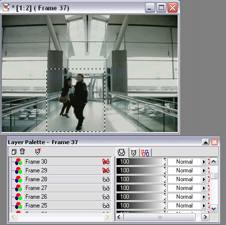
3. This next part is really hard to describe, so I'm going to give you a step by step look with pictures.

Step one: Plain image

Step two: Being to add in your scanlines in light gray (or a different color of your choosing). Leave one clear pixel infront, in back, and to the right and left of each line you make.

(Magnified x6)

4. Continue to make your lines until you have the entire picture (or the parts you want covered in scan lines) covered.

Erasing Backgrounds in Microsoft Paint

Ah. The hardest Paint task of them. Background erasing. Does Paint have a fancy tool for this? No. Does Paint have anything to make this easy for you? No. Once again, we're doing it by hand.

1. Open your image in Microsoft Paint. Make it nice and big for your first time.

2. Magnify it times 8 (6 can work sometimes).

3. Look at your picture. Is there a definite outline that you can follow between the image itself and the background? If so, you're all set to begin erasing. If not, choose a new image for the first time.

4. I'm going to give you another picture step-by-step direction for the main part of the tutorial.

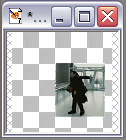
Step one: Choose the eraser tool, and put it on the smallest setting. Begin going around the outline of your image, like so:

Click for magnified example

Step two: Go around the entire image this way.

Click to see (unmagnified) example.

(I made mine greyish so it would show up better)

Step three: Erase the remaining background outside of your space.

All done!

Bordering Text in Microsoft Paint

1. Open Paint.

2. Make the text you want to spazzify.

3. Click on the paint brush tool, on the lowest setting (one pixel) in the color you want to border your text in. Magnify your text by 8. 6 is alright, too.

4. Go around the edges of your text with the color you've chosen to border with, like this:

Click for end result.

It's rather time consuming, and takes a while to master. I've been bordering text for a while now, and that still took me a good five minutes.

Other Helpful Sites

Darkest Faerie Lair

A tutorial site with lots of great tutorials for graphics, none for Paint however (though they do link you to some great download sites for better programs).

Another Microsoft Paint Tutorial Site

A wonderful site with great directions (though some of their opinions differ from my own).

Microsoft Windows Tutorials - Screenshots in MS Paint

A nice tutorial on screenshots in Paint.

Microsoft Paint photo retouch methods

Great tutorial on removing red eye from photos in Microsoft Paint.

Learn to use the tools and make pictures with MS Paint

Another nice tutorial site on making things in Paint.

Xandorra's Place

Really nice tutorial on making cartoon dolls in Paint.

Gifworks

Fabulous .gif effect maker, I used to live by it when I used Paint.

ImageMagick

My all time favorite browser program, the best I've ever found.

***

Hopefully I could help at least someone with those. And please don't steal and call them your own, I worked hard on a lot of those.


Image
the greatest love story never told.


Top
 Profile  
 
 Post subject:
PostPosted: Wed Jul 06, 2005 5:17 pm 
Way Beyond Godly
Way Beyond Godly

Posts: 8715
Joined: Sat Jun 05, 2004 9:10 pm
Location: Cleveland, Georgia
Gender: Female
I'd like to present to you my favourite effect called the Sketchie. ^^ This can be pulled off in PSP 8 (maybe 9), but I also know of a version in PS 7. If you want to know more different effects, you can learn more effects from DM's Guide to Practice Banners. (Also where you can find the PS version for the sketchie. Warning though: It's big)

1: Open a picture, duplicate the picture layer. Set the duplicate's blend mode on Hard Light, set the original on normal.
2: Create a new layer between the Hard Light and normal layer, fill it white (no need to mess with your tolerance)
3: Go to Adjust - Add/Remove Noise - Add Noise, and have the following settings: Random, 50% noise, monochrome. Click OK.
4: Then go to adjust - blur - motion blur and have it set at 48% angle, 100% strength
5: Set the layer's blend mode to multiply. (Burn works too, but there needs to be more on burn)
6: Repeat as needed/wanted


Image


Top
 Profile  
 
 Post subject:
PostPosted: Sat Jul 16, 2005 9:16 am 
Beyond Godly
Beyond Godly
User avatar

Posts: 4874
Joined: Thu Jul 22, 2004 3:20 pm
Location: Vancouver!
My most favorite way to make backgrounds

Okay... this is my tutrial for making prettyful backgrounds on PSP9. It might work on other PSP versions too.

A

1. Select a marble brush. It should be a preset brush.
2. Pick a color, and then just randomly click on your image until it looks about 50% full.
3. Pick another color, matching the first one, and maybe another marble brush, and go over the image again.
4. Select yet another color, and repeat the above step until you feel it looks full.
5. Create a new layer. And on that layer, depending on wether your image is dark or not. (If it's dark, pick white, if it's light pick dark) and go over the picture with marble brushes.
6. Go to distortion effects, and select wind. (Motion blur will work too) and it doesn't matter what direction, set the % to 50. Or whatever you feel looks right.
7. Go to layer properties and make the layer about 33-50 % opacity.
8. Add faint text, scanlines, and if you have them, single swirl brushes faintly in the background for added effect.


Top
 Profile  
 
 Post subject:
PostPosted: Mon Sep 12, 2005 8:50 pm 
Honorary Member
Honorary Member
User avatar

Posts: 2918
Joined: Mon May 31, 2004 3:20 pm
Location: Paducah, KY
A very detailed guide to making mini-movie icons.

I love making these, and a lot of this stuff I've had to teach myself, because there's not really that many tutorials floating around. So I thought why not make one. The opportunity came today while I was making one. I basically kept notepad open and wrote down everything I was doing.

This tutorial was written for use with PaintShop Pro 7 and Animation Shop 3, though I'm sure it could easily be adapted to other programs.

First you need your screencaps. There are a number of ways to go about this. The easiest way is to use a program that automatically takes screencaps for you. VirtualDub is a free, easy-to-use program that you can download here . You can find a tutorial on how to use it for screencapping here.

However, VirtualDub only takes screencaps from video files on your computer. You can't use it to take screencaps from a DVD. PowerDVD allows screencapping from a DVD. You can download a thirty day trial here. Your computer may already have PowerDVD 5.1 installed. Mine did, but it was a really weird program made for tech-phobes, and wouldn't do what I wanted it to. So I had to upgrade to PowerDVD 6.

In PowerDVD, right click on the video, and click Configuration. In the Configuration window, click the Capture tab and select Capture To File. Select the folder you want the frames to go to.
When you get to the point in the video from which you want to take your screencaps. Right-click and click Forward > 1/2x. This plays the video at half speed. While the bit you want to capture is playing. Hold down the C key on your keyboard. Afterward, look in the folder you specified earlier, and you should find all of your screencaps.

(Note: The best clips for mini-movie icons are short, clear, single shot, single angle, clips. You can make mini-movie icons from multi-shot scenes, but it's trickier to pull off)

Now, once you have your screencaps, from whichever program you used, you'll want to open them all in Animation Shop. The easiest way to do this is to use the Animation Wizard. When you get to the Add Image screen, highlight all of the images, to add them all in at once. Make sure they're in the right order before clicking Next.

Once your images are open, look at them and get rid of any excess frames that you don't need at the beginning or end. Select all of the frames (Edit > Select All). Now you'll want to get rid of a lot of the ones inbetween. Click Animation > Cull Animation, and get rid of either every other frame, or every third frame, or even more. You be the judge. You can always get rid of more later if it's not enough.

Once this is done, select all of the frames and export them to PSP (File > Export Frames > To Paint Shop Pro).

Now, in PSP, take a look at your frames. In my case, all of the action in the scene was happening in the very center, with a lot of boring empty space around the sides. This means it's time to crop.

When cropping frames for mini-movie icons, the important thing is to make sure each frame is cropped in the same spot so that the animation doesn't wobble around.
I taught myself a little trick for this.

When you export the frames, PSP opens them all in one images, as different layers. Starting at the top layer (which is the last frame), use your rectangular selection tool to draw a selection around the part you wish to keep.
Hide the layer. On the next layer, if you need to expand the selection any, do so. Then hide that layer. Keep doing this until you're down to the bottom layer.
Example image, showing the process.. sort of.

You can also crop the frames in odd shapes (circles or whatnot) and even feather them so that the animated area fades into the background (like I did here). Just make sure every frame is cropped and faded in the same places.

Now, click Image > Crop To Selection.

Next you need to resize the image. The animation in a mini-movie icon should take up around a quarter of the overall icon size. Your image is probably not a perfect square. In the resize window, whichever number is smaller in the pixel measurement should be brought down to about 50, give or take a couple of pixels.

Now, when things get resized, sometimes they get fuzzy. If you wish to, go ahead and sharpen all of the frames.

Now it's time to start turning it into an icon.

You'll want to expand the canvas to 100 x 100 pixels (Image > Canvas Size). But you want to make sure that your animation box gets positioned correctly. So before you expand the canvas, decide where you want to put the animation box within the base. If you want to play with it, open a new 100 x 100 image, and copy and paste one of the frames onto it. Move it around on the blank canvas and decide where you want it, keeping in mind leaving room for borders and text.

Now, expand the canvas. Set the demensions at the top to 100 x 100. Be sure to set the image placement (at the bottom) to what you want. In my case, I want it 7 pixels from the right, and 15 from the bottom.
Tada!

At this point, save the image as a PSP file and close it. Close it in Animation Shop as well. (This is necessary to break the link between the two).
Now reopen it, and begin creating your base.

Don't make your base too terribly fancy, as it will detract from the rest of the animation, and just make the filesize bigger. You'll want new layers at the bottom for the background, and at the top for the text.

Once you've finished your base. Save again as a PSP file.

My finished base

Now the hard part comes. You have to open all of those frames back up in Animation Shop and animate them.

In PSP, hide all of the frame layers except the very first one. Now copy and paste as a new animation in Animation Shop. To copy all of the visible frames at once in PSP, click Edit > Copy Merged (or Ctrl + Shift + C).
Then, in PSP, make the second frame visible, and copy merge it into AS after the first frame (Edit > Paste > After current frame or Ctrl + Shift + L).
Keep uncovering your frames and copying and pasting them into AS until you have all of them.

Once all of your frames are together in the right order, you'll want to adjust the frame rate. Select all of the frames, and then go to Animation > Frame Properties. The speed of a mini-movie icon makes or breaks it. You don't want it to be too fast.
If you've set the frame rate pretty fast, and the animation is still too slow, it means you have too many frames. Get rid of some of the ones in-between.

Another thing to keep in mind, if your frame rate is extremely fast (less than 5 or 6 100ths of a second) it may slow down once uploaded to the internet, as browsers won't be able to play it at as high speeds as Animation Shop can. If you have this problem. Make it slower, and get rid of some frames to make it the right speed.

Next you want to decide how you want to make your animation start and end. You can leave it as is, so that it just loops on itself, all at the same speed. You can have the last frame fade to black (or white) and back into the first frame (I usually don't do fades, because it just adds more frames). Or you can have the first or last frame (or both) pause for a moment, before the animation loops.

Now comes the part that will give you a HUGE headache. LiveJournal has a filesize limit of 40k for icons. It can be extremely annoying to have to keep messing with your icon to get it below 40k. The best ways to lower the filesize of a mini-movie icon is by getting rid of some of the frames (be sure to adjust the frame rate accordingly) and to lower the amount of colours used (which you can do through the Optimization Wizard).

Finished Product:
Image

(It originally had 37 frames, but I cut it down to 17 to get it under 40k)


Image
Love is blindness. -- Set by my Secret Santa =D


Top
 Profile  
 
 Post subject: Next step
PostPosted: Sun Jan 01, 2006 12:41 am 
Newbie
Newbie

Posts: 5
Joined: Sat Dec 31, 2005 3:15 am
So whats the next step, remember, take baby steps before you try to walk ;-).


Top
 Profile  
 
 Post subject:
PostPosted: Tue Jan 31, 2006 2:00 pm 
PPT Student
PPT Student
User avatar

Posts: 415
Joined: Tue Aug 02, 2005 2:39 am
making glowy icons... (very breif, cause i'm tired :P)(For photoshop 7.0)

1. Go to paint and create a completely purple desktop (just 1 colour; Set it at tiled if its small...)
2. save and set as desktop
3. Take a screenshot(Press the 'print screen' button)
4. Ctrl+V it into an existing wallpaper (on photoshop)
5. Go to: Select > Color range > Magentas
6. Delete the magentas :O
7. Double click on the layer, then click outer glow...
8. Now the files should be all glowy :D...

(Works better with dark desktops... Also, play around with the level of glow to get a better... glow...)


Image


Top
 Profile  
 
 Post subject:
PostPosted: Fri Apr 21, 2006 2:14 am 
Beyond Godly
Beyond Godly
User avatar

Posts: 4874
Joined: Thu Jul 22, 2004 3:20 pm
Location: Vancouver!
Color Wash Effect

http://www.deviantart.com/deviation/32139753/


Top
 Profile  
 
 Post subject:
PostPosted: Tue May 30, 2006 8:24 pm 
PPT God
PPT God
User avatar

Posts: 1744
Joined: Mon Feb 07, 2005 11:31 pm
Location: England
Lighting Effects for Adobe Photoshop

Use the dodge tool. Its the one that looks like a black magnifying glass. If you right click two more options come up. These are burn and sponge. The dodge tool is useful for adding things like realistic sunlight or moonlight. Ive used it for a few pictures and the outcome is always spectacular.


"I am a sly cat, I am a summer wind, I am birds in flight, I am the sun, I am the sea, I am me!"

Neo account: ginger23456


Top
 Profile  
 
 Post subject: Re: Graphics Secrets
PostPosted: Thu Aug 21, 2008 4:48 pm 
PPT Toddler
PPT Toddler

Posts: 233
Joined: Wed Aug 20, 2008 11:07 pm
How to Make a Good Signature Image on MS Paint (HtMaGSIoMSP)
Notes: Set your selection tool to transparent. And when saving images, do them in png because jpg and gif make it blurry, but jpg is worse in mo opinion. To change colors instantly, click the color you want to change, right click the color you want color A to change to, click the eraser, right click, and then move your mouse over the color you want to change.

1. Open Paint
2. Use the rectangle thingy to make the signature's basic shape (height by width). If you want to remove it afterwards, make the rectangle 3 pixels bigger in both height and width. And I don't know why, but it's always 1 pixel smaller than intended when I use it, so if you want a 300x100 image, you have to use the rectangle to make it 301x100.
3. Find an image you want to be in the signature. If the image is part of an even bigger one, you must use the Select tool to remove the image from the main one.
Example: Rip Zexion from the Organization 13 image that's missing Roxas.
4. Remove the big image now that you don't need it and shrink the canvas.
5. Start editing the stuff around Zexion. It would be easier to outline him in red and then remove the stuff past the red outline, but other colors would work as long as it's not something too dark.
6. Remove the stuff outside of the outline. It's optional to thin out the outline and is preferred. (Uh oh, I'm a lazy person because I accidentally saved image 6 as image 5, so I'll be quick and move image 4's Zexion to image 5.)
7. Outline the color with black. And optional if you color the 1st outline color to another one.
8. Now we're going to put the outlined image out of the way to edit the signature box. To make a filled border for the siggy, make a line 3 pixels away from one side. And squares in the corners are always optional, but they're part of my style.
8a. If possible, you can use a sprite version of the character/image.
9. Color filling! For the option squares, you can fill them in with a color and add in a few pixels of another color. And for the border and background, just take colors from the image (let's steal both the Zexions' hair color!) and open a new window.You copy the image you're going to use and take the eyedropper tool to take a color from the image. Then go to colors, edit colors, and click OK; the color automatically goes into the black color. Click the color next to the black and again, take a color then the process of making it into the color panel. Repeat until you get at least 4 colors. We're going to break this section into a few more for coloring techniques
a. Airbrush technique
1. Make the canvas 300x100 or whatever the image size is. If you're going to make the border colors, fill in the inner rectangle with a basic color so it won't get the same color as the border and vice versa.
2. Fill in the canvas with one of the colors you took from the image(s).
3. Click the airbrush tool and pick another color. Then start spraying randomly, but try not to get too much of the color in one spot, unless you want to.
4. Repeat the action with another color.
5. When you're done, go to your first paint window, C&P (copy and paste) the signature into the other window, click somewhere else, C the signature, and paste it into the first window. Repeat this action for either the background or the border. It's optional to add in white dots, but please use a custom white (or click the autmatic white, click "define custom colors, and get the arrow down a few) and not the automatic white because it'll get filled in.
b. Pencil scribbles
1. Do the same instructions from 1-2 on technique a, but find another color set (if we used Zexion's hair, we could use his skin, lol).
2. Click the pencil tool and start scribbling.
3. Choose a different color and scribble. (To me, it looks like a spyder made a colorful web)
10. Now to add in the image, you have to move the background somewhere else and put the image somewhere. When you get the image into the siggy, move the siggy over the background.
11. Text, the magic of ownership. (You may need to download fonts.) First, click the text tool, type something, and scroll down previewing the fonts.
12. When you find a font (I'm quite fond of Endor), click the rectangle option, click the fill thing, and click the black color in your color tools. Make it big enough so that the font can fit. Change your color to red and enter the text you want your siggy text to be.
13. Click the bucket tool and right click the black rectangle. Then repeat with the black in the letters for things like Os, Ds, As, etc.
14. Outline the text with another color like gray or something (and make a note to yourself that you shouldn't outline on the text). Then remove the color inside the text.
15. You can fill in the white area with red or another color to check if you forgot a few pixels for outlining. For the spots that have Ds, Bs, etc. you can fill it in with a color like bright green so that we can move on to filling in the color for the fonts.
16. Open up Microsoft Word and put in an image. Right click and format the object, go to colors and lines, click the no fill thing and then click fill effects. Use presets and scroll down to preview them (yay, gradients!). Take the gradient sample and put it onto your Paint screen.
17. Once you P'd it enough for the font to be filled, remove the stuff outside of the font.
18. It's optional to make a smaller text with a phrase like "dance water, dance" or "Cloaked Schemer." Yay!! But if not, you just move the font onto the image. And you go through the same process as the text stuff above.
19. Move all the extra stuff out of the canvas, move your signature to the top left corner, shrink the canvas so you don't see any white in the corner, and save.
20. When you're done, go to photobucket or another image hosting site, upload your final signature image, and enjoy!

Images showing most steps:
From here to here but there aren't any 11-12. Instructions are on the image descriptions as well.


Last edited by Xaidread on Thu Aug 21, 2008 4:59 pm, edited 1 time in total.

Top
 Profile  
 
 Post subject: Re: Graphics Secrets
PostPosted: Thu Aug 21, 2008 4:53 pm 
PPT Baby
PPT Baby
User avatar

Posts: 98
Joined: Tue Aug 19, 2008 9:24 pm
Location: Midwest, USA.
Gender: Female
Ummm...Oh yes. In MS Paint, if you need to background erase, pull your eraser up and RIGHT CLICK (say again) RIGHT CLICK on the image. It works if you've put in text and want some of the bg gone. I haven't seen it to work otherwise, though.


Oh, and to make a cool image, go here: http://www.jacksonpollock.org/


Image
Set by Neko! (thankies)


Top
 Profile  
 
Display posts from previous:  Sort by  
Post new topic This topic is locked, you cannot edit posts or make further replies.  [ 13 posts ] 

All times are UTC


Who is online

Users browsing this forum: No registered users and 3 guests


You cannot post new topics in this forum
You cannot reply to topics in this forum
You cannot edit your posts in this forum
You cannot delete your posts in this forum
You cannot post attachments in this forum

Search for:
Jump to:  
Powered by phpBB® Forum Software © phpBB Group