Pink Poogle Toy Forum

The official community of Pink Poogle Toy
Main Site
NeoDex
It is currently Wed Jun 26, 2024 9:36 am

All times are UTC


Post new topic This topic is locked, you cannot edit posts or make further replies.  [ 98 posts ]  Go to page Previous  1 ... 3, 4, 5, 6, 7
Author Message
 Post subject:
PostPosted: Sat Sep 18, 2004 11:00 pm 
PPT God
PPT God
User avatar

Posts: 1271
Joined: Tue Jun 22, 2004 2:43 pm
Gender: Female
Optimus - Pretty good job cutting the little guy out from the blue background. Okay, I really find this icon adorable. My little problems with it are that tere is some greyish bits around the animal (can't think of what that animal is called...) and that the letter 'i' in the subtext you used looks weird to me.

bluehawaii19 - Not bad. That was a hard image you chose to work with. I like the border you used. The text curving around his head looks a little weird. I'd maybe move it up a little bit away from him. And the cursive font is a little bit hard to read.

Chii - Very nice. I love what you've done to the image. It's a beautiful effect. Really, my only problem is with where you placed the word 'take.' I'd have maybe put 'every breath' on one line, and then 'you take' one line down.

Apricus - Yep, icons are definitely right up your alley. =P I love the simplicity of this, and the placement of text in the horizontal band. My only problem is that the border looks a little jaggedy, though that sort of can't be helped.

Neopets Addict - It's sort of plain, but I like it. The fact that you have the penguin faded into the background is just enough detail and a good filler. I like the text you've used, though I'm not overly fond of the animation. You really haven't done much with this set though.

Neko - I love the background and the colors. And the text, whatever language it's in. The only thing I don't like is the black border. (Meep. I want this icon!)

Koku - You've resized it, maybe blurred it a bit...and then it looks like you just stuck on text. Sorta hard to rate.

Kyra - I really like how you've placed the image, as well as the text. The faded look of the text works really well. The background effects are simple, and add just enough to the image that they don't take away from the picture.

Dobbitron - Well, you just sort of added a background. How you've blurred that into the puppy looks sort of odd, and the background is a little too empty. This could be fixed by adding more design to it, OR changing the main text to a larger font to fill up space.

paola - Interesting image choice. Hm...It's really sort of hard to tell what the image is until you've looked at it for a few seconds. It's very nicely put together, but the text is close to impossible for me to read until I sorta squinted, tilted my head, and stared at it for a minute. =P

Okay.... my votes go to Dobbitron and Koku.


Image
Gone.


Top
 Profile  
 
 Post subject:
PostPosted: Sat Sep 18, 2004 11:17 pm 
PPT God
PPT God
User avatar

Posts: 1519
Joined: Mon May 31, 2004 11:18 am
Location: Las Vegas
Wow...I thought I was really out this round. :o

I will work x10 harder on the next task. :)


Image - Set by Sapphire Faerie


Top
 Profile  
 
 Post subject:
PostPosted: Sun Sep 19, 2004 12:16 am 
PPT Student
PPT Student
User avatar

Posts: 366
Joined: Mon May 31, 2004 8:35 pm
Location: Lalaland
Dawn2 wrote:
Neko- Mixed feelings. I can't decide my own feelings on this. Kind of pathetic for me, eh? Anyway, I do like how you erased the background on the original image (you did, right?) and put in a new one (same comment). You made the new one (same comment again) blend in so well with the old one that it looks like the original photograph. That is very good. You chose great colors for the text- it looks quite nice. All in all, I'm still not sure of myself, but I think I like it. :P


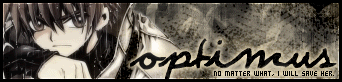
*sweatdrop* I didn't do anything like that. Though, I did use the Overlay effect. ^^;; meep!

vkceankraz wrote:
Neko -- Eeee! Lovely image you chose. I love what you did with it. The color scheme seems a bit too cool for the "love" theme. It's very pretty nonetheless.


Meep! In truth, I was trying to make a dream-ish kind of theme. I always thought that purples and blues make a nice dreamy effect! *sweatdrop* ^. ~;;;

Marissa wrote:
Neko: First a comment for Kim, that isn't the character for love. Going off that, you probably should have put something in the background as to what it does say (I don't know the word, I assume it's some flower or plant). I really like what you've done to the background, it's very dreamy and romantic. 9/10


I was going to put what the character meant, but it looked horrid, so I left it as is. Oh, well.

Flame wrote:
Neko - I love the background and the colors. And the text, whatever language it's in. The only thing I don't like is the black border. (Meep. I want this icon!)


I added the black border because my older bro told me, he said it looked better that way, though I don't see any difference if there wasn't a border! *blinks* Fufuu...hmm...you want this icon? Is it that good? Then, maybe, I can you one. ^^


Thank you all of you! Btw, to avoid anymore confusion, the character I used in my icon is the Japanese kanji symbol for the word dream, which is yume. Geez, I can't believe I lasted this long in this competition!


Image
"The path I've chosen had no effort, unless I took that chance, at the decision I've made, for all I've done and suffered." - Mi-Ku, © Mi-ku All Rights Reserved.


Top
 Profile  
 
 Post subject:
PostPosted: Sun Sep 19, 2004 1:07 am 
PPT God
PPT God

Posts: 1195
Joined: Mon May 31, 2004 6:35 am
Neko wrote:
vkceankraz wrote:
Neko -- Eeee! Lovely image you chose. I love what you did with it. The color scheme seems a bit too cool for the "love" theme. It's very pretty nonetheless.

Meep! In truth, I was trying to make a dream-ish kind of theme. I always thought that purples and blues make a nice dreamy effect! *sweatdrop* ^. ~;;;
Thank you all of you! Btw, to avoid anymore confusion, the character I used in my icon is the Japanese kanji symbol for the word dream, which is yume. Geez, I can't believe I lasted this long in this competition!

Thanks for pointing that out. At first glance, it looked like "love" to me, which is why I thought that that was your theme. It's okay. Calm down. *patpat* :)


Top
 Profile  
 
 Post subject:
PostPosted: Sun Sep 19, 2004 5:12 am 
PPT Student
PPT Student
User avatar

Posts: 484
Joined: Mon May 31, 2004 5:25 am
Location: Massachusetts
Gender: Female
Dawn2 wrote:
Paola- I'm not really a fan of this icon. First off, I didn't know what the heck the image was until I looked at the original one. Second off, the only bit of text I can actually read is 'cry and SCREAM'. However, the border is pretty nice and the colors look alright. I would suggest just making the text more legible and maybe using different images- some that everyone can tell what they are when they're resized. :)


That's what I like the most about it, the colors. :)

vkceankraz wrote:
Paola -- It's gorgeous. I love it. Although it looks really simple, it's a great effect. The only problem is the text... I can't read any of it except for the "cry and scream" part. If the text were more legible, it would have been perfect. Either way, it's a pretty nice job.


Heh, I'm not really sure it's all that great ^^;

Marissa wrote:
paola: I like this one, and I actually can read the text, "Bury your head...cry and scream." The whole theme is very nice, but I think the real confusion is with the picture you used. I think it kind of looks like a frog at first glance, other people may see other things. This picture from a different angle might have been clearer. I can see how some people wouldn't be able to read the text, you may want to go for a clearer or bigger font. 7/10


Yeah, everyone that saw it was confused. I wanted it to be like that though. It reflects my emotions at the time that I made it. I think that's what I really like about it, it has a bit of me in it. (Did that make sense? XP)

Flame wrote:
paola - Interesting image choice. Hm...It's really sort of hard to tell what the image is until you've looked at it for a few seconds. It's very nicely put together, but the text is close to impossible for me to read until I sorta squinted, tilted my head, and stared at it for a minute. =P


XD I liked the image, and somehow I wanted to use. I started it before this round was set :P


I didn't think I was going to make it past this round. I'm pretty surprised. I guess, I wanted it to be confusing that's why I never changed the image. And the text is supposed to be hard to read XD I guess I should've stuck with the first version.


Image


Top
 Profile  
 
 Post subject:
PostPosted: Sun Sep 19, 2004 5:13 am 
PPT Warrior
PPT Warrior
User avatar

Posts: 838
Joined: Mon May 31, 2004 6:40 am
Location: Cybertron, Australia
Thanks for the ratings guys!

I had realy doubt with this icon but judging from the ratings I guess that other people see some merit in it. Maybe next time I'll try to think more positively and try to have more confidence when creating and posting my graphics.

Thanks guys!


Image


Top
 Profile  
 
 Post subject:
PostPosted: Sun Sep 19, 2004 6:40 pm 
PPT God
PPT God
User avatar

Posts: 1271
Joined: Tue Jun 22, 2004 2:43 pm
Gender: Female
Neopets Addict wrote:
Wow...I thought I was really out this round. :o
I will work x10 harder on the next task. :)

Neko wrote:
Geez, I can't believe I lasted this long in this competition!

paola wrote:
I didn't think I was going to make it past this round. I'm pretty surprised.

Optimus wrote:
Thanks for the ratings guys!
I had realy doubt with this icon but judging from the ratings I guess that other people see some merit in it. Maybe next time I'll try to think more positively and try to have more confidence when creating and posting my graphics.
Thanks guys!


All of you are so modest. :)

For all of you who thought you were going to be out this round, well, the jduges have obviously thought your graphics were better than you thought/hoped they were. You all have deserved to get this far. All of you have talent. The people who have been voted out of this competition
had talent. So I guess that makes it all the more awesome for you all to have made it this far.

Good luck for these last few rounds. I'm thinking there's only going to be three more rounds at most, so you especially have to work your hardest now. Because it's down to the best of the best of PPTTG.

The next round will be announced shortly.


To Optimus specifically, you have improved. Your graphics have varied in what effects you've used, though everything you make is still so obviously yours. I look at a set, and I can say "Oh, Optimus must've made that!" I'm glad to see that this competition has helped you a bit. (I think you've participated in all three of them...)


Image
Gone.


Top
 Profile  
 
 Post subject:
PostPosted: Sun Sep 19, 2004 8:30 pm 
PPT God
PPT God

Posts: 1195
Joined: Mon May 31, 2004 6:35 am
Yarrrr. Ye've all improved muchly. Tis a fine thing ter see. We judges be highly glad that ye've taken our advice inter consideration. Pass the grog around, laddies!


Top
 Profile  
 
Display posts from previous:  Sort by  
Post new topic This topic is locked, you cannot edit posts or make further replies.  [ 98 posts ]  Go to page Previous  1 ... 3, 4, 5, 6, 7

All times are UTC


Who is online

Users browsing this forum: No registered users and 35 guests


You cannot post new topics in this forum
You cannot reply to topics in this forum
You cannot edit your posts in this forum
You cannot delete your posts in this forum
You cannot post attachments in this forum

Search for:
Jump to:  
Powered by phpBB® Forum Software © phpBB Group