Awwwww! Some of these are so cute! I feel like long ratings today...
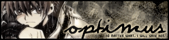
Optimus- So. Cute. I really like this icon and only see a few minor flaws. The first is the faded version of the image in the background- I think it would look a bit better if it were just a bit more faded- it's just a bit hard to see what's the faded version and what's the normal picture. I also don't think you should of used scanlines. Scanlines are most well used when you really need the image to stand out, and in this case, I don't think you do. Great use will all of the colors- other than those two things, I think it looks marvellous. Keep up the good work!
Bluehawaii19- Gah. Can't see the original image. This makes rating hard... anyway, I have mixed feelings about this icon. But first off, I love the curve and placing of 'Mr. Perfect Guy', as well as the font used for it. It looks very nice. However, I cannot read the other bit of text very well; I can only be sure of the worst word. I think the border is a bit thick, as well. However, I really like the image you used; I just don't think this is your best piece of work.
Chii- Love. It. This icon is absolutely beautiful. I love the placing of the rose, I love the placing of the text, I love the font used, I love all the colors, and I love the background. There is nothing in this icon that I don't absolutely love. You just did things so incredibly well- gah, I'm in shock right now. No, not because I think you're a bad artist and this is good, but because I've never seen an icon so wonderfully beautiful before. Once again, I absolutely love it. No problems whatsoever.
Apricus- Did you colorize the image? I can't quite tell. But I do really like this icon. The text is very readable, which I think is usually the biggest problem with LJ icons. I like the faded areas around the image- they go very well with the feel of the icon. And I LOVE the border- the roundedness of the border goes well with the roundedness of the gears.
Neopets Addict- The
cutest icon this round. However, it's quite simple and I'm not entirely a fan of it. First off, the animation. The white makes it a bit hard to read, and I think it's too flashy for this paticular icon. If the text were stationary, I don't think I'd have any problems with it. And as for the simplicity- well, it just doesn't look like you worked all that hard on it. Yes, it does look quite good, but I don't think you worked as hard on this as you have in the past. Other than that, though, it looks just fine- the colors are pretty okay, and again, that penguin is so cute, it's to die for.
 Neko
Neko- Mixed feelings. I can't decide my own feelings on this. Kind of pathetic for me, eh? Anyway, I do like how you erased the background on the original image (you did, right?) and put in a new one (same comment). You made the new one (same comment again) blend in so well with the old one that it looks like the original photograph. That is very good. You chose great colors for the text- it looks quite nice. All in all, I'm still not sure of myself, but I think I like it.
 Koku
Koku- Again one that I'm not sure about. I'm not quite sure how hard you worked on it, but I do like it. I especially like the image/text placement. However, I have a bit of a problem with the image work. I'm not quite sure if you did anything to the image to make it look... different, but if you did, I would suggest you didn't do that. It kinda reminds me of .jpg compression. And if you didn't do anything to the original image, I would suggest despeckling (did I spell that right?) it. However, I think the simplicity goes alright with this icon. I don't think it's your best, but it does look pretty nice.
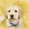
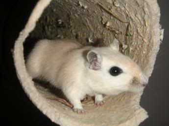
Kyra- Why is everyone using pictures of cute animals? Why, I ask, why? Anyway, I love it. the stars in the background of the icon looks so blending in, it looks as if they were a part of the original picture. The main problem I see is that the text is a bit hard to read. I think this icon would look quite good with no text at all- besides, the eye is drawn immediately to the picture (good!) and you don't really notice the text at all. Other than the text, I really don't see any problems. *huggles the mouse*
Dobbitron- Again, another cute animal. xD I really like this icon. The border is very plain, which I like very much. Two problems: I really don't like the text placement for some reason. I think this icon would look very nice without any text at all. And the second problem- part of the dog is clear as a bell, and another part of the dog is nearly completely faded into the background. I would suggest to either: A) Bring the faded part into view or B) Take out the faded part all together. Those are the only problems I see. Oh, and I LOVE the yellow background.
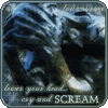
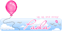
Paola- I'm not really a fan of this icon. First off, I didn't know what the heck the image was until I looked at the original one. Second off, the only bit of text I can actually read is 'cry and SCREAM'. However, the border is pretty nice and the colors look alright. I would suggest just making the text more legible and maybe using different images- some that everyone can tell what they are when they're resized.
This time, I'm sorry to say that my votes go to Bluehawaii19 and Koku. Sorry, guys.


 - Set by Sapphire Faerie


 <-- By Silja


