Pink Poogle Toy Forum

The official community of Pink Poogle Toy
Main Site
NeoDex
It is currently Sat Jun 29, 2024 3:46 am

All times are UTC


Post new topic This topic is locked, you cannot edit posts or make further replies.  [ 118 posts ]  Go to page Previous  1, 2, 3, 4, 5, 6, 7, 8  Next
Author Message
 Post subject:
PostPosted: Sun Oct 24, 2004 11:07 pm 
PPT Trainee
PPT Trainee
User avatar

Posts: 657
Joined: Tue Jun 01, 2004 4:35 am
Location: Australia
Gender: Female
Thanks for the comments guys :)

Yeah... it was a really hard picture to work with! So pixelly and horrible. I tried looking for another picture to use, but nothing grabbed my creativity like that one did. So I went in with a brush and smudge tool to smooth it out, which was rather time-consuming. I think when I finally got to the background, I was just wanting to finish it off!

The other two pictures I used were very subtle... the glowing dots are probably the more obvious of the two, in the background. The trees were mainly for texture, but I thought I better reference them ;)


Image
Nyum nyum nyum...


Top
 Profile  
 
 Post subject:
PostPosted: Mon Oct 25, 2004 3:38 am 
Way Beyond Godly
Way Beyond Godly
User avatar

Posts: 6691
Joined: Tue Jun 01, 2004 5:55 am
Gender: Female
Looks like I'm going. Its alright, I knew it would happen, its totally no surprise. *shrugs* I'm sorry you are going too, Dawn. *hugs*

Thanks to the judges for their advice. I'll try to use it. And good luck to everyone else. *hugs contestants and judges*


Image


Top
 Profile  
 
 Post subject:
PostPosted: Tue Oct 26, 2004 11:00 pm 
Honorary Member
Honorary Member
User avatar

Posts: 2456
Joined: Mon May 31, 2004 5:54 am
Location: THE HEART OF DARKNESS. *ominous drums* Haha, just kidding, I'm stalking you. :D
Gender: Female
Oh, I am SO sorry I haven't rated yet. >_< I'm at my aunt's house, and she's been without the internet since Sunday. Gah! *Apologizes over and over*

Darklegendary: First of all, nice job. The colours blend well, the fonts work the graphics, and the blending in the sig is nice. :) Few things that are bugging me, though: The text in the av would probably look better if moved more to the right- it's not in a bad position, but it's slightly awkward-looking. Also, the sig's a bit grainy. It would probably have been better if you'd made it a .jpg, instead of the less supported colours of .gif. Overall, good job, though. :)

Zero: I'm a bit puzzled why you sharpened the image when taking it out from the original. If anything, it perhaps should have been blurred slightly. oO In addition, the colours you used don't match the picture's colours- instead, they clash. The brighter yellows and reds of the background and text don't match the darker, 'smoother' reds, blues, yellows and whites of the pic. :/

However, I really must compliment you on your wonderful job of extracting and restoring the image, though. Great job. :)

Kitten Medli: My main problems with this have to do with the text. Both the subtext and main text are rather choppy- the main text should be anti-aliased to a nice-looking setting (I'm not sure if PS Elements has the same anti-alias settings as PS, but I'm going to assume it does. :P), and the subtext isn't really a font that goes well with the set. Also, the shade of yellow you used for the text doesn't quite match the yellow of the pic- close, but not enough to match, as it's too bright. I do like the background, though. It looks like you worked hard on it, and the work paid off- it looks wonderful. :)

Charka: I'm not sure why you used that particular font for the subtext/av text: it doesn't blend in well with the graphic/s, therefore detracting from the overall quality. A simpler pixel font would have done well. :/ Colourizing is well done. The main text does work well with the graphic. :)

Knives: Excellent set. Only things I can find that are off are the subtext in the sig: the outline is black, which though alright, would have been better if you’d used the same colour as the outline for the pixel text in the av- matching colours are always better than one out of a few that doesn’t. :) Also, the av looks slightly cluttered- perhaps if the text was moved over to the right a bit?

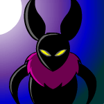
Sapphire Faerie: Nice job on the colourising! The grey-green colour of the girl’s skin doesn’t really match the rest of the graphic/s, though. The background and 3D border are nice... The 3D border of the text doesn’t match the graphic- not in colour scheme, but how 3D it is. Overall, nice work.

Meowth1982: You’ve also done a nice colourising. The bar behind the sig subtext isn’t all that great, though- if it stopped as it came to the character, coming out only between that gap between her and her arms, it would probably be more effective. :) Also, the outline of the main sig text would probably look better if it were thicker.

Alex: Very nice work! I noticed, though, that the av and sig don’t match- the text in the av isn’t outlined, while the subtext in the sig is; the picture and background are a bit blurred in the sig, whereas no blur at all in the av…

Starchaser: As always, great job. There are a few too many stars in the av, though- they make it look too busy. The av text would also probably be better if moved down- that area of the av is a bit empty. :)

Neko: Nice job! I’m not really fond of the subtext or av text, though. The font doesn’t really work well with the graphics. :/ The bar behind the subtext isn’t faded very well, on either side (left and right). The dots on the right of the girl’s head in the sig are far too concentrated, in that area- it would be better if they were spread out.

DM was on fire!: Good job on the blending of the various images. I have two critisisms, however: the pictures you chose, and the main text in the sig. With the images, I’m not sure how many are available, but the one in the middle of the sig, inbetween the ‘on’ and ‘fire’ in ‘DM was on fire!’, doesn’t match the other four pictures, at all- it’s bolded outline and lack of small, fine details, in contrast to the finer outlines and details of the other images, doesn’t match at all, really. :/ As for the text, the outline is too thin, and as a result, a bit hard to make out.

Marissa: Wonderful graphics work. I can only see one small thing that I don’t like. In the sig, the background version of the image is a bit awkward. The bangs of the woman look a bit like cuts- not hair (is it hair? I’m not sure.).

(Anything past this is rushed, as Scott is prodding me with a whip)

Shadowfare: The pixelish background in the sig isn’t all that great. It detracts from the quality of the graphic. The subtext colours are a bit off- the effect, though nice, makes it hard to read some of the text.

Apricus: Overall, very, very good work. A few minor details: the picture’s really pixelish at the edges. Not nice. In the av, the text is a bit too bright, and the pink of the text doesn’t match the pink of the graphics (not really, anyway).

r4che1: Set is nicely done. However: the subtext’s font doesn’t match the rest of the set, and it’s a bit large. The blue-green outline of the other text is a bit too bright, in contrast with the other, lighter, colours. The scanlines of the sig are too obtrusive, and would probably look better at a lower opacity.

Kristina: Good image extracting and colourising job- image looks fine, without any pixelly spots or pink pixels left in, and the colourising is nice. The text in the sig is really blurry, though, and the text in the av would look better with an outline or subtle glow, so it doesn’t stand out sharply from the background or look too plain in comparison. The background is alright, too, though it could definitely be better, as it’s simply blurred brushes of different colours.

laq: VERY good colourising. Very. My only crits have to do with the av: the text is a bit too far too the left, it seems, as it looks off. Also, the av is a bit empty. I’m not sure what you would be able to do to make it not as empty, however.

Mazil: I really don’t think you should have used that particular picture (of the girl) for the set. It isn’t very good quality, so although the set is excellent, the picture is hard to work with, and it shows- it lowers the quality of the set.

Neopets Addict: The av is a bit too big- wide, I mean. There’s too much empty space. Also, the outline of the Ixi is far too pixelly- it’s choppy where it’s protruding out of the graphics. However, the background and fonts are quite nicely done/chosen, finishing off the graphics with a nice touch.

Dawn2: For Paint, it’s very well done. The extraction and move of the dove to another part of the picture is incredibly smooth- I can’t tell you moved it. The borders would probably look better as a different colour, instead of black, which doesn’t match the set at all. The main sig text should be anti-aliased, as the pixellish text clashes with the graphic (You should download a better graphics program, such as GIMP- it’s free, and good. :/).

Polarbearpop: …I can’t see the set. I saw it before, though, and from memory, the text in the background was distracting, and really took away from the quality of the sig- would have looked better at a really, really low opacity, or if not there at all.

My votes go to Dawn2, Medli, and Polarbearpop (from memory, I'd already decided this vote upon looking over the sets on Sunday morning. :) ).


can't find the sig from this set, so instead, you get a <3 .


Top
 Profile  
 
 Post subject:
PostPosted: Wed Oct 27, 2004 1:45 am 
PPT God
PPT God
User avatar

Posts: 1271
Joined: Tue Jun 22, 2004 2:43 pm
Gender: Female
...Alex, don't worry about it. Wait until you see how late I can be with ratings. ^^;;

Dawn2, Medli, and polarbearpop cannot participate in this round.

Round 2 Requirements
-Make a set
-Use a neopets image
-No blue

*Flame runs off before anyone tries to kill her because of the 'no blue' requirement*


Image
Gone.


Top
 Profile  
 
 Post subject:
PostPosted: Wed Oct 27, 2004 2:04 am 
PPT Warrior
PPT Warrior
User avatar

Posts: 900
Joined: Tue Jun 01, 2004 5:03 am
Location: on a chair
Noooo! No blue! *tries to kill flame*

And when is the deadline?


-used to be darklegend-
currently: lurking ^-^


Top
 Profile  
 
 Post subject:
PostPosted: Wed Oct 27, 2004 3:43 am 
PPT God
PPT God
User avatar

Posts: 1143
Joined: Wed Jun 02, 2004 8:14 am
Location: In a cage...
oh, I know a perfect one, esp. for halloween! I'll edit this post when I finish (maybe over the weekend or so, or maybe in a day)


Image


Top
 Profile  
 
 Post subject:
PostPosted: Wed Oct 27, 2004 8:43 am 
PPT Trainee
PPT Trainee

Posts: 692
Joined: Mon May 31, 2004 3:29 pm
I'm back from Rome ^^;
But I sent in an early set in because I didn't know if I would be back in time for this round. Flame, you don't mind if I change it do you? It was kinda rushed. If not, then here is the new version. Ok, it probably looks exactly the same, but with minor touchups, ya?

Av-: Image
Sig: Image

Original Image: Image

Program used: Photoshop elements 2


Image


Top
 Profile  
 
 Post subject:
PostPosted: Wed Oct 27, 2004 5:45 pm 
Way Beyond Godly
Way Beyond Godly

Posts: 8715
Joined: Sat Jun 05, 2004 9:10 pm
Location: Cleveland, Georgia
Gender: Female
No blue?! There goes my Taelia set. :cry:

...Alex wrote:
Good job on the blending of the various images. I have two critisisms, however: the pictures you chose, and the main text in the sig. With the images, I’m not sure how many are available, but the one in the middle of the sig, inbetween the ‘on’ and ‘fire’ in ‘DM was on fire!’, doesn’t match the other four pictures, at all- it’s bolded outline and lack of small, fine details, in contrast to the finer outlines and details of the other images, doesn’t match at all, really. :/ As for the text, the outline is too thin, and as a result, a bit hard to make out.


*cough*thepicturewasdrawnbyadam.iwantedtouseit*cough*


Image


Top
 Profile  
 
 Post subject:
PostPosted: Wed Oct 27, 2004 6:47 pm 
Honorary Member
Honorary Member
User avatar

Posts: 2918
Joined: Mon May 31, 2004 3:20 pm
Location: Paducah, KY
Image Image

Original image: Image
Programs: PSP 7, AS 3


Also, the original av: http://img.photobucket.com/albums/v18/s ... /jimav.gif
The filesize was over the limit, so I had to squeeze it down.

Let's all hope Jim doesn't kill me for that, and boy do I feel over-punctual.


Image
Love is blindness. -- Set by my Secret Santa =D


Last edited by Sapphire Faerie on Sun Oct 31, 2004 12:03 pm, edited 1 time in total.

Top
 Profile  
 
 Post subject:
PostPosted: Wed Oct 27, 2004 8:02 pm 
PPT God
PPT God
User avatar

Posts: 1271
Joined: Tue Jun 22, 2004 2:43 pm
Gender: Female
Darklegendary wrote:
Noooo! No blue! *tries to kill flame*

And when is the deadline?


4-5 days, as always. :)

Sapphire Faerie wrote:
Let's all hope Jim doesn't kill me for that, and boy do I feel over-punctual

I'll protect you. :P Well, provided the people who also want to kill me aren't successful...


Image
Gone.


Top
 Profile  
 
 Post subject:
PostPosted: Thu Oct 28, 2004 12:36 am 
PPT God
PPT God
User avatar

Posts: 1851
Joined: Tue Sep 21, 2004 5:58 pm
Location: In Ohio. Catch me if you can :P
Image Image

Original Image: http://images.neopets.com/new_greetings/551.gif
Programs Used: Paint Shop Pro 8

*shakes her fist at Flame for the no Blue requirement* I was waiting for it too...

Edited: Fit all of the Jubjub into the sig


Image

<STOWA|Sleep> my sister questioned the title. "Half Blooded Prince? Does that mean he's a Moogle"


Last edited by meowth1982 on Thu Oct 28, 2004 3:42 am, edited 1 time in total.

Top
 Profile  
 
 Post subject:
PostPosted: Thu Oct 28, 2004 2:20 am 
PPT God
PPT God
User avatar

Posts: 1417
Joined: Tue Jun 01, 2004 12:03 am
Location: In a place called vertigo! :D
Potentially stupid question: Does it have to be an official Neopets image (drawn by the artists there), or can it be a Neopets image drawn by someone else? Like fan art or something. :oops:


Image
Click here, click here! Don't be a c-c-c-combo breaker! :D
THANK YOU ZILARY. <3


Top
 Profile  
 
 Post subject:
PostPosted: Thu Oct 28, 2004 6:05 am 
PPT God
PPT God
User avatar

Posts: 1519
Joined: Mon May 31, 2004 11:18 am
Location: Las Vegas
Here is my Halloween Moehog entry :

Image

Image


Original Image : Click!

Program Used : Photoshop CS


Image - 
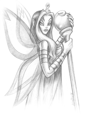
Set by Sapphire Faerie


Last edited by Ken on Thu Oct 28, 2004 8:23 am, edited 1 time in total.

Top
 Profile  
 
 Post subject:
PostPosted: Thu Oct 28, 2004 8:11 am 
Honorary Member
Honorary Member
User avatar

Posts: 886
Joined: Mon May 31, 2004 7:03 am
Location: Los Angeles, CA
Why I decided to combine Fyora and freedom of speech (and make it all gold and shiny)?
I plead the fifth. It just sort of...happened.

Image Image

Original Image (also some brushes for the BG - do I need to provide a link to those?)
Program Used: Photoshop 7

Also, apologies go to fungi, who I stole some of the subtext from. :P


Image


Top
 Profile  
 
 Post subject:
PostPosted: Thu Oct 28, 2004 7:31 pm 
PPT God
PPT God
User avatar

Posts: 1271
Joined: Tue Jun 22, 2004 2:43 pm
Gender: Female
laq wrote:
Potentially stupid question: Does it have to be an official Neopets image (drawn by the artists there), or can it be a Neopets image drawn by someone else? Like fan art or something. :oops:


Official Neopets image. Sorry for not clarifying sooner.


Image
Gone.


Top
 Profile  
 
Display posts from previous:  Sort by  
Post new topic This topic is locked, you cannot edit posts or make further replies.  [ 118 posts ]  Go to page Previous  1, 2, 3, 4, 5, 6, 7, 8  Next

All times are UTC


Who is online

Users browsing this forum: No registered users and 33 guests


You cannot post new topics in this forum
You cannot reply to topics in this forum
You cannot edit your posts in this forum
You cannot delete your posts in this forum
You cannot post attachments in this forum

Search for:
Jump to:  
Powered by phpBB® Forum Software © phpBB Group