Sun Apr 15, 2007 5:53 pm
moogie wrote:so, I'm not quite sure if this fits the round's requirements, could you please give me your ok WIS?
source
Photoshop 7
(note: this may change, if I have time and can realize another idea I have)
Yeah, I'll accept that as being not completely monotone.
Thu Apr 19, 2007 7:05 am
Image(s) used: Katamari! : DD
Program(s) used: Adobe Photoshop CS2
I actually think that this might change. XD Oh, and btw, I seriously could code this. So yeah.
Fri Apr 20, 2007 12:35 am
Changing my entry, may change it again (possibly back ot the first one)
Source
Photoshop 7
Once again, I'm pretty sure this isn't monotone, but if you think it is, WIS, let me know.
Source
Photoshop 7
Once again, I'm pretty sure this isn't monotone, but if you think it is, WIS, let me know.
Fri Apr 20, 2007 6:34 am
It technically isn't monotone as there are shades of all three primary colors in it (yellow/blue/red), but depending on what is believed to be monotone it could be considered to be.
Sat Apr 21, 2007 1:45 am
Sat Apr 21, 2007 10:23 am
Sun Apr 22, 2007 10:04 pm
I will be extending this round for another 24 hours. >_< Get those navigation bars in!
Tue Apr 24, 2007 3:17 am
Alright, LAQ and Ethics are automatically eliminated for not turning in their entries. 
Round 5 Grading
They're all on this page, so I'm not going to put them all in one post. (Lazy) However, Judges, please DO TAKE NOTE that Moogie's entry is:
http://img.photobucket.com/albums/v438/ ... ga/r5b.png
NOT
http://img.photobucket.com/albums/v438/ ... tga/r5.png
Grading is due by April 27th
2 people will be eliminated this round. This is the last round before the finals!
(If you have complaints about elimination this round, just tell me and I will make this a non-elimination round. Seeing as how you were probably not aware due to circumstances that this would be the last round before the final 3.)
Round 5 Grading
They're all on this page, so I'm not going to put them all in one post.
http://img.photobucket.com/albums/v438/ ... ga/r5b.png
NOT
http://img.photobucket.com/albums/v438/ ... tga/r5.png
Grading is due by April 27th
2 people will be eliminated this round. This is the last round before the finals!
(If you have complaints about elimination this round, just tell me and I will make this a non-elimination round. Seeing as how you were probably not aware due to circumstances that this would be the last round before the final 3.)
Wed Apr 25, 2007 5:10 pm
Sun Apr 29, 2007 2:41 am
Not trying to be annoying or pushy or anything...
...but wasn't yesterday April 27th?
I understand everyone is busy with finals and end of school. So I'm just wondering if WIS is extending judging for another week then?
I can wait.
...but wasn't yesterday April 27th?
I understand everyone is busy with finals and end of school. So I'm just wondering if WIS is extending judging for another week then?
I can wait.
Sun Apr 29, 2007 7:55 am
*nudges judges to judge*
Round 5 Gradings
YesItIsh
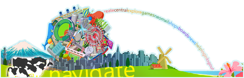
Very creative. I like the rainbow of links. Even though I personally don't think this is as good as it could have been graphically, it makes up for it by being very creative (which is what I was looking for this round). I personally don't like the scanlines at all. The Navigate text seems off to me as well. - 8.5/10
Zilary
Very adorable! The idea is very nice, and the bubbles for links is very creative! The colors work together very nicely. I personally dislike the extra bubbles on the text. Personally, I hate really fancy fonts, because they never fit in well with graphics. I'm pretty sure there's a version of the same font without that many bubbles, so I think I would have preferred if you had used that, or another bubbly font. Also, I think there should be some kind of border that separates the sidebar from the rest of the hypothetical page. - 9/10
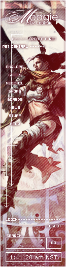
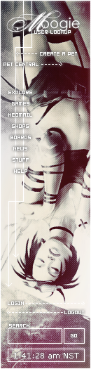
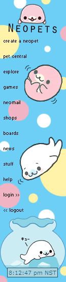
moogie
I personally like this sidebar. The links and text are placed in a nice position. The subtle colors are nice. Personally, I kind of wish the pixel motif were replaced with something smoother, though. - 9/10
Pixa

The color scheme for this is surprisingly fitting. However, I think this sidebar is too saturated for the text. The lines (motion blur? Pixel stretch?) running vertically is also very distracting and doesn't add anything to the image. The whole sidebar gives off a very messy feeling. - 7.25/10
Neko
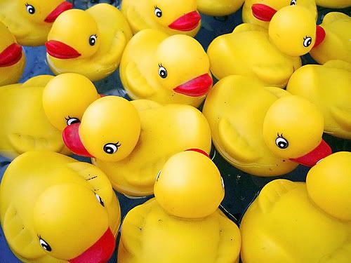
This is very adorable! I really like the simplistic background. However, I think there was so much more you could have done to add to this sidebar. For one, I think a different font would have served this sidebar's purposes much better. I think it should be something cute, or squiggly like the text from one of your source images. Black is also a bad color for text in this sidebar, in my opinion. White text (preferably cute/squiggly) with a slightly thick stroke would have looked really nice. A few more things you could have added were perhaps things like rounded corners, white drop shadows for the... fish? etc. - 8.25/10
Round 5 Gradings
YesItIsh
Very creative. I like the rainbow of links. Even though I personally don't think this is as good as it could have been graphically, it makes up for it by being very creative (which is what I was looking for this round). I personally don't like the scanlines at all. The Navigate text seems off to me as well. - 8.5/10
Zilary
Very adorable! The idea is very nice, and the bubbles for links is very creative! The colors work together very nicely. I personally dislike the extra bubbles on the text. Personally, I hate really fancy fonts, because they never fit in well with graphics. I'm pretty sure there's a version of the same font without that many bubbles, so I think I would have preferred if you had used that, or another bubbly font. Also, I think there should be some kind of border that separates the sidebar from the rest of the hypothetical page. - 9/10
moogie
I personally like this sidebar. The links and text are placed in a nice position. The subtle colors are nice. Personally, I kind of wish the pixel motif were replaced with something smoother, though. - 9/10
Pixa
The color scheme for this is surprisingly fitting. However, I think this sidebar is too saturated for the text. The lines (motion blur? Pixel stretch?) running vertically is also very distracting and doesn't add anything to the image. The whole sidebar gives off a very messy feeling. - 7.25/10
Neko
This is very adorable! I really like the simplistic background. However, I think there was so much more you could have done to add to this sidebar. For one, I think a different font would have served this sidebar's purposes much better. I think it should be something cute, or squiggly like the text from one of your source images. Black is also a bad color for text in this sidebar, in my opinion. White text (preferably cute/squiggly) with a slightly thick stroke would have looked really nice. A few more things you could have added were perhaps things like rounded corners, white drop shadows for the... fish? etc. - 8.25/10
Tue May 01, 2007 1:53 am
WIS: thanks for the score. For clarification, what do you mean by the pixel motif? do you mean the font, the arrows, or something else?
Tue May 01, 2007 1:59 am
The font and the arrows.moogie wrote:WIS: thanks for the score. For clarification, what do you mean by the pixel motif? do you mean the font, the arrows, or something else?
Fri May 04, 2007 1:37 am
=\ I'd hate to do this, but this needs to be bumped. The judges haven't rated and the due-date was quite some time ago. If the judges don't rate the sidebars by May 6th (they'll have the weekend), I'll move on to the final round with only my ratings. Which, to be honest, isn't very fair to the contestants. C'mon, judges, there are only 5 graphics to rate. =\