Pink Poogle Toy Forum

The official community of Pink Poogle Toy
Main Site
NeoDex
It is currently Fri Jun 28, 2024 10:07 pm

All times are UTC


Post new topic This topic is locked, you cannot edit posts or make further replies.  [ 151 posts ]  Go to page 1, 2, 3, 4, 5 ... 11  Next
Author Message
 Post subject: Ratings
PostPosted: Thu Oct 28, 2004 11:02 pm 
Honorary Member
Honorary Member
User avatar

Posts: 3805
Joined: Mon May 31, 2004 4:03 am
Location: Waterloo, Canada
Any ratings on graphics goes here and only here, no stray topics. ;P

Ratings Board Rules:

1. Keep your criticism constructive.
2. You must give/get ratings at a ratio of at least 1:1, that means for every graphic you ask for ratings on, you must rate at least one other. And I mean a meaningful, well-thought out rating, not just a number or "that's good."
New Addition: These numbers do not stack up. If you rated two sets and asked for one rating, you cannot make a post later asking for one free rating because you rated earlier.
And be good about your ratings, if I see continue to see many ratings that simply say "that's good" in many words, I will raise the ratio to 3:1.

3. You may not ask for ratings on work that you did not make.
<hr>
To get you all started again, try the end of the last split, or you can go ahead and rate my new set.


Image Image


Last edited by Yoshi on Sat Jan 15, 2005 6:10 pm, edited 1 time in total.

Top
 Profile  
 
 Post subject:
PostPosted: Thu Oct 28, 2004 11:15 pm 
PPT Student
PPT Student
User avatar

Posts: 302
Joined: Fri Jul 23, 2004 2:48 am
Location: Ontario, Canada
Gender: Female
Yoshi.... I like your current set. The colours and images used are perfect for Autumn and Halloween. The set is simple, yet stands out. I give it an 8/10.

Can someone rate this blend for me, please and thanks?

http://img.photobucket.com/albums/v168/tropikalprincess18/Kellyblend.jpg

Yoshi edit: Maaaajor page stretch, image changed into link.


Image

------------------

Thanks to the wonderful Neko for the amazing set.


Top
 Profile  
 
 Post subject:
PostPosted: Fri Oct 29, 2004 3:24 am 
Way Beyond Godly
Way Beyond Godly
User avatar

Posts: 6691
Joined: Tue Jun 01, 2004 5:55 am
Gender: Female
Mary : Beautiful. :) The colors are nice and I like the text. It is hard to read, but we wouldn't want it to stick way out, either. :P Nice job, though. 9/10.


Image


Top
 Profile  
 
 Post subject:
PostPosted: Sat Oct 30, 2004 6:13 pm 
Beyond Godly
Beyond Godly
User avatar

Posts: 3703
Joined: Mon May 31, 2004 10:11 pm
Location: 51°23' 0°30
Mary, the colours, like Medli said, are awesome. It's extremely nicely done, shame about the text. But ah, it's really nice. Only thing I can pick, though, is that the last image is cut off.


Image

(I took the photo too. Signature to come later.))


Image
kudos sasha+gregory // PPT's Unofficial President


Top
 Profile  
 
 Post subject:
PostPosted: Sat Oct 30, 2004 6:53 pm 
Beyond Godly
Beyond Godly
User avatar

Posts: 4673
Joined: Mon May 31, 2004 5:14 pm
Location: Inside a box
Bluehawaii19: The color and actual blending of the images is very good. My only problem is the text, because it's rather hard to read.

Xerai: I like it so far! The 'r' seems a bit blurry, though, and the squares aren't even. Can't wait to see the sig^^

----------

Ratings on my current sig? The original picture is here.


Image


Top
 Profile  
 
 Post subject:
PostPosted: Sat Oct 30, 2004 7:10 pm 
PPT Student
PPT Student
User avatar

Posts: 302
Joined: Fri Jul 23, 2004 2:48 am
Location: Ontario, Canada
Gender: Female
xerai wrote:
Mary, the colours, like Medli said, are awesome. It's extremely nicely done, shame about the text. But ah, it's really nice. Only thing I can pick, though, is that the last image is cut off.


Image

(I took the photo too. Signature to come later.))


Actually, you need to scroll a bit for the rest of the image.


Image

------------------

Thanks to the wonderful Neko for the amazing set.


Top
 Profile  
 
 Post subject:
PostPosted: Sat Oct 30, 2004 7:26 pm 
Beyond Godly
Beyond Godly
User avatar

Posts: 3703
Joined: Mon May 31, 2004 10:11 pm
Location: 51°23' 0°30
bluehawaii19 wrote:
xerai wrote:
Mary, the colours, like Medli said, are awesome. It's extremely nicely done, shame about the text. But ah, it's really nice. Only thing I can pick, though, is that the last image is cut off.


Image

(I took the photo too. Signature to come later.))


Actually, you need to scroll a bit for the rest of the image.


Oh... :oops: Didn't notice.


Amethyst wrote:
Xerai: I like it so far! The 'r' seems a bit blurry, though, and the squares aren't even. Can't wait to see the sig^^


Must be your eyesight...the r is just like every other letter. And the squares...thats the idea..Really ._.


Image
kudos sasha+gregory // PPT's Unofficial President


Top
 Profile  
 
 Post subject:
PostPosted: Sat Oct 30, 2004 8:09 pm 
PPT Toddler
PPT Toddler
User avatar

Posts: 228
Joined: Sat Oct 30, 2004 12:42 pm
Location: Texas
Ooh, Amethyst, your sig is wonderful! Great job making the image look like night.. the blue tones are very nice. <3

Anyone even want to comment on my sig? :lol:


Image


Top
 Profile  
 
 Post subject:
PostPosted: Sun Oct 31, 2004 4:43 pm 
Honorary Member
Honorary Member
User avatar

Posts: 1341
Joined: Mon May 31, 2004 9:43 pm
Location: Antarctica
Amethyst : I love the night sky you created. It makes the image a lot more interesting. The star is a nice touch as well. The fading font is perfect for that signature. The main text has an interesting font. I'm bit a torn on if I like it or not, though. I like the glow around it, though. It makes it seem as if it's made of stars. 9/10

Riddikulus : I'm not a big fan of cut-outs although the one you chose works well with the otherall image. I really like the font that you used for the main text. I think that the stars in the background are a bit overused, but again, they work well with the signature. The image you used is very.. different. ;P The orange tones compliment the brown, though. 7/10

Please rate this set :
Image Image


Image


Top
 Profile  
 
 Post subject:
PostPosted: Tue Nov 02, 2004 12:46 am 
PPT Trainee
PPT Trainee
User avatar

Posts: 540
Joined: Mon May 31, 2004 4:18 am
Location: Hotlanta :P
Robot - The set has a rather endearing simplicity to it, which makes it look really cool. I like the angle the girl is at, and the heart. I have a problem with the background, though. I don't like the greyness fading to white. It feels like the background should be the same color.. I dunno. 9/10


Image

(He who fights with monsters should see to it that he himself does not become a monster). And when you gaze long into an abyss, the abyss also gazes into you.


Top
 Profile  
 
 Post subject:
PostPosted: Tue Nov 02, 2004 12:51 am 
PPT Trainee
PPT Trainee
User avatar

Posts: 657
Joined: Tue Jun 01, 2004 4:35 am
Location: Australia
Gender: Female
Xerai - As Amethyst said, looks good so far! *tilts head at it* What's it a photo of? I guess we'll be able to see that better, when you've made the sig. :)

Riddikulus - Hehe, that's a cool photo! Very unique. I like the cutouts too, you don't see angled cutouts like that very often :) The main font you've chosen is very cool, though a bit hard to read on the av. Maybe a 1px outline around it might help? The only other thing I noticed was that the sig looks quite "tall". If you made it a bit shorter, it would be more in proportion to the av, as well as helping fill a bit of the empty-ish space above (and to the left of) the main text .

robot - Very neat and simple, yet effective... you seem to be very good at that :) I like the way you positioned the picture, and the heart stands out really well, adding interest to the set :)


Image
Nyum nyum nyum...


Top
 Profile  
 
 Post subject:
PostPosted: Thu Nov 04, 2004 10:06 pm 
Beyond Godly
Beyond Godly
User avatar

Posts: 3703
Joined: Mon May 31, 2004 10:11 pm
Location: 51°23' 0°30
mazil wrote:
Xerai - As Amethyst said, looks good so far! *tilts head at it* What's it a photo of? I guess we'll be able to see that better, when you've made the sig. :)


It's a pony,


Image


Image
kudos sasha+gregory // PPT's Unofficial President


Top
 Profile  
 
 Post subject:
PostPosted: Sun Nov 07, 2004 4:03 am 
Honorary Member
Honorary Member
User avatar

Posts: 886
Joined: Mon May 31, 2004 7:03 am
Location: Los Angeles, CA
Robot: Aww, what can I say? Your sets are great, and this is no exception. I love the set, the composition, and the way the heart adds a splash of color. The fonts are nice too. In the sig, I might move the girl over a bit to the right to get rid of some of the empty space and prevent the overlap with the text. Also, for some reason, I think the thought bubble might look better without the scanlines in it... but that's me being weird and nitpicky.

Ridduklus: I like it! The cutouts are cute, the background is nice (although the little bit of green next to 'got' is sort of distracting), the text and image are nicely blended in. In the av, I'd move the text a little to the left, away from the border - just about a pixel or so. Tnhe sig is a little too tall for my taste, and you end up with empty space at the top. Since the sig subtext overlaps with the guy anyhow, I'd just move the main text down a bit and put the subtext at the top.

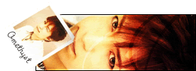
Amethyst: Well, I still think the butterfly sig was fabulous, but this is nice too. You did a really impressive job of changing the whole feel of the image from day to night, and it looks quite natural. The main text is a little too bright, and dominates the image. I love the subtext quote, by the way.

xerai: I could tell it was a horse, but it took me a little work. :P It might work better if you lightened the scanlines a bit. I'd also move the text about one pixel to the left. I like the squares and the fading line at the bottom.

Mary: Nicely done - I like the feel of the whole iamge, and it looks quite smooth. For some reason, the text over the third person from the left looks a little odd. Also, since there's a lot more writing on the left than the right, the image looks somewhat unbalanced. Maybe you could have done the main text as only two lines, spread it out more, and put her name across the bottom?

Yoshi: I love it. It's quite inspiring - I actually can sort of feel the autumn air and the warmth of the tea when I look at it. I might take away the characters at the left, though, as without it the set is more simple and...literal, I guess, but it looks fine that way too.

Ratings?
Image Image


Image


Top
 Profile  
 
 Post subject:
PostPosted: Sun Nov 07, 2004 6:03 am 
Honorary Member
Honorary Member
User avatar

Posts: 1341
Joined: Mon May 31, 2004 9:43 pm
Location: Antarctica
Starchaser : I love that set. It's so.. calming, perhaps. The old painting look that it has makes it really appealing. You chose the perfect font for the signature's main test. I like the faded letters in the avatar as well. 10/10

By the way, the overlapping text in my set is actually from the original image, but I loved the font and the way it looked so much that I couldn't bring myself to erase all of it. I'll have to mess about with it and see how it looks with the girl and the text moved around a bit.


Image


Top
 Profile  
 
 Post subject:
PostPosted: Sun Nov 07, 2004 4:36 pm 
PPT God
PPT God
User avatar

Posts: 1431
Joined: Tue Jun 08, 2004 11:34 pm
Location: FLA, represent.
bluehawaii19: Nice job on the blending but the text is a bit hard to read 8/10
xerai: Aww its a pony :D Hehe, I like ponies so 9/10
Riddikulus: That was the best movie ever xD. He has mad moves and I wanna learn that dance like mad crazy xD.
Robot: Ooooh so purdy 9/10 for sure. Like the Japanese (or is it Chinese?)
Starchaser: Ooooooh so blue. Like how the sub-text on th esig doesn't stand out too much. 9/10 ^_^


Image


Top
 Profile  
 
Display posts from previous:  Sort by  
Post new topic This topic is locked, you cannot edit posts or make further replies.  [ 151 posts ]  Go to page 1, 2, 3, 4, 5 ... 11  Next

All times are UTC


Who is online

Users browsing this forum: No registered users and 1 guest


You cannot post new topics in this forum
You cannot reply to topics in this forum
You cannot edit your posts in this forum
You cannot delete your posts in this forum
You cannot post attachments in this forum

Search for:
Jump to:  
Powered by phpBB® Forum Software © phpBB Group