DM was on fire! wrote:
Robot: You do love that thing, dontcha?! Anyway, I love the Japanese font, but I don't get 'b-thmp' on the avatar. Might just be me, but...I also noticed that the BG on the av is lighter than the sig. There's nothing you can do to make the BG more...iunno, exciting. I love it, though!
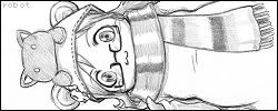
The image itself is from a manga. The "b-thmp" is one of the sound affects that the creator uses for the sound of that characters heart beating. As for the background, it's lighter in the avatar because of how I cropped it. It's the same shade as the signature, you just don't see the contrast of the darker area.
DM : Your set it is nice. I like the shades of green that you used. The main text on the signature fits wonderfully and I love the simple green border. The cutout of the image is very jagged, though. It's a bit distracting. I don't like the way the text on the avatar is positioned. It is hard to read it when it's over her body like that. 7/10
bluehawaii19 : The blending of the images themselves is done very well, however, it's hard to make out the actor's face. The spots over his face are distracting as well. I like the shades you chose, but overall the image a bit too dark. I love the font that you chose, but in some areas it blends in with the background too much. 7/10


 | < Fader By/Knando |