Firstly, my ratings.
Moogie:Set:

I really like this set.

It's very bold, and eyecatching. Looking at your original image, you did a good job of concealing/cleaning up the artifacts. The placement of the image is also very nice. I really like the scanlines, and how you erased parts of it so that it doesn't cover the main object of the signature completely. I really like the borders, they are simple yet unique. The text is nicely done as well. What I didn't see right away, though, was the little bits of color you added around the main image. It really makes the whole signature stand out.

Personally though, I would have preferred the subtext to be in an all-capital non-pixel font, like Garamond or Georgia, etc. This is a matter of personal preference, though, and I know that such a font may not be very legible if placed in the same area. -
9.5/10Icon: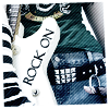
Very clean and simple. I like that a lot.

The border, as I've mentioned before, is unique yet simple. It adds a really nice touch to the icon. The text stands out nicely in black, and doesn't look awkward at all. I'm not too quite fond of the placement of the text though, it seems a little awkward placed there, but I cannot think of how it may be placed appealingly on this icon otherwise. Nice, bold icon though. -
9/10ZilarySet

I really like this set also! It's very clean and sharp, I like that. The text is very nicely placed and the font choice fits this set very nicely.

You've picked a very good image to work with! A few suggestions though, that could have made this set even better. In my opinion, I feel if you had the white border go over all of the signature, instead of having the dandelion on top, it would look better. Right now, the dandelion looks awkward cut off at the edge of the graphic instead of at the border. Secondly, I think the stalk of the dandelion, and the center, is too strong for the signature, compared to the rest of the image. If you somehow dull it down a little bit, it would make this signature even better.

Other than that, very nice clean and fresh set to look at! -
9.25/10Icon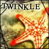
It's a cute little icon.

The scanlines are done perfectly in this icon, not too strong, and compliments the image very well. However, I'm not too fond of the border/font choice, though. The text seems to "official" and strong for this icon. Perhaps a funner font and a funner border would compliment the image more. Black doesn't suit this icon very much.

-
8.25/10YesItIshSet:

I really, really like the concept of this signature. The ideas and some of the technical qualities of it are very nice. I really like the main text, because I was surprised it would work so well. Good job recreating some of the stars, and working with a low quality image. However, I have to say, I'm not too fond of the colors of this set. I think, perhaps a little sharper, and more contrast (with different colors

) would have served this set well. The whole signature feels a little drab and blurry. -
8.75/10Icon: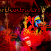
On first sight, I couldn't tell what this icon was.

It's really messy.

However, once I take a look at the original image, and the main image sort of clicks in my mind, I really like the effects you have in this icon. It's very complex, and perhaps even a little too strong. (Just a little darker would have brought more attention to the already brighter-more-contrasted focus). However, my favorite part of this icon is the text. It fits the whole icon perfectly and the colors are very nice. -
8.5/10 Secondly, blueZ's ratings.
Moogie:Set: - 8.6/10

very nice composition and arrangement, its very interesting and intrigues the eye.
but one little thing is i think the bold black border and the strong scanlines doesnt fit with the softness of the image, other than that good job!
Icon:9/10

great and smart color choices, very pleasing to the eye, the text was nicely placed as well, strong yet subtle.
ZilarySet9.8/10

outstanding, very simple, but effective, wonderful and smart colors.
you successfully created a atmosphere of lightness, great text as well.
very good set.
Icon 8/10

not as good as your set but, it has its good qualities, i think the focus was very well done here, theres a clear thought of composition, and text is bold and nice as well. but i think the black diagonal lines stands out just a bit too much.
YesItIshSet:9/10

i absolutely adore the color scheme here, its very nice and gentile, the text is nice as well, however, i think the focus here is just a bit off here for me. because i couldnt really tell if the focus was on the text or the rock. but just other than that, very good set
Icon:8.5/10

first of all, very nice colors, i liked how you stuck with a few colors only to keep it simple, how ever, i think the content is not as simple as it should be. i think there is just a bit too much going on, and it doesnt have a clear focus which confuses the eye. remember, less of more, cha cha cha Sharmen....(yeah i went there)


