Hey, my computer has reset itself when trying to do this twice now - so I'll post as I go.
hakojo

Okay, I've done this twice now...

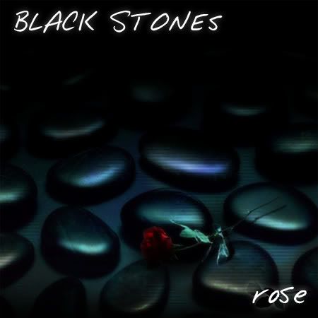
I really like this one, apart from the font, but more on that later. I really like the colours in this, and the ways the stones have been seamlessly blended. The shadow on the rose is really nice, however, it looks like it is just suspended in the air, perhaps drawing the shadow in a little closer would have been to your benefit. The rose petals have a few pixels from where it was cut out, which bother me slightly. The second rose image has been used very inventively. Back to the text, it doesn't really fit. I think that a Gothic font would have worked better here, too. It can still look... like you wanted it to, just adds a nice finish.
8.5/10
Bangel

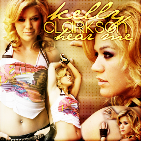
This a graphic really in your style, which I think could have been a limitation in producing in a CD cover (I agree with blueZ, it's a very 'photoshoppy' graphic), but I'll try not to mark down for that, because I don't think it'd be fair. The background is great, the images are bold and all in the same style. I think the text is good too, it's bold and catches my attention.

Perhaps the album title could have been a different colour to really catch attention. I think Kelly in the corner isn't all that bad, I think the way you've cut it out makes it look as if she were resting on the bigger Kelly's shoulder, and I thought it looked pretty good to be honest. However, she is a little small down there, perhaps an image could have been incorporated into the background instead.
8/10
Neko

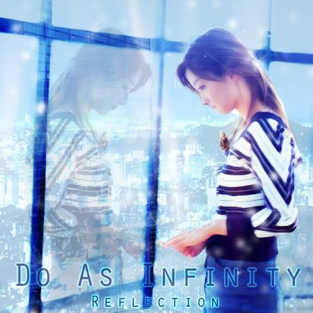
This is a really creative and impressive graphic, I like it a lot. You've really injected some life into the original image, and created a great graphic. Does it pass the test as an album cover? Well, yes. Heh. I think it's inventive of how you've transformed the image, the reflection looks quite natural, as does the city scape, but what bothers me is what feels like a forced inclusion of the image of the aurora and one of the cityscapes. They really didn't strike me at first (the cityscape after WIS pointed it out, and the aurora after looking really closely). The colours are great, and the text fits the purpose, I do not think a Gothic text would have worked well, so good job on being quite bold. It just looks really magical and enchating, overall. Well done.
9/10
Kitten Medli

I'll start off by saying I really like the colours on this one, I think they look nice, the swirl brushes look good, I like the effect, it's quite serene. The text is quite bold, and I like the overlay, however, it looks slightly anti-aliased. The way you've blended the images slightly bothers me too, it just doesn't look... natural. I think it lets you down here.

7/10
LAQ

I'm slightly mixed over this one. Though it does look dreamy, and I like how you've used all the images, it looks slightly messy. The colours work well in my opinion, I actually really like them. However, the quality of the images just doesn't help you out. The way you've cut out Enya, using a soft brush I guess, gives a dreamy look, but it just looks confusing in the end. However, I like the colour on the dress. This is probably one of the most creative uses of images this round. I like the font for the word Enya, but I'm not sure on the choice for Watermark.
7.5/10

Click the wonderful signature. You know you want to.


