Week 2
LAQ
 Balance:
 The balance is great on this one, it's very soothing in a kind of retro way.
Colors: I like the adjustments you made to the original image, it makes it much more warm.
Text Area/Text: The text area is very well placed, however I do have some concerns with what color text would be used, because with an image like this the only colors that would be visibale and work fairly are dark colors. The font you used for the mian text is great.
Look: Very dream-like. I like it.
Blog Score: 9
Overall: 8
Ansile
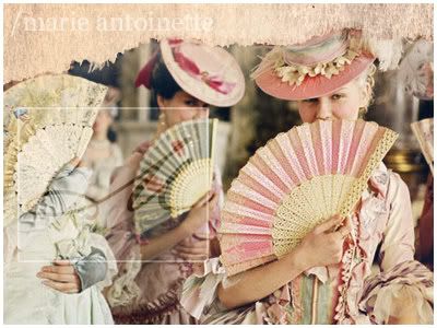 Balance:
I have a love hate relationship with the balance of this image.
Colors: I love the pastel look and feel of this image because it really works well with the era in which Marie lived in.
Text Area/Text: This is what I have a problem with, I understand the reasoning behing the small text box, but again as stated before, the color options for the text are very limited. I like the litte '/marie antoinette' at the top, it shows that you understand the concept of the picture and the movie's concept.
Look: I like it. Had it not been fore the text box, it would've been flawless.
Blog Score: 8
Overall: 9.5
Zilary
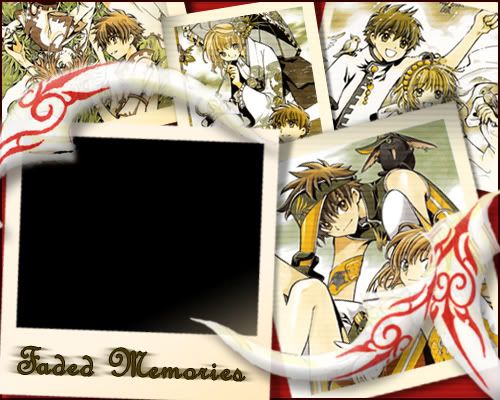 Balance:
 The balance is grea,t however, the 'feathers; are a bit of a distraction.
Colors: The colors all work very well.
Text Area/Text: I really don't like the text area in this one, it looks more like it could be used for a slideshow type thing/feature.
Look: It works well.
Blog Score: 6
Overall: 8.5
hakojo
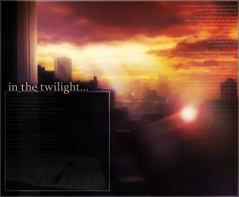 Balance:
 The balance between the two images is on the verge of crossing the line of being awkward. But still good.
Colors: Very eerie, loves it!
Text Area/Text: The text area is well thought out, I like where you positioned it.
Look:Post-Apocalyptic, ver nice.
Blog Score: 8
Overall: 8.5
Kugetsu
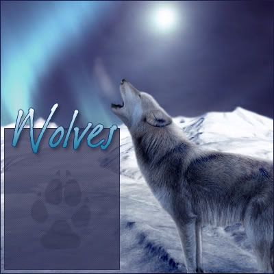 Balance:
Very nice.
Colors: It all works very well.
Text Area/Text: Very well positioned, love the paw print, the font color wouldn't be as much of a problem in some others.
Look: Wow. Just wow. You win the internetz. However, a different font would've made it even better.
Blog Score: 9
Overall: 9.5
Ken
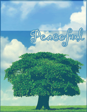 Balance:
 The balance is good in this one.
Colors: The colors are very summer-y and uplifting and fun XD
Text Area/Text: I like how you positioned it, it's very smart.
Look: Simplistic. I love it. The scanlines actually help in this one.
Blog Score: 8
Overall: 8
Rachel
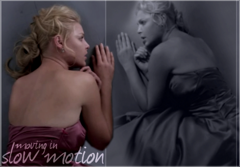 Balance:
 Well, the balance is alright in this one, but it isn't up to par really.
Colors: The colors work well, it works well with the look and feel of the image and what Izzy was going through at that moment.
Text Area/Text: What bugs me is the look the second image gives it, it sort of looks reflected. I mean I understand it, but it's sort of cliche, I think, in this case, a close up of her, or maybe a different image of her would've worked better. Again the text color could be a problem.
Look: Very sad and grey. I like it.
Blog Score: 5
Overall: 7
DM was on fire!
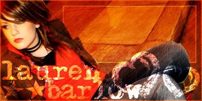 Balance:
 The balance is great on this one.
Colors: The colors all work well, I really appreciate how you kept the original colors of the image, it shows that you're really listening to the jcomments we all make.
Text Area/Text: The text area is great, but again, it concerns me that the font color for the blogger might be dificult to choose.
Look: It has a very urban look to it.
Blog Score: 7
Overall: 8
Bangel
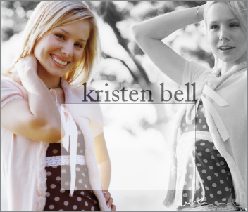 Balance:
The balance on this blog is very well thought out, it work great with the original.
Colors: The colors work very well.
Text Area/Text: The text area on this blog is awesomely placed.
Look: I like the blend, but I can see the parts where you tried to make it transparent. Mainly the whole right side of her face/hair.
Blog Score: 8
Overall: 6
jade_em
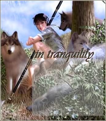 Balance:
 The balance is alright, however, I feel the text box looks a bit overpowering.
Colors: The colros are very 'woodsy' and natural.
Text Area/Text: Again, the text color could be a problem in this one.
Look: The look is very relaxed and natural.
Blog Score: 7
Overall: 8
Neko
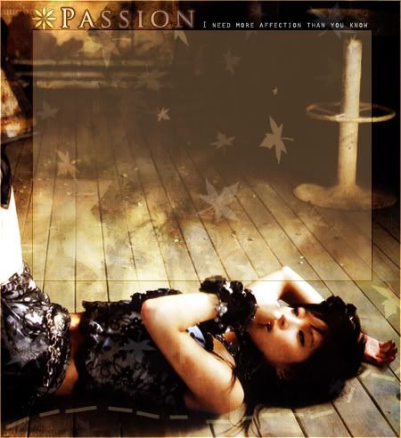 Balance:
 The balance is outstanding on this one, it all works very well.
Colors: The colors are very warm, and I like that.
Text Area/Text: Again, as said many times before, the text area is flawlessly chosen, but my main concern is the font color that would be used.
Look: Very Autumn-y, I like it. Peaceful-chic.
Blog Score: 7
Overall: 9
Kitten Medli
 Balance:
 It's great, I love it.
Colors: The colors all work well.
Text Area/Text: The text area is centered so it makes it the main focus of the the image.
Look: I looks very sunshine-y
 Blog Score:
 8
Overall: 9
(Sorry it's so late! Will I be punished?

)
President of the Sugarinii/Tasha fan club.
Sugarinii's soulmate... since 1991!


