Wed Jan 25, 2006 8:50 pm
Random Havoc: I know what it is, waiting for a rating.. 
*Clears throat*... I think it's fantastic, it's pretty obvious you didn't make it in paint in a few seconds, some of the parts are unclear but the total is nice! A few things you may want to change are the border, which may be a little too thick and the lines in between that seperate the images... try and make 'em as equally wide as possible, perhaps white might be a little 'dull' background color but with the person standing in front of your picture, it just works
"By Random Havoc" is a good way of drawing people to ask you to make a set for them as well, but meh. it's original
---
just because I wanna know, can someone rate MY set again too?
Fri Feb 03, 2006 7:36 pm
Random Havoc: Hmm. I'm guessing this isn't a signature or part of a set - it looks like its the last part of a comic strip or something like that. Well, if it is a signature - I thought I'd tell you that the dimentions are too large anyway, that is 450x150pixels and the PPT restrictions are 400x100pixels.
With that out of the way... I think its really good! The images are full of colour and I think that you seperated them with white is effective. I especially like the dots - they create a difference between the pictures in boxes and the man standing in front (bottom right corner). I the way he sort of over-lays all the other pictures, even the borders - exept you've got a black line going over him on the right side. Also his head blends in with the top right picture... but I don't know what you could do about that really.
Maybe you could use a more interesting font for the 'By Random Havoc'? ... that font does fit in with the comic strip theme - but it just looks a bit out of place to me.
Overall, well done! A good piece!
Jens: I don't really know what to say!! Very good and very original. The only thing really is that the green of the pipe in the signature doesn't fit in with the rest, - its much more metallic than anything else.
I the animation and font!
Rate, please?

I haven't made sets or even been on PSP for probably a year!! So its prob. not my best! =P
With that out of the way... I think its really good! The images are full of colour and I think that you seperated them with white is effective. I especially like the dots - they create a difference between the pictures in boxes and the man standing in front (bottom right corner). I the way he sort of over-lays all the other pictures, even the borders - exept you've got a black line going over him on the right side. Also his head blends in with the top right picture... but I don't know what you could do about that really.
Maybe you could use a more interesting font for the 'By Random Havoc'? ... that font does fit in with the comic strip theme - but it just looks a bit out of place to me.
Overall, well done! A good piece!
Jens: I don't really know what to say!! Very good and very original.
I
Rate, please?
I haven't made sets or even been on PSP for probably a year!! So its prob. not my best! =P
Sat Feb 25, 2006 4:48 am
jens: I love the Mario set. I really like how the avatar moves when Mario hits the wall. The animation looks great and I really like how your username pops up on the signature. 8.5/10
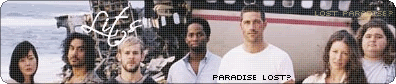
maniac: I am not a huge fan of the font you used for the signature. The pixel font on the avatar looks pretty good. The image you chose for the set is an older one, but it does show off a good amount of the cast. I like the rounded design of the set. 7/10
Can someone rate these two photomanips I did?


Sat Mar 04, 2006 7:13 pm
Maniac-Very nice. I've never seen the show, but it's a very nice set. Particularly like the image you used for te avatar. I love the grid pattern on the sig, although the main text there looks a little out of place.
Jen-I will never stop loving that set, hehe. I still giggle every time Mario gets smashed. I especially love how the whole avatar moves when he runs into a wall.
Rate my sig?

Jen-I will never stop loving that set, hehe. I still giggle every time Mario gets smashed. I especially love how the whole avatar moves when he runs into a wall.
Rate my sig?
Sat Mar 04, 2006 9:21 pm
bluehawaii19: I don't think I'm qualified to rate photomanips as I don't know whats involved in doing them. I'm guessing its sort of a bit like a colourisation where you shade and colour etc? Well anyway first image is very nice - I'm loving the bright green of the dress, it's really vibrant but the green of the shoes doesn't look quite right to me. Her hair is gorgeous!
Looking at the second image I'm now thinking that a photomanip is putting lots of images togethar as one?? Well, thats what it looks like because the flowers on the right stand out too much they look like they've been put on top instead of part of the picture with the girl. The beach out of the window looks lovely but the ends of the paml leaves are looking a bit pixely.
I love the girl's hair in this one too!
Req: I really like how the person at the front is in the focus and the person further way is blurred - nice effect! ^.^ I also like the diagonal lines - how do people do that??? I've always wanted to know! The text stands out well as it has the sort of glow around it, only thing is its a bit empty at the top right. Doesn't really matter though - still looks nice!
_________________________________________
Could someone please rate these two sets? Please?!
Sat Mar 04, 2006 11:25 pm
maniac wrote:bluehawaii19: I don't think I'm qualified to rate photomanips as I don't know whats involved in doing them. I'm guessing its sort of a bit like a colourisation where you shade and colour etc? Well anyway first image is very nice - I'm loving the bright green of the dress, it's really vibrant but the green of the shoes doesn't look quite right to me. Her hair is gorgeous!
Looking at the second image I'm now thinking that a photomanip is putting lots of images togethar as one?? Well, thats what it looks like because the flowers on the right stand out too much they look like they've been put on top instead of part of the picture with the girl. The beach out of the window looks lovely but the ends of the paml leaves are looking a bit pixely.
I love the girl's hair in this one too!
Basically, photomanips are taking two or more images and merging them together to look like one image.
For the first one, I took a picture of Denise Richards and maniped Evangeline Lilly's face onto hers so it looked like one image.
For the second one, I took a picture of Gillian Anderson and maniped Alyson Hannigan's face onto hers so it looked like one image. I also took a picture of a beach and maniped it to look like the background of the window was a beach scene.
I never changed any of the shading or colouring in the images, so the shoes in the first one already looked like that, etc.
Here are the original images...
http://www.filelodge.com/files/room11/2 ... h103_4.jpg
http://www.filelodge.com/files/room11/2 ... 05-004.jpg
http://www.filelodge.com/files/room11/2 ... 107_10.jpg
http://www.filelodge.com/files/room11/2 ... h107_1.jpg
http://www.filelodge.com/files/room11/2 ... 534130.jpg
Sat Mar 11, 2006 4:58 am
Hi everyone. I'm extremely new at this. These are only the first sets I've ever attempted. I tried using the trial version of Photoshop. If you have any suggestions, or if there is anyone who would kind of like to serve as a mentor, I could sure use the help.
Oops Sorry Marissa. Well, like I said above, I'm new at this, so I don't know how much help I will be at giving ratings, but I'll try!
Maniac:
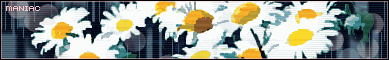
For your first set, the one with the daisies, I really like it to begin with. I think the background that you used is really cool and isn't distracting, but it's interesting to focus on. I wish there was some kind of subtext you could put on, but then again, I don't exactly know where you would put it. Just one thing that bothers me a little bit about the signature. Right in the middle, there's a darker brown spot, kind of the size of the middle of the daisies. I don't know if that's supposed to be there or not, but to me, it doesn't quite look like it fits.
For your second set, again, I really like the background (I'm wondering where people are getting all these cool backgrounds...). I also like the extra little border that's a few pixels inside the real border. I think it adds a nice touch. My one comment of something to think about is the text. I personally have a really hard time reading it. Maybe if you used a darker color or outlined it more so it stood out. I have to squint, with my glasses on, to figure out what it says.
Okay, on to my sets that I just made. Again, I'm new at this. The past two days were the first times I have ever really attempted this. If anyone could point me in the direction of some really good tutorials or people who would like to teach me, I would really appreciate it. Also, I could really use some help with the font for the subtext for the first one. I couldn't find a good font at all.
Set 1:


Set 2:


Thanks again for any help!
Marissa Edit wrote:Ratings Board Rules:
2. You must give/get ratings at a ratio of at least 1:1, that means for every graphic you ask for ratings on, you must rate at least one other. And I mean a meaningful, well-thought out rating, not just a number or "that's good."
Oops
Maniac:
For your first set, the one with the daisies, I really like it to begin with. I think the background that you used is really cool and isn't distracting, but it's interesting to focus on. I wish there was some kind of subtext you could put on, but then again, I don't exactly know where you would put it. Just one thing that bothers me a little bit about the signature. Right in the middle, there's a darker brown spot, kind of the size of the middle of the daisies. I don't know if that's supposed to be there or not, but to me, it doesn't quite look like it fits.
For your second set, again, I really like the background (I'm wondering where people are getting all these cool backgrounds...). I also like the extra little border that's a few pixels inside the real border. I think it adds a nice touch. My one comment of something to think about is the text. I personally have a really hard time reading it. Maybe if you used a darker color or outlined it more so it stood out. I have to squint, with my glasses on, to figure out what it says.
Okay, on to my sets that I just made. Again, I'm new at this. The past two days were the first times I have ever really attempted this. If anyone could point me in the direction of some really good tutorials or people who would like to teach me, I would really appreciate it. Also, I could really use some help with the font for the subtext for the first one. I couldn't find a good font at all.
Set 1:
Set 2:
Thanks again for any help!
Tue Mar 21, 2006 2:25 am
Maniac:
- I really like your first set, very simple and clean. Nothing much else to say. =D 9.5/10
- Your second set seems a little too busy for me though, and the mass of yellow is a bit of a pain on my eyes. This is just my opinion, but I would suggest toning down the amount of yellow. Other than that it's pretty good. 7/10 =)
Mayanspypilot:
- The first set seems a little off to me, maybe it's the background or the font. For a first time it's looking pretty good though, maybe make it a bit smaller in size to even things out a bit. =) 7/10
- Your second set is very simple, I like it. The only thing that bugs me a little is the image and how there seems to be a line where it fades out. Maybe that is just my eyes though. ^_^; 8/10
Okay~ I haven't made a signature inforevahandbeyonditisntevenfunnah. So I randomly decided to make one with Vanilla Ninja, since I love that band so much, and a set for DM's contest.
Ohwell, anyone care to tell me whatcha think, of both if possible? =)
Thu Apr 06, 2006 11:16 am
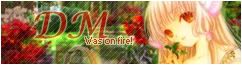
Phantom: (the DM set) It's cool! It looks very soft. You manage to have a lower-opacity text and a colourful background without super duper fragilistic colours that hurt my eyes. My only remark is that you use a bit too much effects; you should keep it simple and easy to watch (by which I mean: NOT like my average set ^^) I'd give it an 8,5/10
---
Anyone rate this set I made for Webkitty's contest?


---
Anyone rate this set I made for Webkitty's contest?
Thu Apr 06, 2006 9:32 pm
Jens: Personaly, I severely dislike lime -- too bright, too catchy, too non-background-like. Seeing as to how that's Luigi's cap's color, I don't think you could do anything about that. You also seem to have added the top, left and bottom borders -- but not the right one, for some reason. There's also a white line around the whole image: if you're using that intentially as a sort of border for subBlack, use a shade of gray (copy the color from the box containing your post) -- it'd be undetectable in subSilver, and would stand out a bit less against the black background
The avatar looks awesome -- the white edges make its borders hard to define on subSilver, though -- a 1 pixel black border would be awesome.
---
I'm back to my old minimalistic habits (at least for the time being, that is). Does this appear as a completely black rounded rectangle, or is the text moderately visible?
Sat Apr 08, 2006 4:28 pm
HL - It's semi visible. I had to squint a bit, but that's because I've got smudges everywhere on my glasses. I think it looks good, but maybe make the text just a little bit lighter.
Jens - I love it. But, just to let you know, there's a part of the black border missing on the signature, and it makes it looks a little bad. I also would've prefered some sort of border on the avatar.
----
Incase no one's noticed, I made a Chii set a few days ago, and I'd like some ratings:


Jens -
----
Incase no one's noticed, I made a Chii set a few days ago, and I'd like some ratings:
Wed May 03, 2006 2:56 am
*edit*
i took down the pic, i was informed that its copyrighted
http://www.deviantart.com/deviation/5772843/
DM-i like the Chii set, really nice font and everything seems
to go together, nice job
i took down the pic, i was informed that its copyrighted
http://www.deviantart.com/deviation/5772843/
DM-i like the Chii set, really nice font and everything seems
to go together, nice job
Sun May 07, 2006 2:10 am
Could I get a rating on my set?
1-10, 1=worst, 10=best.
Runedit:
Snippy Edit: I like jens' set. The animation on it is smooth and it isn't annoying like most animated items. I like that the colors aren't glaringly bright either. Mario is cool also.
1-10, 1=worst, 10=best.
Runedit:
Ratings Board Rules:
2. You must give/get ratings at a ratio of at least 1:1, that means for every graphic you ask for ratings on, you must rate at least one other. And I mean a meaningful, well-thought out rating, not just a number or "that's good."
Snippy Edit: I like jens' set. The animation on it is smooth and it isn't annoying like most animated items. I like that the colors aren't glaringly bright either. Mario is cool also.
Last edited by Snippy on Sun May 07, 2006 8:07 pm, edited 1 time in total.
Sun May 07, 2006 12:37 pm
Anyone like to rate mine? Any suggestions would be great.
Snippy- I like the picture, but it seems a bit plain. I think you might want to add some sort of border and filters. The drawing should be smoothed out a bit, the edges look a little ragged. Overall, I think it gets a seven. Good idea, but some things can be improved on.
Snippy- I like the picture, but it seems a bit plain. I think you might want to add some sort of border and filters. The drawing should be smoothed out a bit, the edges look a little ragged. Overall, I think it gets a seven. Good idea, but some things can be improved on.
Sun May 07, 2006 8:10 pm
mogster500- I like your set. The graphics on them are really nice looking and have a harmonious color pallet. If you wanted to have more details on it I guess you could type a phrase on it, but I think it's fine the way it is.