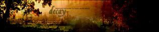
|
Adoration: This set looks a little boring, it's probably because of the flat colors of the original photo you used. I see you darkened the photo a little bit, the dark shadows look very awkward against the relatively light background. I rather dislike the display font you chose, it's very ungraceful adds a very unbalanced look to your whole set. The animation is cute and very smooth, but I think it's a little unneccessary. 7/10
Amethyst: I generally don't approve of work like this (extracted picture + stock photo background). The extraction around the monarch's wings is a little grainy, but the rest of this set is very nice, the striking contrast is very good and eye-catching, and the unobtrusive fonts go very well with the look I think you were going for. 7/10
Apricus: I like this set a lot, the muted colors are a very interesting combination that works surprisingly well. The subtle effects on the walls really make a big difference in the look. I especially like the grungy inner border. 10/10
Bangel: The extraction around the picture is very pixellated, especially around Buffy's shoulder. I don't like how the subtext bar looks like it's suddenly cut off, and it's even odder looking that the light part extends a few pixels beyond the lines that border it. Another note to consider, both Buffy the Vampire Slayer and Angel have very distinctive fonts, and either of them would have looked perfectly at home in this set rather than a plain font. 6/10
DM was on fire!: This set looks rather boring to me, the extraction is sloppy in her hair, and pasted over a halftone screen background. The color scheme is not too great either, the pastelly blue really clashes with the dark colors on the original picture. 6/10
Fizzy: This is a cute idea, but there are a few details you should work on. First off, there's an errant dark spot at the top edge of the av, it's rather distracting. The extraction on the car is a little odd looking, all the lines of the car are not rounded, but you cut them out as if they were. Lastly, it looks very bad to have an incomplete picture, especially when you can see where the edges are cut off, you have a complete picture, just move it around a little bit so that it all fits in on the sig. 7/10
InsanePlushie: The grungy textures on the av are very nice, but on the sig they start to look inconsistent on the right half. I'm not too fond of the border on the av, it looks very awkward and doesn't really go with the picture at all. The display text on the sig is very nice, but it's so overpowering that you hardly notice the subtext, even though it's animated. 7.5/10
Jasujo: The inverted colors are very eye-catching, but the colors on the sig are very blotchy, probably because you had to alter them by hand to match the av. The backgrounds look rather muddy with so many colors mixed in, and the text is very crowded, and the slight duplication and blurring on it doesn't really help its readability. 6.5/10
_jaye_: I can see you played with the levels a little bit, but other than that and adding a grid overlay, you haven't done anything but add text. 5/10
jellyoflight: I actually like how you imitated a lense blur on this picture, it's a nice focus. However, the mosaic filter is really out of place looking, especially since I can see a hard edge where it ends just before the dog's ear. The plastic-y looking font doesn't really match well with any part of the set, nor do the cut off corners of the sig. Actually, the corners look as if you wanted to make them round, and then forgot to make them transparent. 6/10
Kandice: A word of advice, this set is very dark, when I looked at it on a lab computer, it was almost pure black. Keep in mind that not all monitors are the same. I'm guessing you have an LCD (flat panel) monitor, they can pick up dark tones much better than most other monitors. Also, I can't see your source image. The gothic look of this set is very obvious, and every element really upkeeps it nicely. However, it looks kind of boring, the same picture is repeated many times against what looks like a plain background with some swirly brushing over it. 6.5/10
Kitten Medli: Overall, this is very clever, even if you didn't do much at all to the image. I think the butterfly in the background should be a little bit more visible, perhaps if you didn't put the text directly in front of it. I'd also suggest you use a true sky blue color cast, rather than cyan. 8/10
Koku: I like how you made the colors of this set really intense, it makes it very fun, as do the butterflies. The display text on the sig is overpowering though, the stark contrast between the dark grass and white text is very distracting. 8/10
LAQ: It's a cute set, the screening and hand-coloring on the original image gives it a nice nostalgic look, which you added to nicely with the sepia-toning and handwriting overlay. I think blending in the dark-toned image on the right of the sig looks very awkward, especially since all your text obscures the actual picture so much. The text needs a little work, the pixel text is really hard to read; it's small to begin with, and the light border around it makes it look even smaller. As for your display text, it really looks out of place because its lines are so bold and all the other lines in the set are very fine and unobtrusive. 8/10
Lauren.: Hm. I see you used wallpapers again. And again, you didn't do very much to them, simply overlaid one over the other. Otherwise, the pink text is really overpowering, it distracts from everything else in this set. 5/10
mazil: I like the colors of this set, the monotone looks very nice with the high contrast. I'm going to disagree with the others, I like the jittery text on the sig, it's very fitting. The background, however, looks a little boring, just some swirly brushing over a gradient. 7.5/10
Neko: I like the warm colors of this set, they're very autumny, which is reflected in the maple leaf overlay you have. In addition to the cut off right side of the bar behind the subtext, it looks a little bit topheavy since the letters are closer to the top edge than the bottom. 8/10
Neopets Addict: The pink flowers against a pink background make this set look really confused, since the flowers are rather hard to distinguish from the background. If you used a lighter or darker shade of pink in the background, the distinction would be much clearer. The display font on the sig is very awkward looking, since the majority of set is in shades of pink, and there is a very bold white word in the middle of it. 7/10
Rachel: I like this set quite a lot, the changes you made to original photo are great improvements, and not at all distracting or obtrusive. The recoloring on the daisies is very well done and adds good contrast to the water, which looks really watery now. The jittered font is very cute, and I like how you extended the legs of the R on the sig, it really stands out. 10/10
Scholastic: This set is very nice, the colors are very bright and fun, and everything you've done to it contributes to the fun look. I like the oblique positioning of the text, it's very bold and it does well filling the otherwise empty space. Your composition, however, needs some work, it looks like you quickly erased around the tree with a soft-edged brush, rather than took any time actually trying to make it blend well with the background. 8.5/10
Sunnie: This set looks a little boring. It's best to try and make a background, simply echoing the original picture and fading it a little bit is not stimulating or challenging at all. Also, that faded repeat picture is really just empty space, there is no need to avoid covering it up with text. 6/10
timkhj: This reminds me of those things they sell at the mall, where the water is made to look like it's moving by means of a flickering light source behind it. It's interesting to see someone try to reproduce the effect, but it only worked convincingly in a few areas. In the areas where there's a little white overspill (particularly the rocks), the effect looks very mechanical, not realistic at all. The rest of this set is rather lacking, I think because you focused too much on the animation. 6.5/10
Twisted Sanity: Honestly, it doesn't look like this set uses any more than two pictures, the other pictures in the background are too faint to notice. The mosaic effect you used is interesting, but it looks rather random, try a smaller radius for a closer match. The blurry subtext on the sig is extremely distracting, as is the bold white display font. 7/10
watericesage: There seem to be a lot of compression artifacts in the flower, especially on the sig. I like how you drew all the attention to the sunflower by making everything else very muted. 8/10
I vote out DM was on fire!, _jaye_, Lauren., and Sunnie.

|


