<b>Darklegendary</b> -- Pretty! I like the dreamy sort of feel; it's very different from the mood the original picture conveyed. I dislike your choice of pixel font though. The inversion in the background is a bit distracting, as is the text to the side. It sort of draws my eyes to that side, rather than at the center or at the image.
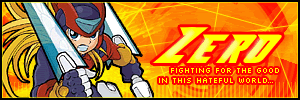
<b>Zero</b> -- Your style is very original. The only issue I have with the sig is how the stroke of the subtext blends in with the background. It's so vivid... makes my eyes hurt a bit.
<b>Medli</b> -- Empty space is a killer. You could have easily shrunken the image smaller and everything else smaller as well. Also, use a pixel text. The bar behind the subtext needs to be thinner. Even though I really like the colors you used, where did the border color come in? Borders need to be toned down so that they frame the picture, not so that they draw attention away from the image.
<b>Charka</b> -- Subtext choice, once again. Try to select a font that is even, or use all caps. I like the hue you chose. It's nicely done, other than the pixel font selection.
<b>Knives</b> -- Awesome! I love the contrast in the image. Lovely. The only thing is that in the av, "vertigo" is hard to read because it's covered. If you were to cover it, I'd suggest lowering the opacity of the "a sense of" so that you can still see part of "vertigo".
<b>Sapphire Faerie</b> -- I love how you only chose to let some colors show through. Creative. I've noticed that in all your sets, you bevel the border. Sometimes it works, and sometimes it doesn't. In this case, it's so bright and beveled that it takes attention away from the image. The main text could be bigger. Again, empty space is not a good thing. The subtext is hard to read. Try using all caps. The bevel kind of makes it look funny.
<b>Meowth</b> -- I think you should have kept the original colors of the image. It looks way too muted at grayscale. The bar behind the subtext shouldn't be that thick. It's distracting and not elegant. Put all the subtext on one line. The purpose of the bar is to separate it from the background, so don't be afraid to cover up part of the image. Also, the sides of the bar are cut off too abruptly. Gradients should fade for a bit longer.
<b>Alex</b> -- So cute!! It fits Rissa too.

I don't know. I can't think of any harsh criticisms for you. Even though it looks really simple, the end effect is nice. Props.
<b>Starchaser</b> -- Classy. It's gorgeous. I love that you used varying shades of purple, rather than just one. I dislike the grayish shadow around the oval though, because it doesn't seem to fit. The border is pretty cool. The av could use a bit of the same spectrum the sig has.
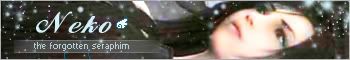
<b>Neko</b> -- It looks surprisingly good, despite the image you chose to work with. The quality was pretty bad, but it looks decent on your set. Good job. The only problem I have is with the faded bar behind the subtext: it is cut off abruptly and isn't centered.
<b>DM was on fire!</b> -- Much better than your past entries, in terms of filling up space. However, I still consider it a part of the background, and therefore your text should be placed differently. The font is bad choice; it's too thin and hard to read. Perhaps you should have given it a thicker stroke. Again, the uneven subtext.... You guys, pick a font that doesn't have letters randomly taller than other letters, or use all caps!
<b>Marissa</b> -- Sexy ;P. I like how you have a zoomed-in image of her eye behind the curtains. It emphasizes the subtext. Lovely job.
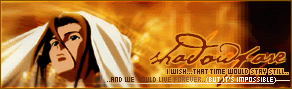
<b>Shadowfare</b> -- Cool! You could have moved the text around a bit, so that it's more balanced, and easier to read (applicable to the subtext). The pixely/square effect doesn't quite go with the mood of the set, though.
<b>Apricus</b> -- I like it! The grid in the background looks a bit choppy on the right, rather than the smooth unevenness in the rest of the background. There are no other complaints. It's awesome.
<b>Rachel</b> -- It's so cute! Good job with the matching colors. Almost exactly what I would have done ;P. The main text should have been moved downward, toward the center. Next time, try a pixel font or a shorter font, so that the bar isn't so thick. The gridlines are also a bit strong. Try lowering the opacity next time. The border is thick as well. If you use a double pixel border, try varying the shades of colors so that it doesn't look so bland.
<b>Kristina</b> -- Blue! Love blue.

It's nice. The border could be a deeper shade. And the text is a bit hard to read. Lighter stroke? Or set it on overlay or something, so that it stands out more.
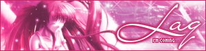
<b>Laq</b> -- Love the shade of pink/magenta you used. I normally don't like pink, but it's sexy. I'm sad that the score didn't show up on the final result though; it was really pretty on the original image. No matter, you did a fantastic job. It's gorgeous.
<b>Mazil</b> -- Yay! You're back! *hug* Right. Back to the set. I like the cut outs. Unique. I think the original image was kind of crappy in quality, and that lowers the quality of your set. Pretty font selection; it goes with the windy mood of the set.
<b>Neopets Addict</b> -- When an image has that many chunky pieces on the side, you shouldn't leave it sticking out. If you do, you need to be sure to have a bit of matte or clean up the edges. It looks messy. Also, the image does not stand out; rather, it blends in with the background. Work on the text placement. Center it, please. It's off balance.
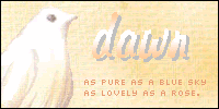
<b>Dawn</b> -- Decent for Paint. But uhh.. I really suggest you find a way to use a different program. You are at a disadvantage using just Paint. Your subtext should be centered, and the main text blends too much with the back ground. I dislike the way you placed the text on the avatar. You guys, I've said it before, and I'll say it again: vertical text rarely ever works. Unless you're sure of it, be safe and don't use vertical text. The border should be a different color.
<b>Polarbearpop</b> -- Whatever effects you used on the background are messy. If you're going to do pixels, make them smaller. The text overlay is distracting and only adds to the chunkiness. Next time, move the text to the center. It's unbalanced being at the top. Again, the subtext font choice: use a font that is even, with all the letters the same size, or use all caps.
<b>Everyone</b> -- I've said the following things too many times this round:
1. Subtext: use a font where all the letters are the same size, or use all caps. Uneven text is distracting and unattractive.
2. Text placement: Center your text, or place it in a way that is unobtrusive. When text isn't placed correctly, it draws one's eyes away from the focus of the set.
My votes go to Medli, Dawn, and Polarbearpop.


 - Set by Sapphire Faerie


