Sun Oct 17, 2004 2:39 pm
I like changes, so I don't think I'll have a problem with the new toolbar, although, the yellow is getting a bit boring, can you make the possibility of changing the color as you want, so it will allways stay that color for you, and when other people view your lookup, they will see the color you have chosen? It would really help if you want a lookup to blend more, but you don't know how to cover the toolbar. Hmm.. Maybe it's that something *special* that you can't say anything about, were you have to gain the colors in some sort..
I also really like the idea of the clock, but will it run automaticly or will you have to refresh the page to see the new time? I missed the page were the new toolbar was...
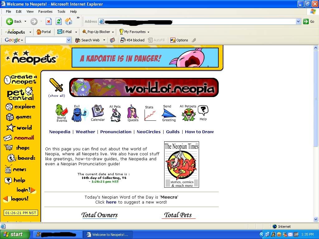
I never understood why there was World and Pet Central, it would be really good if you combined them both, and will make space for another icon.
All in all I really like the new toolbar, and I hope it comes out soon to everybody!
I also really like the idea of the clock, but will it run automaticly or will you have to refresh the page to see the new time? I missed the page were the new toolbar was...
I never understood why there was World and Pet Central, it would be really good if you combined them both, and will make space for another icon.
All in all I really like the new toolbar, and I hope it comes out soon to everybody!
Sun Oct 17, 2004 3:28 pm
I've been reading and thinking and looking at the ss for the new toolbar. There is another consideration re: that big topbar and the ads on it. Yes, I do think it's big, it's distracting, it kind of messes up the look of the pages, I don't know what it will do to all our lookups (especially ones with sidebars/topbanners) - and the people who have already made and submiitted Lookup of the Week entries.
For lookups, I see the top banner as the sticking point re: custom lookups. You're going to go to the time and trouble of making and coding something wonderful ... and have this big yellow "thing" sitting there moving around over your own banner distracting people big time.
Add to that the issues of "immersive advertising" and the fact that the new topbar is not very "subtle", rather it's very in your face - That I believe is a good point and thank you Sierra for bringing that up!
Here's the other thing I've thought of. And I think it's an important point, given there are people with disabilities. ... I'll use myself as an example. I have an inner ear disorder and things that move or flash too much make me very dizzy. There are some games I just can't play because they move too fast. I've literally fallen off my chair.
So, if on every page I'm confronted with not one but two competing, moving, blinking, flashing ads - one on the side and one on the top there's a good chance that it will affect me physically, not just asthetically. And I know I'm not the only person with physical problems/limitations.
Add the dial-up/slow computer/smaller screen resolution (for having to scroll even further down the page to avoid seeing the top thing going and just the banner in general to get to page content), well I definitely see potential problems and alot of people are not going to be happy about this.
Please, update/change the sidebar. That's something that some people will, of course, complain about -- but it's something that I think we can all get used to and probably love for easier navigation. But really, that top banner with yet another ad is just ... over the top.
Thanks
Sun Oct 17, 2004 3:37 pm
i love the new look personally, but i think people are right in saying that the majority of the bar hasn't changed. i'd like (either/ or) the option to change 'themes' on the side bar, and perhaps a look closer to the scroll effect on the shop toolbar.
Sun Oct 17, 2004 3:52 pm
Messs17 wrote:For anyone who missed it:
It's too...clunky. I don't like the top part, but the clock is a wonderful idea.
Sun Oct 17, 2004 5:09 pm
Take. Out. The. Ad.
I will be very angry if that horrid thing stays. Very, very angry. To the point of blackmail.
Okay, okay. *chills out a bit* I don't mind the top bar. But I don't want a banner there; it's too in-your-face. You should put the RE box where the ad is. Or even a little Newsflash box, like on the Portal page. Or a display of portal-page-like stuff, such as NP in shop till, NP in bank, all those useful things. Or anything other than that terrible, awful banner ad. EDIT- Also, you could put the page title banner up there in the yellow thing. Or customisable quick links. Or asparagus. Or pickles. Or cauliflaour (sp?). Or goat cheese. I like goat cheese.
I bet that secret thing is site themes/skins. Which I have been requesting to the Editorial for about a year and a half. *takes all the credit*
Oh, and Adam, don't mind the quote in my signature XD
Sun Oct 17, 2004 5:23 pm
Naniwai wrote:
Okay, okay. *chills out a bit* I don't mind the top bar. But I don't want a banner there; it's too in-your-face. You should put the RE box where the ad is. Or even a little Newsflash box, like on the Portal page. Or a display of portal-page-like stuff, such as NP in shop till, NP in bank, all those useful things. Or anything other than that terrible, awful banner ad. EDIT- Also, you could put the page title banner up there in the yellow thing. Or customisable quick links. Or asparagus. Or pickles. Or cauliflaour (sp?). Or goat cheese. I like goat cheese.
I really love your ideas. It would make surfing the stie so much easier, and it would look coolm and save people time...
Sun Oct 17, 2004 5:24 pm
i think that the top bar should either be the shops tool bar, or the stock market rolling bar. i think that the stock market page feels a bit left out and empty as well, maybe that should get some better pics, like a stock exchange flash thingy-type-thing??
Sun Oct 17, 2004 5:25 pm
Themes would be a great idea, and they could even be a secret thing you have to find, like the avatars. Also, I think there should be some options that users can choose to put on the toolbar, like the featured game, their stocks, money in the shop till, etc.
I won't mind the ad as long as it isn't showing any sponser stuff up there. If the sponsers still want an ad they can still have the small one near the bottom of the page, or something to that extent.
I won't mind the ad as long as it isn't showing any sponser stuff up there. If the sponsers still want an ad they can still have the small one near the bottom of the page, or something to that extent.
Sun Oct 17, 2004 5:40 pm
Not to be picky...but...why the need for a new toolbar anyhow? 
Wasn't the whole portal thing supposed to take place of that for folks who wanted more customization?
I really think other things need more time spent on them than the things that aren't a problem (like the toolbar)....
Like focusing energy on creating a Neopets FAQ page to clear up the rules? Or a billion other things....(bites tounge and refuses to bring up Neoschools).
Anyhow, how many times have you heard players complain about the toolbar?
Sorry for saying this...I don't want any hard feelings. I mean that in the most respectful way possible. I just think sometimes energy is centered on things that make no difference to the site. Like the Hannah Day we just had a few weeks ago....all the time that probably went making new hannah items, hannah shopkeepers, a hannah avatar....yet the fact the game is still glitched since it's release eons ago (and is unwinnable in the true sense because of the 3 unobtainable gems) just seems silly.
Are the sponsors complaining about the ad size and visibility? If that's the reason change is needed maybe we can come up with other solutions to the problem.
I don't like sounding so critical, but in my opinion, the more I thnk about it, it's like putting a seven thousand dollar custom paint job on a 1988 Yugo. It's almost pointless.
Sun Oct 17, 2004 6:17 pm
Oooh. If we're going to have a top bar, I REALLY like the idea of having some useful information there: various bits of account information (like having the username, NP on hand, and something to switch between pets up there instead of all the way at the bottom of the sidebar.) How about an 80x80 picture of your active pet?
At any rate, I think the username/active pet/NP on hand stuff should be more visible than it is now: at the top of the yellow sidebar, rather than at the bottom. Maybe put the clock up there, too?
I also think putting the Shops toolbar up there all the time would be a great idea as well. I frankly use the Shops toolbar as often as the sidebar and I'd love to have it available all the time. (And it would be even better if there were a link to my Stock portfolio in the Shops toolbar... hint, hint.)
I agree a "My Items" link that was always up (either because it's in the yellow sidebar, or because the Shops toolbar had been added across the top) would be a great idea as well. I frankly use "My Items" a lot more than the main shops and it would be nice to have a direct link.
But down with the annoying top banner ad, especially if it's going to be animated.
I don't think a top banner ad for Neopets stuff is actually any less annoying than one for sponsor stuff. At least I know that the sponsor ads are paying for the servers and staff... the Neopets ads are mostly just telling me about stuff I already know about anyway.
Sun Oct 17, 2004 6:30 pm
I love it!
This is great... not only am I starting over on everything, it's like it's changing right along with me!
This is great... not only am I starting over on everything, it's like it's changing right along with me!
Sun Oct 17, 2004 7:19 pm
Wellity, wellity well...
The new guy likey, I don't think the top bar's too big, you'll get used to it, like breathing =P
Might as well introduce me-self, I'm Spivey and I'm new. There.
The new guy likey, I don't think the top bar's too big, you'll get used to it, like breathing =P
Might as well introduce me-self, I'm Spivey and I'm new. There.
Sun Oct 17, 2004 7:47 pm
Well, hello, Spivey.
Anyway, I just got an idea.. it might have already been pointed out, but.. why not take the little bar that shows were you are.. and maybe put that where the ad is, if possible?
Anyway, I just got an idea.. it might have already been pointed out, but.. why not take the little bar that shows were you are.. and maybe put that where the ad is, if possible?
Sun Oct 17, 2004 7:48 pm
I hate the fact that that big add banner is at the top, it will probably only slow the page down, I think they should put events and stuff like that.
Sun Oct 17, 2004 7:54 pm
Okay -- in general the re-design dosen' seem that bad. However I cannot deal with the top bar. One of the things that has kept me playing neopets was the lack of overt or banner ads. The top banner is ugly it's crass and it is unbelievably inconvienet for anyone operating on a low resolution.
With the introduction of banner ads, even if they are for neopets games a portion of the time (although if they still have links to other sites half as much as the little icon does it's too often) I don't know if I'm going to be willing to keep playing. And that's unfortionate that i'll have to stop something I enjoy but the banner ads are something that will continuiously take away from every page of the site.
Not to mention the additional load time. I'm on quite a high speed connection and I still have parts of the site take forever to load. The additional ad graphics will make all of the page refreshed based games, negsweeper, neoquest begin to have prohibitivly long load times, especialy for people on slower connections.[/i]