For Neopets ONLY discussion.
Topic locked

Wed May 10, 2006 5:03 am

Shopkeepers:

CREDIT: http://www.neoextreme.com/

Looks like Lutari Island is on the way?

ImageImageImageImage

Wed May 10, 2006 5:21 am

Goodness, if that's what the Lutari Island pets are going to look like, then I don't think I want one. They're a hideous mishmash of colors, and the art itself makes me sad. Something's off with the gelert's body, and what's up with that korbat's misshapen head? It kind of reminds me of Hello Kitty. ._.

Wed May 10, 2006 5:35 am

Rindi wrote:They're a hideous mishmash of colors.


I quite agree. I'm wondering if the colourist for this grouping has his/her monitor set properly... I like the concept, but the colors are garrish indeed!

Wed May 10, 2006 5:48 am

...Ew. Those are just shopkeepers, right? I can forgive badly drawn shopkeepers.

Image

The Blumaroo doesn't look too bad, but it could be better.

Wed May 10, 2006 8:04 am

Image Image

Wonder if they'll be a dubloon avatar.

Wed May 10, 2006 8:16 am

I don't think it's likely since there's already one that looks like a dubloon you can earn from playing Dubloon Disaster, and then there's one from using training at Krawk Island Academy.

My first impressions of the lutari island brush have solidified into a mass of pure repulsion. It looks like they've been scribbled on in crayon and drawn by a child.

Wed May 10, 2006 11:55 am

Image
look at that nose! :o Its so big and ugly compared to the original gelert


also if this hasnt been posted before:
Image
they tyrannian gnorbu, looks more like the tonu if u ask me :roll:

Wed May 10, 2006 1:50 pm

Image
o_O , really ... it's ... all... wrong

Wed May 10, 2006 5:04 pm

I kind of like the lutari colors. They are different though, but I think they have charactor. And well, I like it that some pets look a little different or have a different shaped head or nose. That is what makes your pet an individual I think. I think the gelert does sort of look goofy, but it looks like it knows how to have a good time too. So someone might like that in their gelert. They can pretend he is just a fun loving gelert, a little goofy or clumbsy, but likes to party.

I think they should start making pets with little changes like that. Like some cybunnys can have floppy ears and some aishas can be fluffier or something. Like ever once in a while someone could get a really different looking pet that was either born that way or made that way at the lab. Or maybe you could buy something to just change their ears or the shape of their tail or make their hair longer or something. Or maybe you can give them wings or scales or something when they normally wouldn't have that. I'd like to see a scaled uni, like a kirin.

And these are just shop keepers. Maybe the staff will work a lot harder on the real artwork.

Wed May 10, 2006 5:56 pm

I think when they get new artists that don't quite have the "feel" for how the pets look yet, they put them to work creating shopkeepers. Some shopkeepers look fine - they are proportioned correctly and the pictures are drawn using proper perspective. Others... well, see for yourself:
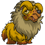
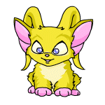
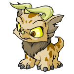
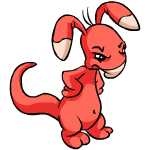
Some examples:
Here you see a well-drawn action-Acara, along side the original :
Image Image

More recent acara with arm coming out of its stomach (yes, that's how it would look if *I* drew it but these people are paid to draw, I would expect they are better able to convey perspective)... "original"/normal pose of this color is shown on right side for comparison.
Image Image

Decent posed blumaroo:
Image Image

Freaky adult baby blumaroo:
Image Image

Now, I dont have anything against pets looking slightly different from picture to picture. Pets drawn in a slightly different style, more cartoonish or more realistic looking - I agree, it gives a bit of personality. I don't have a problem with that. But when the proportions are so wrong that the result doesn't look like it could possibly be your pet in a different pose, or if it was trying to walk or reach for something, it would collapse because the legs are attached wrong or completely straight instead of organic looking or ... you get idea. (I think the sniggering blue yurble has been bitten on the leg by a spider, that's why it's puffed up all the way past the hip and no recognizable knee area.

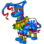
If you look at the lupe shopkeepers, you see that there is a consistent look that TNT strives for. No, they're not all exactly the same, but you can tell they're all made from the same model.

The gelerts, though... they are awful.
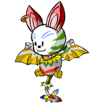
http://www.neopets.com/select_shopkeeper.phtml?category=1&sub_cat_id=14&search=Gelert The baby has no back to its head. Achyfii guy has no bottom jaw and he has mutant cheeks and crossed eyes. Faerie running is blocky and looks like scooby doo. I think the red playful and the shadow gelerts are the most well-done in terms of changing the look and pose but retaining the essence of a gelert: even though the asparagus one's ear thingies don't really have much "whip" thing on the end, he is still recognizable as a GELERT shape dog.

I don't mind the goofy look on the lutari gelert's face here. It's the shape of his snout, his body, and his ears, and the fact that it really just looks more like a dog thing with eartennas.... not specifically a gelert. And that's what they're supposed to be going for!

Anyhow, just my two cents, but I hope that they fix those images before releasing them. Of course, they released the microcephalic baby gelert, so I guess I'm out of luck...

Let me 'splain... no, there is too much. Let me sum up.

(11/4)

Wed May 10, 2006 6:11 pm

I like the blumaroo the best anyway. I know a lot of people complain when artists just colorfill the original poses, so I like it when they actually redraw the pet. Sometimes they kind of get it wrong, though. And sometimes they mess up even when they colorfill, like with the jelly usual and it's three arms. Maybe they'll tweak these a little more before they go online as our actual pets.

Wed May 10, 2006 6:38 pm

An adult baby Blumaroo...umm... o_O

Wed May 10, 2006 7:33 pm

Stars_of_Night wrote:Image
look at that nose! :o Its so big and ugly compared to the original gelert


also if this hasnt been posted before:
Image
they tyrannian gnorbu, looks more like the tonu if u ask me :roll:


That Gnorbu looks SO damned COOL I Need one for mine >>

Wed May 10, 2006 8:56 pm

Image
The grall looks fat

Wed May 10, 2006 9:23 pm

Personally, I really like the Lutari color. What we've seen of it anyway. I love all the bright colors used.

I think the Blumaroo shopkeeper is really good. I don't really like the rest, but it's not the coloring. It's the way the pets are drawn.
Topic locked