Fri Apr 27, 2007 8:54 pm
Good, it's not just me who gets high-strung from the information overload. It's like attack of the modules.
Fri Apr 27, 2007 8:54 pm
shapu wrote:Well, you can increase and decrease text size, which might help. Just hold down the CTRL key and scroll your mouse wheel or up or down.
If you want to block the sidebar, which is a big help just by itself
-if you have chromedit installed on your browser (Mozilla/firefox users only), go to Tools, then click "Edit User Files," and click on the userContent tab. At the very bottom, type this line:
- Code:
.sidebar{display:none;}
-I have not learned how to do that for just neopets, mind you.
-You can do the same in your user style sheets in Internet Explorer, though I don't know how. Vivian58 brought up the possibility in a post in the first thread.
Finally, the sidebar is in a table data box. So you won't be able to move that to the right side of the page, as far as I know.
Anyway, the dropdown menus, as far as I can tell, aren't flash or Java. I believe they're just a really neat use of CSS involving z-indexing the menu itself. When you mouse over it, that changes the index and brings the menu to the front of the page. Normally, it's the bottom layer.
I'll try working with my font settings, thanks. I refuse to use Firefox, the darn browser makes me so angry I want to smash it to bits (if I could). I am really looking for an external style sheet I can use with IE/Avant. I was thinking more along the lines of using a CSS file to possibly remove the top and bottom "theme" and perhaps even saving the old sidebars on my disk so that at least my view of Neopets shows some of the old style. It's possible there is too much CSS to be able to even tweak that much.
The dropdown menus are javascript as far as I can tell. Try turning scripts off for a moment, loading a normal page and see how THAT looks. Oh yeah and why not compare page loading time while you're at it.
I certainly don't need all those links in the dropdown menus. In fact I need NONE of them. The old sidebar at least contained some useful things that I used occasionally. Everything else I really do think is "user preference" and user responsibility for that matter. I have a folder of links that I use very frequently. Even Neopets Toolbar is bulky and unnecessary. It also contains hardly any of the things I use often, too many things of what I don't care about or don't use, and actually did not alllow itself to be customized very much at all. (It kept glitching and reverting back to the default. Perhaps that is an old bug.)
We are not a bunch of drone clones that all use the same thing and all want the same thing, nor do we all conform to the same thing just because that is all that is available. I suspect TNT's brains were sucked out by aliens. That is the only explanation that I can come up with now.
EDIT: Attack of the modules. LOL! Good one! I was going to suggest earlier that this whole customisation thing would have been much more appropriate as a Game and not a mandatory 'get used to it' change.
Fri Apr 27, 2007 9:09 pm
shapu wrote:anjuna wrote:If anyone out there is good with CSS, I wonder if you can tell us if there are external style sheets we can use to at least, say, get rid of the glaring box outlines and perhaps change sizes of things to make them so I don't feel like I have to immediately go to an eye doctor and get a new prescription for glasses that magnify as powerful as a microscope!
Well, you can increase and decrease text size, which might help. Just hold down the CTRL key and scroll your mouse wheel or up or down.
If you want to block the sidebar, which is a big help just by itself
-if you have chromedit installed on your browser (Mozilla/firefox users only), go to Tools, then click "Edit User Files," and click on the userContent tab. At the very bottom, type this line:
- Code:
.sidebar{display:none;}
-I have not learned how to do that for just neopets, mind you.
-You can do the same in your user style sheets in Internet Explorer, though I don't know how. Vivian58 brought up the possibility in a post in the first thread.
For Firefox, to make the code applicable only to Neopets, I believe it works if you just stick everything in between the curly brackets:
- Code:
@-moz-document domain(neopets.com){

}
I have no idea how to do that for IE though. :/
Except for the sidebar, I quite like the new layout, as it is more efficient, but it just takes getting used to.
However, for some themes, for example the clock is practically black text on dark blue, which is hard to read! So I used:
- Code:
#nst{color: white !important;}
You can even change the font size to make everything look bigger, btw! :)
Finally, they added a new element for ads, so even in Firefox with Adblock, I still see the black ADVERTISEMENT bar, with a blank white area underneath, so I added this to my user style sheet. This works in IE, too, as far as I know:
- Code:
.adBox{display:none !important;}
I spent hours combing through the Neopets CSS yesterday while redoing my user lookup.
Fri Apr 27, 2007 9:12 pm
This whole thing has GOT to be a late April Fools prank (May Fools?), since everyone hated the one they had. Plus they had to have noticed how everyone hated on the sucky pet revamps, why would they go through with them? This can't be for serious at all, man.
Plus this little quote in the news gives me hope to believe I'm right:
And if they are for serious, well then I'm done with them. Just when I was getting back into the site, too...
Plus this little quote in the news gives me hope to believe I'm right:
We would also like to mention that if you aren't happy with the change to any of your Neopets, don't go hunting for a morphing potion just yet! You may find justice early next week.
And if they are for serious, well then I'm done with them. Just when I was getting back into the site, too...
Fri Apr 27, 2007 9:21 pm
yvonne_l_d wrote:
I would have been supportive of the changes if it had been just the layout. I can't stand the pet redraws. My xweetok now looks like mickey mouse.
You shouldn't insult Mickey by comparing him to that redraw. The images look more like the Disney movie rip-offs you can find at the Dollar Store or K-Mart discount bin.
I'm *still* annoyed with the Lutari redraw. No, I don't like him standing upright... but the ice-cream seller in Terror Mountain's Happy Valley has been standing upright since before I got my lutari. *HIS* artwork looks fine. *My* pet's artwork looks awful.
 Vs.
Vs. 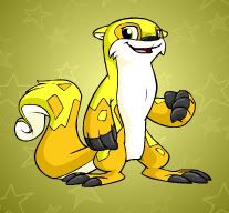
Fri Apr 27, 2007 9:21 pm
vivian58 wrote:You can even change the font size to make everything look bigger, btw!
Finally, they added a new element for ads, so even in Firefox with Adblock, I still see the black ADVERTISEMENT bar, with a blank white area underneath, so I added this to my user style sheet. This works in IE, too, as far as I know:
- Code:
.adBox{display:none !important;}
I spent hours combing through the Neopets CSS yesterday while redoing my user lookup.
Yes I think increasing font size might be the only way to 'push' everything back to so that the page is rendered more like Daze mentioned earlier, conforming to the size of the window viewed. Usually the ads here are blocked leaving a huge black space. I almost don't care but it is annoying.
I am really way more annoyed by the ugly 'boxes' around everything. And the redundent useless things on almost every page. I really admire people that know a lot of CSS tricks and hope that if many of you are as angry as most of the rest of us you're working on some funky codes that you might be able to share with us all later. Neopets is an eyesore now.
Until Neopets either changes back, totally revamps this new style, or users come up with some way I don't have to look at neopets native style, I am just staying off the site. I can't believe I saved up millions of NP just to basically find myself not even wanting to do anything with them.
EDIT: Zero! I am also still sort of in disbelief of this. I still hope it's a joke.
Fri Apr 27, 2007 9:25 pm
Matrinka wrote:yvonne_l_d wrote:
I would have been supportive of the changes if it had been just the layout. I can't stand the pet redraws. My xweetok now looks like mickey mouse.
You shouldn't insult Mickey by comparing him to that redraw. The images look more like the Disney movie rip-offs you can find at the Dollar Store or K-Mart discount bin.
I'm *still* annoyed with the Lutari redraw. No, I don't like him standing upright... but the ice-cream seller in Terror Mountain's Happy Valley has been standing upright since before I got my lutari. *HIS* artwork looks fine. *My* pet's artwork looks awful.
I do agree with that. The Lutari is hideous. But I am still very much liking the new layout.
Fri Apr 27, 2007 9:25 pm
anjuna wrote:
I am really way more annoyed by the ugly 'boxes' around everything. And the redundent useless things on almost every page. I really admire people that know a lot of CSS tricks and hope that if many of you are as angry as most of the rest of us you're working on some funky codes that you might be able to share with us all later. Neopets is an eyesore now.
- Code:
.contentModule {
   border: 0px;
   }

.contentModuleTable {
   border: 0px;
   }
I just pulled this from my lookup, it should get rid of all the borders around the modules, at least.
Fri Apr 27, 2007 9:29 pm
I think if you get rid of the sidebar with CSS though, you lose both of the modules. I sort of like the active pet module but could live without it if it got rid of my Neofriends module, however without it I don't think there's a fast link to get to your quickref page.
I'd like it if they at least made the modules seperate items in CSS so we can block them individually if we want, even if they're not officially optional.
I'd like it if they at least made the modules seperate items in CSS so we can block them individually if we want, even if they're not officially optional.