Which pets need revamps?
Thu Aug 19, 2004 7:56 pm
I can't believe the fact that this doesn't seem to be on the first page.
Anyway, I think the next revamp should be the Scorchio. I mean, seriously, look at the poor thing...
Wait ,a scratch, a neckbrace and bandages? That's it?
Anyway, post opinions here.
Anyway, I think the next revamp should be the Scorchio. I mean, seriously, look at the poor thing...
Wait ,a scratch, a neckbrace and bandages? That's it?
Anyway, post opinions here.
Thu Aug 19, 2004 8:36 pm
IMO I think the Shoyru(mouth missing and Buzz(Nose missing) need a revamp.
Neopet
Fri Aug 20, 2004 4:59 am
Ruki..already..lol....no..i think Tuskaninny! There getting on my nerves...the strawberry fields forever Tuskaninny is HIDEOUS take a look...<img src="http://images.neopets.com/pets/happy/tuskaninny_strawberry_baby.gif">
Fri Aug 20, 2004 5:42 am
The Gelert, the Uni, and the Ixi. The first two I really dislike even after revamps for some reason, and I've never liked the Ixi.
Oh, and of course, the Tuskaninny. ;P
Oh, and of course, the Tuskaninny. ;P
Fri Aug 20, 2004 7:03 am
Geeze... a ton of them still need to be revamped (if you actually read all of this.... when I say fresher/updated/newer look or something along those lines.. I'm usually talking about a bit more detail and better shading)
I'll just go down the list....
Nimmo-It's not as bad as some of the others.. but they still need an improved look
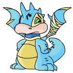
Scorchio- They just look so outdated. Just look at those feet
Korbat- Those poor lil things could be so cool looking, but they just look lame/simple.
Kiko- Need I say more?
Usul- Also another pet that could be very cute but all it looks like right now is cross-eyed
Aisha- So so outdated looking. Must.. give.. it.. new... look!......
Chia- *read comment for kiko*
Eyrie- Now out of them all.. this pet has the most potential for being the coolest looking pet out there. But NOPE! Just take a look at those pathetic excuses for wings. (darigan eyrie should be the goal for what the other colors should strive to look like)
Tuskaninny- Poor poor tuskaninny. No matter how many posts people make about you.. you never get revamped.
Flotsam- I don't know what they need to do to improve it.. they just need to do something.
Kacheek- Show it some love and give it a bit more of an updated look with more personality other than some polite looking grin.
Buzz- Just needs to be jazzed up a bit. Still keep it's buggy non-cute look.. but just update it a bit.
Gelert- Nothing really major needs to be done to it.. just a fresher updated look.
Mynci- Myncis... I must say that they are my least favorite pet. It also could use a fresher new look
Peophin- Yet another pet that could look super neat with a new look. And get rid of that headplate thing for the love of everything good!
Quiggle- *read comment for kiko and chia*
Zafara- They look outdated as well. Just fix im up some and they'd be spiffy
Techo- Same as above.
Meerca- Don't think much should be done.. like others.. just a fresher newer look.
Chomby- More detail.. More Detail!
Pteri- Poor thing is just ugly. Make it look more like a sparrow and less like some angry evil thing with a zafara tail
And yep.. that's all from me lol
lol
I'll just go down the list....
Nimmo-It's not as bad as some of the others.. but they still need an improved look
Scorchio- They just look so outdated. Just look at those feet
Korbat- Those poor lil things could be so cool looking, but they just look lame/simple.
Kiko- Need I say more?
Usul- Also another pet that could be very cute but all it looks like right now is cross-eyed
Aisha- So so outdated looking. Must.. give.. it.. new... look!......
Chia- *read comment for kiko*
Eyrie- Now out of them all.. this pet has the most potential for being the coolest looking pet out there. But NOPE! Just take a look at those pathetic excuses for wings. (darigan eyrie should be the goal for what the other colors should strive to look like)
Tuskaninny- Poor poor tuskaninny. No matter how many posts people make about you.. you never get revamped.
Flotsam- I don't know what they need to do to improve it.. they just need to do something.
Kacheek- Show it some love and give it a bit more of an updated look with more personality other than some polite looking grin.
Buzz- Just needs to be jazzed up a bit. Still keep it's buggy non-cute look.. but just update it a bit.
Gelert- Nothing really major needs to be done to it.. just a fresher updated look.
Mynci- Myncis... I must say that they are my least favorite pet. It also could use a fresher new look
Peophin- Yet another pet that could look super neat with a new look. And get rid of that headplate thing for the love of everything good!
Quiggle- *read comment for kiko and chia*
Zafara- They look outdated as well. Just fix im up some and they'd be spiffy
Techo- Same as above.
Meerca- Don't think much should be done.. like others.. just a fresher newer look.
Chomby- More detail.. More Detail!
Pteri- Poor thing is just ugly. Make it look more like a sparrow and less like some angry evil thing with a zafara tail
And yep.. that's all from me
Fri Aug 20, 2004 8:02 am
They're all ok IMO, except for the faerie Chia.
Fri Aug 20, 2004 4:45 pm
If they revamp the Shoyru, they better NOT touch the Faerie one!!! If Eifro looks like a woman I'll have to repaint him!
Elephante: It's a fat tub of lard. If they make it shiny it'll at least look pretty!
Gelert: The legs just seem awkward.
Scorchio: Flat and ugly.
Tuskaninny: ...No comment.
Kau: Flaaaaaaat.
Nimmo: They're not TOO bad, but they could be better.
Quiggle: Flat and the happy pose is kinda creepy. Little too happy...
"I'M HAPPY!!! I'M HAPPY!!! I'M HAPPY!!!"
Pteri: They really could look super cool if they just looked better!
Eyrie: Same as Pteri.
Fri Aug 20, 2004 7:37 pm
Tuskininny, all the way! I can't believe they haven't helped this poor pet yet. Also, the Flotsam and Jetsam could use a bit of touching up (touching up, mind you, *not* a total revamp).
Fri Aug 20, 2004 8:09 pm
The Acara, definately the Acara. Or at least their Battledome poses. See:
Fri Aug 20, 2004 9:13 pm
Kiko,Techo,Buzz,Tuskaninny,Shoyru,Scorchio,Gelert,Acara,Aisha,Elephante,Nimmo,Kau,Pteri,Eyrie,Chia,Quiggle,Pteri..
Weeeeeeeee.
You know,I'd get a Pteri if they updated it to look like the TCG Pteri.
Weeeeeeeee.
You know,I'd get a Pteri if they updated it to look like the TCG Pteri.
Last edited by Kitten Medli on Thu Sep 02, 2004 5:54 am, edited 2 times in total.
Fri Aug 20, 2004 9:57 pm
shoyru. Not to much of a change, just a little newer. A tuskwhatever, the quiggle, and the scorchio.
Sat Aug 21, 2004 12:44 am
I think most of the pets, at least the ones that have not been released or revamped in the last 2 years, need a little nip and tuck. Some, like the Tuskaninny, the Kyrii, Quiggles, and Scorchios need some major help. Others just need a little... oomph or something, so they look more like they belong on a multimillion dollar company's website.
Sun Aug 22, 2004 9:27 am
After that 'Koi Revamp' crap I don't want to see another pet undergo a drastic change and get totally ruined. So, therefore:
So, in order of "God, someone help that poor creature" to "Eh, it could be a little bit better."
1) Tuskaninny - I don't even have to explain this. The only thing that's not wrong with this Neopet is the basic desciption - it's a seal with a tuft of hair. Sounds OK on paper, but when you actually see how it's been done . . . *shudders*
2) Quiggle - Er, hello? Muscle definition? Better shading? It looks like it's gradient-filled, still. And the lines around the stripes have got to go. I adore the Quiggles on the TCG cards because their bodies are a lot more defined and they look more real - rather than the flat piece of froggy roadkill that Quiggles are now.
3) Shoyru - I still don't see how it's the major Neopet on the site! Someone do something to SAVE IT. The head HAS to be taken out of profile. It looks too weird to see your Neopet looking at you with a single eye. Makes you wonder what the other eye is doing. And since the head is always in profile while the body is not, it constantly looks like it's neck is broken off. Finally, the wings are at an incredibly awkward angle. They're both at the same angle even though the positioning of the Shoyru's body dictates that they should not be. The wings would be in the right place if the Shoyru were facing us and looking straight ahead - but on the side, it looks like one of the wings was stapled on under it's left arm.
4) Peophin - This is the Neopet I always forget exists. It just doesn't fit in at all with the rest of the site. It's just a hippocampus. It's not really drawn in the Neopets style. I'm not saying to cutify it. If anything, it needs a lot more grace - it looks a little bit fat right now. The body should be shrunken a little, and it needs to have more life in it's poses.
5) Mynci - Every single pose needs to be totally redrawn. It's nowhere near as emotionful as it could be. The Myncis on the TCG cards are fantastic and really show the potential of the Mynci.
6) Eyrie - Great Neopet. It's so good, it's managed to be popular for so long despite the crappy and stiff style it's in. It just doesn't fit in with the rest of Neopia. It looks more like a Digimon than a Neopet. It needs a LOT more life. It's limbs should be positioned so they look like they work - it always looks like it's limping to me. The tail needs to be redone so that it looks like it actually has hair - rather than spines. But the major thing that needs fixing is that the wings need to look like actual wings, and not pieces of cardboard pasted into it's abdomen.
7) Techo - The head warps with every emotion, which is very creepy. In every single pose, the head is shaped in a different way. That definately needs to be fixed. It needs to have more definition and shading, too. Some variety in the poses would help a lot, also - why would someone have their arms on the side like that if they were happy/angry/sad?
8) Flotsam - It doesn't look like a dolphin. You can tell that it's supposed to have all the appeal of a dolphin, but the artist couldn't pull it off. The face needs to be shrunk - the nose needs to be extended, and the eyes need to look a lot cuter. Seriously - dolphins are some of the cutest animals on the planet, but the Flotsam is ugly. Also, it shouldn't be posed like a seal. Let it float in mid-air like the Koi. Give it some dignity and some grace.
9) Nimmo - Needs to be drawn more 3-Dish and more alive. I would love to have a Nimmo like the Plushie Nimmo. Emphasize the meditative side and also it's lankyness to further seperate it from the Quiggle.
10 & 11) Jubjub/Kiko - Two OK pets with similar problems. They're too boring. One of the reasons they're like this is because they're too flat. They're viewed in a strictly face-forward 2-D manner. Give us a slight side-view in the poses. Have you see the Jubjub drawing on the McDonald's toys? The feet are still in front of the face, but we can see more of the eyes and the hair looks more realistic. And the Plushie Kiko looks a lot more - ROUND than the regular Kiko. Like it's bulging and actually has weight.
12) Acara - Meh. Give it some more life and variety in the poses and that'll be enough.
13) Kyrii - Just fix the arms. They're stuck out at weird angles. Also, the feet look weird on this creature because it looks like it doesn't really have legs. Fix the positioning of the arms and give them some actual legs and thighs. However, since it's a Neopet that no one ever remembers, and they got screwed over on their 2003 Pet Day, and because Yurbles kind of overlap with them, and because no merchandise has been released - I get the distinct feeling that this poor thing is going to end up having a total Koi reworking to make it into something entirely unrecognizable.
14, 15 & 16) Scorchio/Aisha/Korbat - All could stand to use an update. Although hopefully towards the art of the TCG cards and not the McDonald's art. The McDonald's Scorchios look like blobby Draiks - their arms and hands are shrunken, and the wings are, too.
16) Chomby - It's boring. For a Limited Neopet. Not a good thing. It's just too flat and lifeless. Give it a better bounce in it's step or un-limit it. Have it stomp around in a few poses, for pete's sake.
17) Buzz - Doesn't need a major re-do. I'd just like to see the wings on it repositioned. They don't look quite right to me. Like the two pairs of wings would slap into eachother as it flew.
18) Pteri - Fix the feet so that the head isn't jutting out from the body with both feet held in one place. One of those feet should be thrust forward if it's leaning ahead all the time.
19) Chia - Ignoring the fact that it's the most boring and ugly Neopet on the site in concept, the art style is a little old and I'd prefer that they be updated to match the Purple (correction: Herpes) Chia.
20) Kacheek - Fix the damn feet. Why is one twice the side of the other? Why are they both opposite of eachother? Makes the Pikachu clone look like he's doing a permanent split.
I'd also prefer the Kacheek eyes to match the Speckled Kacheek's, to give it a bit more life:
*takes a breather*
Last edited by Chris on Thu Sep 02, 2004 12:50 am, edited 4 times in total.
Sun Aug 22, 2004 3:24 pm
All I want redone is the Acara. >_< I've forgetten why I created one! They look so blank...*sigh*
And I don't know why everyone thinks the Aisha needs done, I like it!
And I don't know why everyone thinks the Aisha needs done, I like it!
Mon Aug 23, 2004 9:16 pm
Chris wrote:After that 'Koi Revamp' crap I don't want to see another pet undergo a drastic change and get totally ruined. So, therefore:
So, in order of "God, someone help that poor creature" to "Eh, it could be a little bit better."
1) Tuskaninny - I don't even have to explain this. The only thing that's not wrong with this Neopet is the basic desciption - it's a seal with a tuft of hair. Sounds OK on paper, but when you actually see how it's been done . . . *shudders*
2) Quiggle - Er, hello? Muscle definition? Better shading? It looks like it's gradient-filled, still. And the lines around the stripes have got to go. I adore the Quiggles on the TCG cards because their bodies are a lot more defined and they look more real - rather than the flat piece of froggy roadkill that Quiggles are now.
3) Shoyru - I still don't see how it's the major Neopet on the site! Someone do something to SAVE IT. The head HAS to be taken out of profile. It looks too weird to see your Neopet looking at you with a single eye. Makes you wonder what the other eye is doing. And since the head is always in profile while the body is not, it constantly looks like it's neck is broken off. Finally, the wings are at an incredibly awkward angle. They're both at the same angle even though the positioning of the Shoyru's body dictates that they should not be. The wings would be in the right place if the Shoyru were facing us and looking straight ahead - but on the side, it looks like one of the wings was stapled on under it's left arm.
4) Peophin - This is the Neopet I always forget exists. It just doesn't fit in at all with the rest of the site. It's just a hippocampus. It's not really drawn in the Neopets style. I'm not saying to cutify it. If anything, it needs a lot more grace - it looks a little bit fat right now. The body should be shrunken a little, and it needs to have more life in it's poses.
5) Eyrie - Great Neopet. It's so good, it's managed to be popular for so long despite the crappy and stiff style it's in. It just doesn't fit in with the rest of Neopia. It looks more like a Digimon than a Neopet. It needs a LOT more life. It's limbs should be positioned so they look like they work - it always looks like it's limping to me. The tail needs to be redone so that it looks like it actually has hair - rather than spines. But the major thing that needs fixing is that the wings need to look like actual wings, and not pieces of cardboard pasted into it's abdomen.
6) Techo - The head warps with every emotion, which is very creepy. In every single pose, the head is shaped in a different way. That definately needs to be fixed. It needs to have more definition and shading, too. Some variety in the poses would help a lot, also - why would someone have their arms on the side like that if they were happy/angry/sad?
7) Flotsam - It doesn't look like a dolphin. You can tell that it's supposed to have all the appeal of a dolphin, but the artist couldn't pull it off. The face needs to be shrunk - the nose needs to be extended, and the eyes need to look a lot cuter. Seriously - dolphins are some of the cutest animals on the planet, but the Flotsam is ugly. Also, it shouldn't be posed like a seal. Let it float in mid-air like the Koi. Give it some dignity and some grace.Nimmo - Needs to be drawn more 3-Dish and more alive. I would love to have a Nimmo like the Plushie Nimmo. Emphasize the meditative side and also it's lankyness to further seperate it from the Quiggle.
9 & 10) Jubjub/Kiko - Two OK pets with similar problems. They're too boring. One of the reasons they're like this is because they're too flat. They're viewed in a strictly face-forward 2-D manner. Give us a slight side-view in the poses. Have you see the Jubjub drawing on the McDonald's toys? The feet are still in front of the face, but we can see more of the eyes and the hair looks more realistic. And the Plushie Kiko looks a lot more - ROUND than the regular Kiko. Like it's bulging and actually has weight.
11) Acara - Meh. Give it some more life and variety in the poses and that'll be enough.
12) Kyrii - Just fix the arms. They're stuck out at weird angles. Also, the feet look weird on this creature because it looks like it doesn't really have legs. Fix the positioning of the arms and give them some actual legs and thighs. However, since it's a Neopet that no one ever remembers, and they got screwed over on their last Pet Day, and because Yurbles kind of overlap with them, and because no merchandise has been released - I get the distinct feeling that this poor thing is going to end up having a total Koi reworking to make it into something entirely unrecognizable.
13) Scorchio - Could stand to use an update. Although hopefully towards the art of the TCG cards and not the McDonald's art. The McDonald's Scorchios look like blobby Draiks - their arms and hands are shrunken, and the wings are, too.
14) Chomby - It's boring. For a Limited Neopet. Not a good thing. It's just too flat and lifeless. Give it a better bounce in it's step or un-limit it. Have it stomp around in a few poses, for pete's sake.
15) Buzz - Doesn't need a major re-do. I'd just like to see the wings on it repositioned. They don't look quite right to me. Like the two pairs of wings would slap into eachother as it flew.
16) Pteri - Fix the feet so that the head isn't jutting out from the body with both feet held in one place. One of those feet should be thrust forward if it's leaning ahead all the time.
17) Chia - Ignoring the fact that it's the most boring and ugly Neopet on the site in concept, the art style is a little old and I'd prefer that they be updated to match the Purple Chia.
18) Kacheek - Fix the damn feet. Why is one twice the side of the other? Why are they both opposite of eachother? Makes the Pikachu clone look like he's doing a permanent split.
*takes a breather*
Hey, don't diss Kacheeks!