Invasion of the killer black blobby lines!
Wed Jan 26, 2005 2:50 am
So it's no secret much anymore that since Neopets has been converting lines to colorfills (you'll need to have some flash knoweldge to understand that) that some of the items/pet colors lately have had really thick lines which, IMO really really bring down the quality of the images.
The colorfill outlines are good when they need to shrink things down because the lines end up dominating the image if they aren't converted to colorfills. However, when they take this colorfill outlined drawings and make them bigger (if they drew them to small and converted the lines to colorfills while the image was small) then the lines look horribly thick and quite attrocious, IMO.
For instance, Some new polarchuck shopkeepers... very adorable but this is by far the worst I've seen the thickeness of the lines get! Pretty soon pets will just be huge black blobs if the lines get any thicker!!


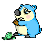
What do you think?
The colorfill outlines are good when they need to shrink things down because the lines end up dominating the image if they aren't converted to colorfills. However, when they take this colorfill outlined drawings and make them bigger (if they drew them to small and converted the lines to colorfills while the image was small) then the lines look horribly thick and quite attrocious, IMO.
For instance, Some new polarchuck shopkeepers... very adorable but this is by far the worst I've seen the thickeness of the lines get! Pretty soon pets will just be huge black blobs if the lines get any thicker!!


What do you think?
Wed Jan 26, 2005 2:54 am
I have noticed how thick the lines are, but, hey, they still look like Polarchucks, so I'm not complaining. I'd honestly rather they work more on the things they promised than making their artwork better. 
Wed Jan 26, 2005 2:55 am
I think that the thinner lines look more professional, and the thick lines look like they're done by a cutsey artist or someone went over the lines on their sketch with a permanent marker.
Personally? I prefer the thinner lines to these.
Personally? I prefer the thinner lines to these.
Wed Jan 26, 2005 2:57 am
Hmm, I dont know, I rather like the thick lines. 
Wed Jan 26, 2005 3:04 am
The thick lines have to go. They look like coloring book drawings.
Wed Jan 26, 2005 3:08 am
It's not so much the thickness of the lines that bother me, it's the quality of the lines. These look like they were just drawn over with a size 2 or 3 brush in Photoshop. They aren't as smooth as lines made in Flash. The lack of shading and the wobbliness of the lines also makes it look bleh.
...
Does TNT freeze you for critiquing their artists' work? o_o
...
Does TNT freeze you for critiquing their artists' work? o_o
Wed Jan 26, 2005 3:42 am
The one with the hearts looks kinda cute with thick lines. ^^;
I don't like the others that way, though.
I don't like the others that way, though.
Wed Jan 26, 2005 3:51 am
I like having a combination of different styles of art on neopets... outside the art gallery too 
Wed Jan 26, 2005 3:55 am
I actually love the think lines. Oo;
Wed Jan 26, 2005 3:59 am
>_> wow, anyone notice the shading is little to zip on those chucks?..well, faerie was shaded all wrong.
They must have a new artist that's trying to get use the the art programs.
I don't mind thick lines, but I do mind the poor excuse for shading, but I shouldn't be one to talk about crappy shading in images. =/
More I look at these images...it's gotta be a rookie artist(program-wise), those hearts' shininess was done with a pencil tool.
Wed Jan 26, 2005 6:48 am
Yea, the art talent is definetly there. They are all drawn very nicely just the lines really bother me! In addition to the heart shine... the ear on the ice cream one is the only part with the thin lines...
And on a side note... it may be coincidence but the dropped ice cream is mint chocolate chip... a running gag in Lilo in Stitch was the fat tourist who would always lose his scoop of mint chocolate chip ice cream
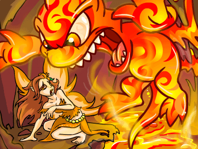
Oh and I forgot to mention this earlier... a good example of how making a colorfill outlined drawing bigger than it was drawn can be seen with this picture... they blew up the petpet much bigger than it was drawn and the lines are super thick compared to the much smaller faerie...

Wed Jan 26, 2005 7:37 am
I always figued it was just dependant on the artist's own style, but that fire faerie pic...wow what a difference in the lines!
I work in Illustrator, and you can scale your drawings so that the lines shrink and enlarge so you don't get weird things happening. I've never used Flash, but it must have a feature like that. My guess is that the lineart in some of the drawings is colored in Photoshop, and that would account for the inability to scale properly later on down the line.
I know Disney and all has strict standards for the lines in their drawings...and honestly I enjoy that Neo doesn't do that, at least to any noticeable degree. Part of the fun of Neo is their artwork. Most of the artwork that turns up has Neo's flavor, but also retains a little uniqueness from the artist which makes it a whole lot more like artwork than cartoon drawings.
Hmm, I was just looking at the Polarchucks again before I hit submit, and I realized that they are lacking pressure! Look how even the lines are, they remain the same thickness all the way through. Hmm. Well, they're awesomely cute nonetheless