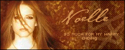
Dragonfire
1st Set:
I love space art; so I think the picture for this first set is spectacular, I really like how the avatar is differenmt then the usual, I also like the little pixel font in the corners...my main gripe about this set is the font used in the sig, it doesn't seem to quite fit, but besides that i very much like it:
7:10
2nd Set:
Another cool space image, the couple things not quite right is the font choice for the main text, and the jaggedness surrounding it. The pixel font is nice, it would look even nicer though if it had the same outline color as the main text:
5:10
3rd Set:
I think this image is the coolest of them all, really great. Again I'm no fan of the font used, actually in my opinion the set would look pretty cool with just the pixel font, but its still nice overall:
6:10
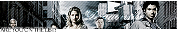
shinigamisrevenge
1st & 2nd Set:
I rate these together since there almost identical; I really likr the characters, there cool looking, the font is also nice, even though I think a thinner outline mite make it look nicer...my main dislike is the background though, it just doesn't seem to fit. but overall I like the characters and font but the background bothers me:
5:10
3rd Set:
Again I like the characters, there cool, the background is ok, could use something a bit more fitting though. I like the font even more in this set because the outline is way skinnier, looks nicer in my opinion; on the blibki pixel font, it looks a little wierd since it colers the whole thingm, maybe keeping it not animated would look a bit nicer in my opinion:
5:10
I have a space set of my own I made rather quickly, ratings are much welcomed.


