Sun Sep 19, 2004 8:17 pm
maniac wrote:
Can you rate these sets please:
Any ideas for subtext on that last one??

I redid it like this:


Any better?? - I know the subtext sucks a bit
I think I've rated that set before Dawn- its very good!
Sun Sep 19, 2004 11:30 pm
maniac wrote:I think I've rated that set before Dawn.
No. You haven't.
Mon Sep 20, 2004 3:25 am
Maniac (flower of beauty set): Ooh, pretty picture. I also like your color choices - the orange text vs. the black of the av is especially striking. I would smooth out the main sig text, and also the flower's edges, which are choppy, but I realize that how easy that is depends on what program you use. I'm a little ambivalent on the cut-outs - they seem to me to interfere with the image, and not to really match. I'd also move the sig subtext a little to the left.
Dawn2: You've definitely been improving a lot lately. I love the grid effects and coloring. All my nitpicks are going to have to do with text: in the av, the color doesn't match well, and the placement takes away from the image. In the sig, the main text doesn't seem to me to stand out enough, and (very nitpicky here), though the sig subtext is fine, that font generally looks better in all caps.
Maniac (Anubis set): Flowers! I adore the picture, and the colors. In fact, sometimes when you have a really nice base image like this, simplicity is best - I'd advise taking the grid and overlays out all together and letting the picture speak for itself. On the av, I'd move the text one pixel away from the border of the pic, so it looks cleaner. On the sig, I'd move the subtext down and to the right, and make the border of the main text thicker. Personally, I like main text to stand out more than subtext, but that's just my own preference.
ZH!: After looking at the set quite a bit, I just now figured out what that image was. And... uh, you've got me stumped for criticism. The coloring, text overlays, pictures, and text, all work together very smoothly, and the set overall is balanced and appealing - so nice job! And I love the star. XD
Apricus: Uh... totally off-topic, but since I never got a chance to tell you, I really loved that city set you had last. Now, about this one...it's quite cool! I can't make out what the picture is of or the sig text says, but even as an abstract work, it's nice. The color's very striking, and the grid adds texture, but isn't overdone. If it was up to me, I'd make the text in the sig a bit smaller, but other than that no complaints.
Amethyst: Waaah! Everyone needs to stop making such pretty sets, or I'm going to run out of compliments. Seriously: I love the picture and the background (not sure if it's from scratch, but if it is, more power to you). The main sig text is absolutely perfect, and the av text looks nice as well. I think the sig subtext stands out a little too much - I'd put it behind the main text and fade it a bit - oh, and it's a DDR song, cool! I'd also add a border to the av. And then, having done all that, I'd steal it and pretend I made it, because it's really awesome looking.
I would rate more, but I'm a lazy child, sorry.
--
Anyhow, can I get ratings on the pic I made for my LJ userinfo?
I'm really happy with the pic - I took it myself. It came out really really dark, but I was luckily able to fix that in PS - it also made it really contrasted, but I think that looks kind of cool anyhow.
Random bit of info: 4 fonts used in this piece. I actually downloaded a new grunge font for it. Pretty pretty.
Dawn2: You've definitely been improving a lot lately.
Maniac (Anubis set): Flowers! I adore the picture, and the colors. In fact, sometimes when you have a really nice base image like this, simplicity is best - I'd advise taking the grid and overlays out all together and letting the picture speak for itself. On the av, I'd move the text one pixel away from the border of the pic, so it looks cleaner. On the sig, I'd move the subtext down and to the right, and make the border of the main text thicker. Personally, I like main text to stand out more than subtext, but that's just my own preference.
ZH!: After looking at the set quite a bit, I just now figured out what that image was.
Apricus: Uh... totally off-topic, but since I never got a chance to tell you, I really loved that city set you had last. Now, about this one...it's quite cool! I can't make out what the picture is of or the sig text says, but even as an abstract work, it's nice. The color's very striking, and the grid adds texture, but isn't overdone. If it was up to me, I'd make the text in the sig a bit smaller, but other than that no complaints.
Amethyst: Waaah! Everyone needs to stop making such pretty sets, or I'm going to run out of compliments. Seriously:
I would rate more, but I'm a lazy child, sorry.
--
Anyhow, can I get ratings on the pic I made for my LJ userinfo?
I'm really happy with the pic - I took it myself. It came out really really dark, but I was luckily able to fix that in PS - it also made it really contrasted, but I think that looks kind of cool anyhow.
Random bit of info: 4 fonts used in this piece. I actually downloaded a new grunge font for it. Pretty pretty.
Mon Sep 20, 2004 4:26 am
Amethyst: I love the butterfly set. The colors selected work great together. The only criticism I can offer, is that the subtext seems a bit faded where it overlays lighter areas in the background. Other than that no compliants. 9.5/10
Maniac: The tulip set: I like the image that you chose to work with, but You could have done so much more with it. I don't think the text you used in the background to create swirls works very well. Also the text on the av is blocky and hard to read. For the grids, I would suggest maybe fading the grid out over one of the tulips to make it stand out more. 6/10
Maniac: Lily set: I like the stark difference between the lily and the background in this set. I don't think you should have put the faded image in the background on the redo. The cutouts are interesting. The only other thing is the edges of your main text on the sig is a bit jagged. Not a bad job. 7.5/10
Don't know if we are allowed to have wallpapers rated or not. If not this can be removed. Can i get ratings in this wallpaper I made it for a friend whos hooked on the game right now.
Also still taking ratings on my current set.
Mon Sep 20, 2004 7:01 am
shinigamisrevenge: Awesome set, the way you did the text is awesome, I love how it matches with the letter that Dieter(Is that his name?) is eating. The subtext looks a bit weird, but everything else is great! Good job!
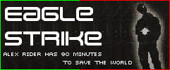
And, wow, the wallpaper looks really cool! I know nothing about wallpapers so I can't really say anything else.
Can anyone rate the set I made?


I really need to practice more, school is taking away most of my free time. =(
And, wow, the wallpaper looks really cool! I know nothing about wallpapers so I can't really say anything else.
Can anyone rate the set I made?
I really need to practice more, school is taking away most of my free time. =(
Mon Sep 20, 2004 1:38 pm
Darklegendary: I did that entire set from scratch after listening to Butterfly for two solid hours. Anyway, here's your rating:
The colors are strange, but I like it. It's awesome how you blended the picture into the background like that. The white parts in the background are sort of distracting; maybe you could lower the opacity? The way you did the text is wonderful, because it's faded enough so that it doesn't stick out, but you can still read it.
Overall, 9/10. Great job^^
Tue Sep 21, 2004 12:24 pm
Shingami (wallpaper): Eh, I'm not really a fan of it. For one, there's no room for desktop items without covering the image or text. For another, it's very simple. It doesn't really... flow, either. 6/10
Tue Sep 21, 2004 12:44 pm
Darklegendry: Love it. However, the av seems a tad plain, though it may just be me. There's something else bugging me about this, but I can't put my finger on it. Overall, it's very nice. 8.5/10
Can someone rate this set I made? It's the first thing I made using Image Ready, and I'm still trying to get the hang of it


Can someone rate this set I made? It's the first thing I made using Image Ready, and I'm still trying to get the hang of it
Tue Sep 21, 2004 1:08 pm
Alex wrote:Can someone rate this set I made? It's the first thing I made using Image Ready, and I'm still trying to get the hang of it
I really like it. It even blinks!
Can someone rate my current one? I threw it together last night on a whim when I decided to come back. ^^;
Tue Sep 21, 2004 8:51 pm
meowth: I really like the pictures you've used and the cutout an the av is very creative - but the cutouts dont match. However the pictures are placed really well and I like the subtext font a lot. WEll done!! Its great! 9/10
Rate please :
:


-------- yes, I know the main text is waaaaaaaaaayyyyyyyy too pixely
Rate please
-------- yes, I know the main text is waaaaaaaaaayyyyyyyy too pixely
Tue Sep 21, 2004 10:42 pm
Maniac: I like the set. All the colors work really well. The suggestion I have for your main font, this is coming from using PS, don't know which program you use, try turning the anti-alias back on and try the different settings. Some fonts need to have the anti-alias on or they become realy pixally. 8.5/10
Rate this set I did for Charka? First request I've ever done.


Rate this set I did for Charka? First request I've ever done.
Wed Sep 22, 2004 7:15 pm
I like that set, shinigami!
it looks marvelous on subBlack. the avatar is a little unclear and i think it should be a little more darker to fit better with the sig, but overall, i'd be happy if i would get a set like that
(rate my set if you don't have anything to rate xD)
it looks marvelous on subBlack. the avatar is a little unclear and i think it should be a little more darker to fit better with the sig, but overall, i'd be happy if i would get a set like that
(rate my set if you don't have anything to rate xD)
Wed Sep 22, 2004 7:19 pm
shingamisrevenge (I accidentally typed Charka at first): I love the way those big, circly things...yeah, shape the set. And normally, I don't like stuff blocking the avatar, this looks better. However, the circles on the signature aren't all that smooth. Only problem I see. (I love the sparkles, by the way!)
Maniac: I agree with shingami. You might want ot turn on the anti-alias. (it's above warp text if you're running the same version is PSP I am) That'll make the text better. I love fading, but there is one problem. The signature is 79 (78.8 K if you want to be specific) k, while the limit is only 50k. Also, I think the border should be goldenrod (or the colour you used on the main and subtext.) Those are the only problems.
meowth1982: I agree with Maniac (man, will I be agreeing with the people I rate above all day?) The cutouts don't match. I think the colours of the borders don't match either, or it's my eyes. Otherwise, nice job!
---------------------
It's a three-for-three. Order that I made them from newest to oldest.

 - I'll update it with the transparent avatar later. I thought I updated it. *sweatdrop*

 and
and  - wasn't sure which one was better.

 - this one was before my new style (which you saw above). I know the first image is pixelly. I had problems getting rid of the anti-alias lines.
Maniac: I agree with shingami. You might want ot turn on the anti-alias. (it's above warp text if you're running the same version is PSP I am) That'll make the text better. I love fading, but there is one problem. The signature is 79 (78.8 K if you want to be specific) k, while the limit is only 50k. Also, I think the border should be goldenrod (or the colour you used on the main and subtext.) Those are the only problems.
meowth1982: I agree with Maniac (man, will I be agreeing with the people I rate above all day?) The cutouts don't match. I think the colours of the borders don't match either, or it's my eyes. Otherwise, nice job!
---------------------
It's a three-for-three. Order that I made them from newest to oldest.
- I'll update it with the transparent avatar later. I thought I updated it. *sweatdrop*
and - wasn't sure which one was better.
- this one was before my new style (which you saw above). I know the first image is pixelly. I had problems getting rid of the anti-alias lines.
Wed Sep 22, 2004 9:20 pm
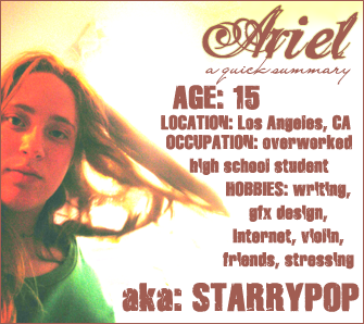
Starchaser - Awesome. The effects you've done to the picture of you with the sun 'shining' behins is awesome. The only think that I sort of don't like about it is the font you used for 'Ariel.'
shinigamisrevenge - Well, let's see. It's not bad, but it's a little washed out looking. There isn't enough color to it. I'd maybe add some more touches of blue to it. Blagh, I can't rate wallpapers...
Darklegendary - The sig is stunning. It's very original looking.The touched of purple are just enough to give it some interest. The thing that sort of ruins this set is how the av looks. It's too colorless, and sort of just look strange where you cut it off.
Alex - Love the animation. But the main font in the sig stands out to much and is too thick, and I guess it isn't dreamy enough, considering what the image you used looks like. Also, it's overall a bit empty.
meowth1982 - It's cute. The like the main font you've used. I'd may have also add the curly cutouts you used on the ab to the sig too...but what makes it set is it's simplicity. Your focus immediately goes to the cartoon character.
maniac - Very nice for the av. For the sig, add the same cutouts you used in the av. For the main font, use a script one. I'd also maybe lessen the height of the sig slightly.
shinigamisrevenge - It's unique with the patterns you've used in the sig and in the av...however, I don't like how it looks in the av. And they're a little too jaggedy looking in the sig, though cutouts tend to be.
DM- First set: I have a question! Is that just sort of your 'signature font?' anyway, the blue you used as a border doesn't go. And the script running through DMG stands out just alittle too much. I also don't like the boxiness of it or the cutouts in the corners.
Second set: My suggestion would be to not you the antialias tool all the time and occassionally delete things by hand. That will give you a cleaner look. This set is actually one of my favorites that you've made. It's layed out well, not very big, and though a tad plain, it goes well. In the av, slow down the animation just a little. It's a tad annoying right now.
Third Set: Eh...the subtext is pixelly. I don't like the placement of the main font. It's jaggedy around where you cut out the fire faerie. Meep! I'm done now.
Thu Sep 23, 2004 7:52 am
shinigamisrevenge- I like that set, only I don't like the avatar being a circle shape. And the sig, I don't like the transparent symbols at the NE and SW corners.
DM 2nd set-Love it! Did you get that quote from Nickleback? *nudges with elbow*Only I thoguht the animation colour on the avatar didn't suit it. And the signature font looks like it's saying "DM was on fise!".
Could somebody please rate this current set I'm using?

DM 2nd set-Love it! Did you get that quote from Nickleback?
Could somebody please rate this current set I'm using?