Sun Sep 12, 2004 1:18 pm
Alex - Very good set. The left of the signature seems a bit empty, but that's just me. 8/10.
Can someone please rate this set?


Thanks. ^^
Can someone please rate this set?
Thanks. ^^
Sun Sep 12, 2004 7:04 pm
robot wrote:Medli : I believe Jens' set actually says "A path towards the stars".
Oh. My. Word.
I really need my glasses!!
Sorry Jens.
Anubis:
The Camel could be shown more and its a little empty in the upper half..but still,good.
Sun Sep 12, 2004 9:17 pm
<b>DM</b> -- Again, tinting! And, emptiness. The main text is hard to read due to the font choice. Also, as I've said in the past, work on your text placement. If you experiment with text, it can fill up a signature easily.
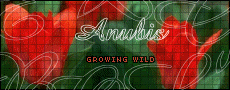
<b>Anubis</b> (the 3 sets) -- You need to put a border on the avatars of all your sets. Also, try downloading some new fonts. You'll find that they enhance a set when used properly. Also try to make the images look like they go with the background. If the main image is cartoony, make the background cartoony. Set a glow around the image to make it stand out some (especially with the dragon).
<b>Jens</b> -- The blue at the bottom of the set looks <i>really</i> bright. Wow. Maybe tint it a little, because it's really distracting, along with the huge cutouts. I prefer your subtle cutouts. Otherwise, it's a really pretty set.
<b>DM</b> -- Maybe you should try filling the set up with something else, rather than duplicating the image and lowering its opacity. And again, text placement! Move the text closer together, so that one's eyes are drawn to the center, rather than the huge space between them.
<b>Robot</b> -- Your style is so unique! It's awesome. No picks whatsoever.
<b>Moogie</b> -- Oooohhhh... lovely! The thing that might need improvement is the speed of the animation. It's a bit slow, so it looks kind of chunky. Oh, and the subtext font. It's rather difficult to read. The flower print overlay is a nice touch.
<b>Alex</b> -- Lurvely! Good border. I just would have picked a more orangy color or gone straight out black for the main text.
<b>Anubis</b> -- It's way too empty. Try mixing up the background colors a bit. I do like the subtext though. Funny.
Sun Sep 12, 2004 11:00 pm
Kitten Medli wrote:Flame wrote:DM - Er, you sound so sure the set would meet requirements for future rounds of PPTTG. Well, okay. Anyway. Stop colorizing. The faded image of her in the background doesn't look that great. And the font you used it a little too thin. Overall, this set is just too empty.
Colorizing is her style..everbody has got one. I dont feel she needs to change it unless she wants to.
Colorizing would be fine. Except that it doesn't make her sets look any better. It would be fine if there was some variations in even the color she chose to make the set, like having some darker purple thrown in.
Mon Sep 13, 2004 1:25 am
Anubis: (3 sets) I like all 3 of the sets. I love the backgrounds on the dolphin and the dragon sets. The edges of the cutout images are abit pixelated. I don't know much about PSP but in PS you can "feather" your selection edges so that they are not so noticable when copied to another image or layer. I agree with another post about the font. It's just a little too plain. 7/10, 8/10, 8/10
Jens: Nice set. I love the image(s) that were used. The only thing that bothers me (and its probably just me) is the cutouts seem a little large in height. Like I said probably just me. Nice job though. 9/10
Alex: I think this is a very simple and nice set. Hope you like PS, I love using it. THe only thing I see is that the edges of the main text are a bit soft. 9/10
Anubis: I like the camel set. It does have a lot of empty space, but for me it seems to work on this set. I don't know camels = desert, maybe? The only thing I notice is in your subtext the letters seem to run together in a couple places. Have you tried changing the spacing just where the letters run together? Thats what I do when I only have 1 or 2 letters that run together. 8/10
I really don't have anything for rating this time, so ratings on my current set?
Mon Sep 13, 2004 6:50 am
Anubis: The left side is a bit empty, you should use mor of the camel. But other that that this set is a great improvment from your last ones. Your doing great.
shinigamisrevenge: Wow, great set! I love the colors and how the polarchuck is eating the E. Hehe, and the subtext is great as well. 10
Can anyone rate my set I just made? I know, I really suck at this.. ^_^;


and, my revised version of the set I made for Denae..


shinigamisrevenge: Wow, great set! I love the colors and how the polarchuck is eating the E. Hehe, and the subtext is great as well. 10
Can anyone rate my set I just made? I know, I really suck at this.. ^_^;
and, my revised version of the set I made for Denae..
Last edited by +Phantom- on Thu Sep 16, 2004 2:49 am, edited 1 time in total.
Tue Sep 14, 2004 2:16 am
Jens - Very nice. It's definitely a cool image. I don't like the cutouts, and I don't like the height of it.
DM - It has color! *cheers* Okay. Starfire faded into the background look wierd. And the scratchy effect of the text sort of doesn't go.
moogs - Make the animation just the slightest bit slower so I can read each line all at once. I had to wait for them to fade back into view to read the whole lines.
Alex - Very simple. I like it. I'd maybe change the colors in the main text to something a little more vibrant.
Anubis- In the av, where you cutoff the animal's head is weird. The text doesn't look too great. For both the av and the sig the backgrounds are too plain. Make the main font in the sig bigger, and change the border color...er..Yeah.
Shinigami - I miss your Duo set. I have a slight obsession with him. XD (And I rated your current set already.)
+Phantom- - It's not bad. The subtext is a little hard to read. And the blue background doesn't really go. But I love the border you made.
Wed Sep 15, 2004 5:55 pm
Flame wrote:DM - It has color! *cheers* Okay. Starfire faded into the background look wierd. And the scratchy effect of the text sort of doesn't go.
*sweatdrop* Well, I didn't have anything to put in the BG. And the font that I liked (Grunge) looked really bad smaller, so I didn't do that. The reason I chose that font is to go with the subtext, since Good Charolette kinda has a hard rock sound to them. I didn't have anything else to go with it. It was just one of those things I did because I had found that picture and I had been searching for it forever.
I'll shut up now.
Thu Sep 16, 2004 9:39 pm
Phantom-
I love this first set you made! I realy like the border you made and the main font is nice and goes with the feel of the set. I like how youve got the two children to stand out of all the blue, they're nice and bright. The only thing I'm not sure about is the squashed picture on the av. The sig is awsome though! 9/10
9/10
2nd set: That is soooo great! I love the background, the picture, the yellow glw-thing, the BORDER!!!!!!!! That is brilliant! Well done! I can't see anything wrong! 10/10!!
Can you rate these sets please:


Any ideas for subtext on that last one??

I love this first set you made! I realy like the border you made and the main font is nice and goes with the feel of the set. I like how youve got the two children to stand out of all the blue, they're nice and bright. The only thing I'm not sure about is the squashed picture on the av. The sig is awsome though!
2nd set:
Can you rate these sets please:
Any ideas for subtext on that last one??
Thu Sep 16, 2004 10:04 pm
Maniac: Ooh...I love the animation on the first set! It's too big for my taste, though. Move the main text and subtext over and make it smaller. As for the second set, the main text of the sig is too plain. And the background is too plain too. I can't come up with a subtext.
more ratings later...
---------------------
Someone care to rate this set I made out of sheer boredom while wating for my mom to help me with my schoolwork?


more ratings later...
---------------------
Someone care to rate this set I made out of sheer boredom while wating for my mom to help me with my schoolwork?
Fri Sep 17, 2004 12:52 am
Maniac:
1st set: WAYYYY to plain. Try adding some brushes or textures to the background. I love the animation on the subtext, though, and the main font choice is cool^^
2nd set: Once again, try adding some stuff into the background. It'll really make the image stand out more. No ideas for subtext, sorry:(
DM:
The main text is rather hard to read. I like the pictures, especially the way one is faded into the background
-----------


Rate please?
1st set: WAYYYY to plain. Try adding some brushes or textures to the background. I love the animation on the subtext, though, and the main font choice is cool^^
2nd set: Once again, try adding some stuff into the background. It'll really make the image stand out more. No ideas for subtext, sorry:(
DM:
The main text is rather hard to read. I like the pictures, especially the way one is faded into the background
-----------
Rate please?
Sat Sep 18, 2004 3:02 am
Squee! Long time since I've rated stuff.
Amethyst: Wow, it's a gorgeous set. I love how vibrant all of the colors are. I'm a sucker for stuff like that. The way the text and subtext vary in color makes it very interesting to look at, and you used your space well. The butterfly is gorgeous! The only thing that I have to pick at is the fact that the avatar doesn't seem to have a border, which would make it look <i>that</i> much better if you put one on. ;D
DM: You're getting much better at making your sets. ^_____^ This one looks quite nice. You've gotten better at using up your space. It doesn't seem to be much of a problem in this one. The faded snow faerie in the background looks all right. There's something a little off about it, but I can't <i>quite</i> put my finger on it. I think the stroke you put on the text could be just a tad darker, because it almost blends in with the background as light as it is right now. Everything else looks wonderful, though.
Maniac: (First set) Mmm, it's pretty. I love leopard print. The animation is very creative and interesting. The text on the signature looks a bit odd, though, simply because the orange is rather bright and looks kind of off in the midst of all the more neutral colors. A light brown text with a black/dark brown stroke would do a bit better. -_^ The text placement in the avatar is a bit odd looking as well, since it's not quite centered. And there's quite a bit of empty space in both. Otherwise, though, it's a cute set.
Maniac: (Second set) Gorgeous piccie. I'm not too impressed with the set though, it's a little lacking. There's a lot of empty space in it despite the fact that it's a smaller set. Subtext might help this, yes, but there would still be a lot of empty space. A few swirls here and there, perhaps a faded flower in the background, would do this set a lot of good. Also, I don't really like the font you chose for the text in the sig. A script font, such as Selfish or Scriptina or the like, would go beautifully with the flower.
Blech, I'm tired now, and rating is hard when I'm tired, considering that I can't think straight when I'm tired. So... I guess I'll just ask for some ratings on my current set?


Amethyst: Wow, it's a gorgeous set. I love how vibrant all of the colors are. I'm a sucker for stuff like that.
DM: You're getting much better at making your sets. ^_____^ This one looks quite nice. You've gotten better at using up your space. It doesn't seem to be much of a problem in this one. The faded snow faerie in the background looks all right. There's something a little off about it, but I can't <i>quite</i> put my finger on it. I think the stroke you put on the text could be just a tad darker, because it almost blends in with the background as light as it is right now. Everything else looks wonderful, though.
Maniac: (First set) Mmm, it's pretty. I love leopard print.
Maniac: (Second set) Gorgeous piccie. I'm not too impressed with the set though, it's a little lacking.
Blech, I'm tired now, and rating is hard when I'm tired, considering that I can't think straight when I'm tired. So... I guess I'll just ask for some ratings on my current set?
Sat Sep 18, 2004 6:47 pm
Wow, it's been forever since I've done this. Maybe that's because I haven't regularly made sets in forever, so yes...moving on.
Silja: Muy bien! Very good quality, the only thing I'm iffy about is the excessive use of the butterfly brush. I see what you're trying to do with it, but perhaps setting the brush spacing a little higher would make it less crowded looking. I like it, though.
Alex: Mmm, it's very nice. The simplicity of it works very well, too. The only things I would adjust are the quality and the text. It's a little too grainy. Also, the border of the text looks greenish; if you made it orange or something similar to the picture, it would look fantastic. Bravo, especially for just starting with PS!
Anubis: It's nice, but really plain. The font is very boring, and is pixellated. What I would suggest doing is adding something to the center and/or right, change the subtext font to something else, and on the av, align the text to something. It looks really randomly placed. Good start, and just a few modifications would make it better.
Phantom: (Your set) That's really cute. The resizing didn't work too well in the av, the characters look really squished in it. In the sig, the text looks a bit too small, try making the subtext a little larger. Also, the menus are a cute idea, but way too small. Make them bigger!  Cute though, I like it!
(Denae one) Another really cute one! The colors are a bit crazy though. The text is rainbow, the monkey has a rainbow xylophone, but the background is...green? What I would do for this one is change the background to be more fitting with the rest of the image/text. But again, this is adorable, and I love it.
Maniac: (Dawn) I like the simplicity of it, it's very nice! And I was just looking at the subtext, that's really entertaining to watch! Hehe. The text in the av is a little misaligned, move it over to the right a click and down two. I don't know if that would make it right in the center, but if you use Photoshop, Ctrl+A-->Layers-->Align-->Horizontal Selection. It centers things. I really like this set; however, 'Dawn' in the sig seems bland (font- and color-wise) compared to the bg. Try changing that around.
(Maniac) The quality of this one is a bit iffy. I don't like the choice of font in the sig, it doesn't match with the flowerness at all. You did well with the simplicity though. Nice work! Also, move the 'Maniac' on the av down a click or two. I'm an aligning nutcase, sorry. :p
DM: This is nice, but really inconsistent. What I would suggest doing is making the doll above the grid in both the av and sig, for some reason it looks weird how it is now. I'd also do the same for the actual snow faerie on the side. The subtext also looks a bit big. Other than that, nice work!
Amethyst: Ooh, pretty! First thing I notice though is that the av doen't have a border. Add one, now. Another thing is that the text on the sig (subtext, that is), is a bit too close to the border. Push it over a few pixels, and that would make it look a bit better. Also, like I told Maniac, moving the text in the av over so it's aligned would make me happy. Unless you're going for an abstract effect...or something. I like this set though.
Apricus: I approve! I'm not sure if it's supposed to be anything in the background, but I like it! The dots add a good texture, too. The one thing I would change is the text in the av, it doesn't seem to match the abstractness of the rest of the set. Perhaps you could make it the same font as used in the sig, and just...yeah. I really like this set though. Nice work!
Now, for my secret underlying reason for rating...I made a set today, and I was wondering if anyone liked it. I haven't made anything in ages, and I wanted an opinion or several on it. So could someone please rate this? Thanks!

Silja: Muy bien! Very good quality, the only thing I'm iffy about is the excessive use of the butterfly brush. I see what you're trying to do with it, but perhaps setting the brush spacing a little higher would make it less crowded looking. I like it, though.
Alex: Mmm, it's very nice. The simplicity of it works very well, too.
Anubis: It's nice, but really plain. The font is very boring, and is pixellated. What I would suggest doing is adding something to the center and/or right, change the subtext font to something else, and on the av, align the text to something. It looks really randomly placed. Good start, and just a few modifications would make it better.
Phantom: (Your set) That's really cute.
(Denae one) Another really cute one! The colors are a bit crazy though. The text is rainbow, the monkey has a rainbow xylophone, but the background is...green? What I would do for this one is change the background to be more fitting with the rest of the image/text. But again, this is adorable, and I love it.
Maniac: (Dawn) I like the simplicity of it, it's very nice! And I was just looking at the subtext, that's really entertaining to watch! Hehe. The text in the av is a little misaligned, move it over to the right a click and down two. I don't know if that would make it right in the center, but if you use Photoshop, Ctrl+A-->Layers-->Align-->Horizontal Selection. It centers things. I really like this set; however, 'Dawn' in the sig seems bland (font- and color-wise) compared to the bg. Try changing that around.
(Maniac) The quality of this one is a bit iffy. I don't like the choice of font in the sig, it doesn't match with the flowerness at all. You did well with the simplicity though. Nice work! Also, move the 'Maniac' on the av down a click or two. I'm an aligning nutcase, sorry. :p
DM: This is nice, but really inconsistent. What I would suggest doing is making the doll above the grid in both the av and sig, for some reason it looks weird how it is now. I'd also do the same for the actual snow faerie on the side. The subtext also looks a bit big. Other than that, nice work!
Amethyst: Ooh, pretty! First thing I notice though is that the av doen't have a border. Add one, now.
Apricus: I approve! I'm not sure if it's supposed to be anything in the background, but I like it! The dots add a good texture, too. The one thing I would change is the text in the av, it doesn't seem to match the abstractness of the rest of the set. Perhaps you could make it the same font as used in the sig, and just...yeah. I really like this set though. Nice work!
Now, for my secret underlying reason for rating...I made a set today, and I was wondering if anyone liked it. I haven't made anything in ages, and I wanted an opinion or several on it. So could someone please rate this? Thanks!
Sun Sep 19, 2004 3:36 pm
ZH!: I like the set! Its very pretty - but I'm not really sure what the picture is of. I think the colours go well though, and star is a good touch to add to the set.
But I reckon sub tex or something in the bottom of the sig would make it a little less empty. Because the background is just plain black - you could maybe add a grid / texture / brush or something.
Its very creative so I give it a 8/10!
**********
Please rate?!

But I reckon sub tex or something in the bottom of the sig would make it a little less empty. Because the background is just plain black - you could maybe add a grid / texture / brush or something.
Its very creative so I give it a 8/10!
**********
Please rate?!
Sun Sep 19, 2004 5:35 pm
Maniac- Way too plain. First off, the pixel text on the av is too close to the border, making it looks incredibly blocky. I don't like the swirls or grids, either. It basically looked like you grabbed an image, threw on a grid and some sloppy swirls and some text. However, the text effect is decent, as are the colors. Not your best work, though- 5/10.
Rate, please.

Rate, please.