Thu Mar 17, 2005 6:28 pm
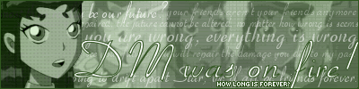
Starchaser: Hmm, well I don't really like it!  Sorry! You said you used three differen images for it, and I can see that - but the 'cartoon-y' woman in the set just doesn't really fit in with the photo-ish background.
 I have no creative adjectives
Anyway, I do like the text on the side though! It looks great! But I don't see the link with the text and the picture.
Maybe I'm just missing the whole point of it But I do hink you blended the images together well. You can't see a 'join' or anything.
Basically, I think you've done it well, but in my opinion it doesn't really make sense.
* * *
Could anyone rate this LJ icon I made please?

Anyway, I do like the text on the side though!
Maybe I'm just missing the whole point of it
Basically, I think you've done it well, but in my opinion it doesn't really make sense.
* * *
Could anyone rate this LJ icon I made please?
Fri Mar 18, 2005 3:31 am
DM was on fire! wrote:
And then this set, I have been wanting to make for a VERY long time, but I've been too lazy to do it. I also would like opinions as to use the quoted version, or the non-quoted version. My father says to use the quoted version.


I LOVE those!!!
I like your first set a lot, but it is a bit plain for my taste, so I would suggest putting some kind of subtle pattern behind the text. It's so pretty though....
9/10
I like the sig with all the words better for your second set, because otherwise the set somehow looks a bit unfinished and blurry, but I lurve the quoted sig and the av! Nice one!
Yet another 9/10 because I think it would be weird to give 10/10's.
Thu Mar 24, 2005 1:08 am
Edit by Marissa:
Marissa wrote:Ratings Board Rules:
1. Keep your criticism constructive.
2. You must give/get ratings at a ratio of at least 1:1, that means for every graphic you ask for ratings on, you must rate at least one other. And I mean a meaningful, well-thought out rating, not just a number or "that's good."
New Addition: These numbers do not stack up. If you rated two sets and asked for one rating, you cannot make a post later asking for one free rating because you rated earlier.
And be good about your ratings, if I see continue to see many ratings that simply say "that's good" in many words, I will raise the ratio to 3:1.
3. You may not ask for ratings on work that you did not make.
Thu Mar 24, 2005 7:09 pm
maniac wrote:Could anyone rate this LJ icon I made please?
I shure can, since you made it for me.
I like the font that says "anubis" right above the hamster on the right. However, the colour of it isn't exactly hard to read, but I feel it doesn't fit into the colour scheme of the animals and the pictures (too much white already, I feel).
The animation is nice, I like it - I can't see if the colour flashing in the boxes is blue or grey, but either way it fits snugly into the LJ icon.
Good job... 8.5/10.
---
Could someone please rate this set I made for myself? Thanks!


I made it in Paint, with a picture I took of my hamster (cheeks chock full of banana
Mon Mar 28, 2005 12:23 pm
Could anyone rate this LJ icon I made please?
Maniac: I don't really have any thing bad to say about this one, except the text could have been out-lined to make it stand out more. This would also have made it match with the border better.
I like the small animation you added at the bottom, its pleasantlly distracting from an otherwise plain icon. (Plus, the animals are UBERCUTE!!)
8/10
Could anyone please rate this set I made for myself? Thanks!
Anubis: Yay! More reeally cute animals! Anyway, moving on
8/10
Thu Mar 31, 2005 2:13 am
Oh wow, this thread has only progressed less than a page in the past month? Eep...quiet. O_o
maniac: Like Shadowfare, I don't really have much to say about this one, largely due to the fact that there wasn't much editing. The main thing I have to say though is that you can perhaps replace the black in the border and the outlines of the little animated squares to a shade of brown. Otherwise, it looks pretty neat, especially with that neat little flashy animated touch.
Anubis: Again, not much to say. Text placements are nice, although "born to be myself" could be moved a few pixels to the right. The av looks awesome in its own little way, but perhaps you can reflect that in your sig by adding a few tinges of blue (also, the sig image is a little too blurry...perhaps better selection would do nicely). Might be hard though- I don't know what program you're using.
Anywho...I'd like a few ratings on my kinda new set. Made from scratch in Photoshop (not drawn- dots were, but that doesn't really count)- other than the main text (drawn) and av text (font). There's also a tinge of animation, but it's a long wait (10 seconds -> animation -> 25 seconds, repeat).
Thanks!
Last edited by Yoshi on Fri Apr 01, 2005 2:54 am, edited 1 time in total.
Thu Mar 31, 2005 9:12 pm
Yoshi: Ooh, I love that. It's pretty. Original, too, I like how the animation is simple and not over done (I dislike over done animation) The curved text is good too, definately a favourite. The dots give good depth, too =D.
Can someone comment (not rate... I hate figures) on my signature? Remember that simplicity was in mind and the 'newspaper' clippings are coming from three different countries, the top one is american, hence the 'chopper' reference, the middle one is from Russia, but of course a mouthful of russian is useless, and the small title going up the side is British.
The actual incident is when two helicopters collided. (If you read the middle one, you can just about make out "A russian M-18 Military Helicopter has crashed...") and obviously 'Brit Chopper'
It's supposed to show how countries are oblivious to other country's losses (none of the sources show of other countries losses) apart from the American one, but they didn't lose anything.
Mon Apr 04, 2005 2:24 am
I believe I already told you I loved your set, Paul, so I'll rate Yoshi's.
I definitely prefer the second av better. It matches a lot better. The first av- the main problem for me is the text. You have all this beautifulness, and you used a brown color. However, I really do love the set in general. It's incredibly creative, and the text curve is genius. I would have taken out the animation if I were you, though, but it's subtle enough for me to not make a huge comment on it. 9/10
New set. Rate-age, please?
Wed Apr 06, 2005 1:36 pm
Yoshi: I love that set! Its really colourful and the animation gives it something extra nice.. I think the ten second gap is just fine.. not too sure with the longer one- but certainly too much would wreck the set, so this is very nice. I like the second avatar better, as the colours match with the sig. But on the other hand, theres nothing really wrong with the first one as the pattern links both halves of the set.
*I have just noticed that the border is really nice too *steals the idea*
xerai: Err- I don't really get the idea of it, so I'm just going to concentrate on the artistic side. I think you've combined all three images very well, and you've used an original border for a good effect. You've got the whole newspaper style and though the smaller text is blurred- the main text stands out so you can read it and it draws attention. Personally I think you should add something to get your message across. Maybe some fading subtext? But overall, thats a good signature!!
Dawn2: Ok, I like the way you've blurred the main text.. but still kept it legible. Very nice! ^^ The placement is good, and I'm guessing you've had to erase the background from the image of the girl, which you have done very well - although some of her shoulder seems to be missing. (Her right shoulder.. the strap is sort of in midair.) But maybe it was like that in the original picture. I don't see the connection with the main text and the image.. but then again I have no idea who the girl is either so I'm guessing thats linked somehow.
I think you've done the background very well. It's a bit empty -possibly due to the lack of subtext- but it doesn't seem to matter as there is some sort of subtle pattern there somewhere...
Anyway, I like it!!
***
Can you please rate these... ?
Wed Apr 06, 2005 4:37 pm
maniac wrote:xerai: Err- I don't really get the idea of it, so I'm just going to concentrate on the artistic side. I think you've combined all three images very well, and you've used an original border for a good effect. You've got the whole newspaper style and though the smaller text is blurred- the main text stands out so you can read it and it draws attention. Personally I think you should add something to get your message across. Maybe some fading subtext? But overall, thats a good signature!!
Hm, I tried explaining it as best I could, so I can't help you there. Thanks.. But the smaller text wasn't supposed to be blurred, it just became unreadable when I angled it. To be honest, it's supposed to be plain and simple and newspaper like, so I don't see how I could fit in fading sub text. Besides, I don't do animation. Nope. Never.
Thu Apr 07, 2005 10:33 pm
It was just an idea. The most important thing is that you like it.
Sun Apr 10, 2005 6:00 am
Maniac
Those sets are very pretty, the good thing about it is that its not boring. The first one is better than the second one in my opinion, the beige outline on the text makes it look awkward. Other than that, its pretty good.
Something you might want to think about, just to add some texture patterns or blurs, for example, copy the entire subtext, make a new layer, use some distortion on the new layer and use an eraser to erase some parts.
Can I get a rating for this?
Wed Apr 13, 2005 8:36 pm
watericesage wrote:Maniac
That's great! But in my opinion, the white pixel font doesn't fit there very well. But the picture is a great use of effects!
Anyone to rate my avatar and signature?
Wed Apr 13, 2005 11:38 pm
Oliverrr - I like both the avatar and the sig, but I really don't think you need to put the pixel text behind the scan lines in either. In fact, I really think you should move it to the front in both the av and the sig. (The main text in the sig isn't quite as bad - the overlay is fine there. But I've never liked the pixel-text-with-scanlines look. I can't say why.) Other than that, you're fine - although I'm not sure why you used a different orange grundo pic in your av from the one in your sig. I especially love your sig - I'm partial to simple sigs without cutouts. Just a rectangle and a thin border are fine. The blend between the purple picture and the grundo picture is very smooth, and although I suspect the pictures originally had nothing to do with each other, the dark-night overtones of the entire sig make the pics look like they actually belong together.
Could someone rate my set, please?
Could someone rate my set, please?
Fri Apr 15, 2005 4:48 am
oliverrr: Overall, I like the look and design of the set. The colours go well together. The text fits with the feel of the set. I like how the subtext fades in and out on the signature. 7/10
Miss Padfoot: I also really like the colours in this set. I like how you faded the subtext into the background on the signature. I am not a huge fan of the text you choose for Tori's name on the signature, but overall, I like the set. 7.5/10
Can someone rate these 2 colourizations I did, please and thanks?


1) is Dominic Monaghan
2) is Courteney Cox