Thu Sep 23, 2004 6:13 pm
Chaud wrote:DM 2nd set-Love it! Did you get that quote from Nickleback?*nudges with elbow*Only I thoguht the animation colour on the avatar didn't suit it. And the signature font looks like it's saying "DM was on fise!".
Yeah, Hero. It was going to be Ordinary by Train, but Hero looked better. Hold on...DM was on fise? XD
Flame wrote:I have a question! Is that just sort of your 'signature font?'
Cobb. One of my favourites, because I was born in Cobb County, Georgia.
Flame wrote:My suggestion would be to not you the antialias tool all the time and occassionally delete things by hand. That will give you a cleaner look.
What do you mean by the 'antialias' tool? You mean the stray pixels? It didn't look so bad when I erased the background, but I had to restart my computer (40% resources and PSP 8 on Windows ME. Do you know how slow that is? You could drink a cup of tea and eat 2 sandwiches by the time it loads a tool!) and didn't save the layers, so when I tried to erase it...bye bye background. *sweatdrop* Must save layers!
Fri Sep 24, 2004 4:46 am
<b>Amethyst</b> -- I went backward just to find this set. I love it! Especially since "Butterfly" was one of my favorite songs in the 8th grade. It's gorgeous. Great colors and effects. It's lovely. The <i>only</i> pick I have with this set is that the subtext could have been placed better.
<b>Maniac</b> (flower set) -- The bottom of the flower in the background is cut off. It's irksome. Also, your main text needs to be anti-aliased so that it doesn't look so pixelly. Good colors though.
<b>Ariel</b> -- I don't know how you do it, but you always make font work. I love the ones you chose and how you put them together. The contrasting effect is pretty awesome as well. The lighting in the back looks great; it makes for a really cool effect. I love it.
<b>Darklegendary</b> -- Oooohh! Pretty! I love the wispy strokes on the sig; they don't look very apparent on the avatar though. The dark colors are great. There's nothing bad about it.
<b>Alex</b> -- Decent job with the fading, but it needs to go a big faster. When you use tweens, set the delay speed on the tweens at 0. That makes the fading a bit smoother. But keep the speed of the normal frames; it's perfect. The space behind the main text needs a bit of something. Try a scanline/grid/something generic overlay. =P
<b>Meowth</b> -- Cute! It's really simple, but I like it a lot. The text placement could have been better; but I suppose with an image like that, you did the job well. I'm a bit partial to matching cutouts on the avatar and signature, but I like each of the ones you chose. To each his own, I suppose.
<b>Maniac</b> (Anubis set) -- The cutouts don't match. Again, anti-alias the font so that it's not pixelly. Either place the subtext in a corner or re-align both texts so that the set doesn't look unbalanced.
<b>Shinigamisrevenge</b> -- Interesting! The only pick I have is the fading speed of the subtext. Like with Alex, you need to set the fading layers need to be set at no delay so that it's not choppy.
<b>DM was on fire!</b> (first DMG set) -- Looks like the same picture I used when I made that DMG set for your set contest. The quality isn't all that great though. Don't use the "screen" blending mode if it'll make the text look neon like that.
<b>DM was on fire!</b> (2nd DMG set) -- The edge of the DMG is really pixellated; did you just use the lasso tool to remove the background? Next time try a layer mask and delete it by hand. What's the difference between the two sigs? That DMG is in a slightly different position? I suppose then I like the first better; I always prefer to see more of the image. Your main text font needs to be thicker or a different color so that one can actually pick it out.
<b>DM was on fire!</b> (Fire faerie set) -- Text placement needs improvement. The edges of the fire faerie are really chunky. Again, I stress using layer masks; they're really handy and they make everything look smoother. The subtext and the text on the avatar are extremely pixelly. Keep anti-alias checked unless you're using a pixel font. I like the size of this set though, and you do an all right job of filing up space.
<b>Chaud</b> -- Um... interesting. I suppose I'd need to understand the theme of your set first, but I'll try to rate it anyway. First off, if you're going to do multiple color border, don't cut off the pixels like that. They should fade into each other. Try the gradient tool. I don't know what else to rate.
I haven't had anything to rate for awhile... so let me poke around.
edit: Please rate the sets I made for Lillie and Messs17.


I was trying out the subtle background animation thing.
<b>Maniac</b> (flower set) -- The bottom of the flower in the background is cut off. It's irksome. Also, your main text needs to be anti-aliased so that it doesn't look so pixelly. Good colors though.
<b>Ariel</b> -- I don't know how you do it, but you always make font work. I love the ones you chose and how you put them together. The contrasting effect is pretty awesome as well. The lighting in the back looks great; it makes for a really cool effect. I love it.
<b>Darklegendary</b> -- Oooohh! Pretty! I love the wispy strokes on the sig; they don't look very apparent on the avatar though. The dark colors are great. There's nothing bad about it.
<b>Alex</b> -- Decent job with the fading, but it needs to go a big faster. When you use tweens, set the delay speed on the tweens at 0. That makes the fading a bit smoother. But keep the speed of the normal frames; it's perfect. The space behind the main text needs a bit of something. Try a scanline/grid/something generic overlay. =P
<b>Meowth</b> -- Cute! It's really simple, but I like it a lot. The text placement could have been better; but I suppose with an image like that, you did the job well. I'm a bit partial to matching cutouts on the avatar and signature, but I like each of the ones you chose. To each his own, I suppose.
<b>Maniac</b> (Anubis set) -- The cutouts don't match. Again, anti-alias the font so that it's not pixelly. Either place the subtext in a corner or re-align both texts so that the set doesn't look unbalanced.
<b>Shinigamisrevenge</b> -- Interesting! The only pick I have is the fading speed of the subtext. Like with Alex, you need to set the fading layers need to be set at no delay so that it's not choppy.
<b>DM was on fire!</b> (first DMG set) -- Looks like the same picture I used when I made that DMG set for your set contest. The quality isn't all that great though. Don't use the "screen" blending mode if it'll make the text look neon like that.
<b>DM was on fire!</b> (2nd DMG set) -- The edge of the DMG is really pixellated; did you just use the lasso tool to remove the background? Next time try a layer mask and delete it by hand. What's the difference between the two sigs? That DMG is in a slightly different position? I suppose then I like the first better; I always prefer to see more of the image. Your main text font needs to be thicker or a different color so that one can actually pick it out.
<b>DM was on fire!</b> (Fire faerie set) -- Text placement needs improvement. The edges of the fire faerie are really chunky. Again, I stress using layer masks; they're really handy and they make everything look smoother. The subtext and the text on the avatar are extremely pixelly. Keep anti-alias checked unless you're using a pixel font. I like the size of this set though, and you do an all right job of filing up space.
<b>Chaud</b> -- Um... interesting. I suppose I'd need to understand the theme of your set first, but I'll try to rate it anyway. First off, if you're going to do multiple color border, don't cut off the pixels like that. They should fade into each other. Try the gradient tool. I don't know what else to rate.
I haven't had anything to rate for awhile... so let me poke around.
edit: Please rate the sets I made for Lillie and Messs17.
I was trying out the subtle background animation thing.
Fri Sep 24, 2004 6:48 pm
vkceankraz, those are very nice sets, the background animation is really well done, the subtexts are nice too; yet there are a lot of people using subblack and there around the books and barbecue there is a thin white border. you should try and edit it with an eraser to make it fit for every subcolor 
Fri Sep 24, 2004 7:15 pm
vkceanraz wrote:Looks like the same picture I used when I made that DMG set for your set contest. The quality isn't all that great though. Don't use the "screen" blending mode if it'll make the text look neon like that.
It is! I tried to find that picture since I liked it so much and found it. I think the reason that the text looks like that is I forgot to set the opacity on the text or didn't set it all that low.
vkceanraz wrote:The edge of the DMG is really pixellated; did you just use the lasso tool to remove the background? Next time try a layer mask and delete it by hand. What's the difference between the two sigs? That DMG is in a slightly different position? I suppose then I like the first better; I always prefer to see more of the image. Your main text font needs to be thicker or a different color so that one can actually pick it out.
No, I used the fill tool on about a 38 or so tolerance the the BG eraser. And the difference is the second one is shorter on the bottom.
Sat Sep 25, 2004 3:52 pm
vkceankraz: The cutouts on Lillie's are perfect! It makes it feel kind of old timey, and I really like it. Messs17's is nice too. Darn it, I can't find anything wrong with them! Although I think that's a good good good thing!
Can someone rate the new one I just made? I just got some brushes for PSP and I'm slowly learning cutouts. I hate how when I set transparency in PSP 8 it knocks it down to 256 colors, I feel like it takes away a lot from the original look of the sig. :/ Here they are though:


Can someone rate the new one I just made? I just got some brushes for PSP and I'm slowly learning cutouts. I hate how when I set transparency in PSP 8 it knocks it down to 256 colors, I feel like it takes away a lot from the original look of the sig. :/ Here they are though:
Sun Sep 26, 2004 10:28 pm
DM: (this is your time) 7/10. it's not bad. you used a weird layer blend mode for the backround text, maybe next time try soft light or overlay (if you use PSP, dunno if you have photoshop). and the 'DM was on fire' is a difficult text to read.
(they say that a hero can save us) nice! did you put the image on a different layer? cause that's what it seems like. i like it, but again - the 'DM was on fire' is sotr of hard to read. 8/10
(where's the fire truck) 8/10. the backround is ok (did you do a sunburst or something in the left hand corner?) and the text is pixelly on the av and the subtext on the sig. (did you have antialias checked?)
Chaud: 5/10, the pic is blurry and the border is um...awkward. I can't see the sig because photobucket is acting up right now.
vkceankraz: oh wow! those are so pretty! i love 'em. the subtext on lillie's sig could be outlined, because it's a tad hard to read without a border but I love the backround animation. I love your cutout for Mess17's sig. They're beautiful. 9/10 for both.
Meowth1982 I can't see the av because photobucket is acting up, but I like the sig! The text sticks out great and its easy to read for the most part which is good. The backround is sort of lacking detail. it's hard to see it because the purples are almost the same. But I like how the zafara is cut out ^_^
Now, you can rate this if you want, but I only really wanna know which one you like best. (They're LJ headers if you can't tell.) It's my first time blending which is why it wasn't done very well. Just wanna know which color looks best (in your opinion. I can't chose).
1.
2.
3.
4.
I know some of the pics probably aren't showing up. Photobucket is being a big meanie right now x_x.
Sun Sep 26, 2004 11:20 pm
Kim: Those are the best. I really do love them ^^ so pretty *_*
Fzun: I only see the first one. I really love this one. The only thing bugging me is the blending, some of it's a little confusing, but other then that, I love the first one ^^ Also, you should try creating some kind of border around the guy because it looks kinds wierd. the second one...is the same thing...O_O?
...I still have the av you made me ^^
see?:
Love that av!
anyways *ahem* Anyone mind rating this set I made me? It's my official set ^^


Gotta love the hightops ^^
Fzun: I only see the first one. I really love this one. The only thing bugging me is the blending, some of it's a little confusing, but other then that, I love the first one ^^ Also, you should try creating some kind of border around the guy because it looks kinds wierd. the second one...is the same thing...O_O?
...I still have the av you made me ^^
see?:
Love that av!
anyways *ahem* Anyone mind rating this set I made me? It's my official set ^^
Gotta love the hightops ^^
Mon Sep 27, 2004 6:04 am
Chii: Ooh, spiffy. I like the color scheme, cut-out, and layout, as well as the cool lines and BG. I would make the shoes a little more prominent (perhaps fade the bg a little?) and move the sig subtext a bit to the left so it doesn't interfere with the pic, and makes the sig look more balanced.
Fzun: Can't see them now, but I saw in your LJ and kept meaning to comment... I like the grey one best, with the orange one coming in second. Can't really do a proper rating now, as I can't see the pics.
Meowth: Can't see the pic, sorry.
Kim: Wow. Seriously, those are amazing. I love them both, especially Lillie's set. The animation works perfectly - it's beatiful, and adds to the set without being distracting. Hmmm... on Lillie's set I might make the subtext stand out a bit more, by stroking it or something, but it really looks fine as is because the background's fairly light. Can't really think of anything else.
Chaud: Hmm... I like the sig piccy... the av pic is interesting, but a little... I don't know...just strange. It's not bad, though. The fonts and composition in the sig are good, but the text is way too bright - you should fade it a bit. I would also get rid of the bright green/red borders, they're really distracting and don't match.
DM:
(set 1): This is my favorite of the ones here... I like the close focus of the picture, and the text overlay (although I'd tune it down a bit on the av). I would change the coloring of the text in both av and sig, which don't really match with the pic, and make the main sig text slightly more prominent, since that font is really skinny.
(set 2): The pic is kind of sloppily cut out, and it's really distracting - I'm also not crazy about the way you made the "fire" in the av black - I know you were trying for contrast, but it looks kind of odd. The BG is nice. The sig subtext, I'd go with another font.
(set 3): As you mentioned, the fire faerie is kind of pixelly. So is the text on the av, and the subtext on the sig, which are really bright and take up a lot of room - I'd go with a pixel font instead. Overall, my main complaint is that both the av and the sig look really cramped.
Shinigami: Preeetty! That's your first request? Ack, it's too good for that, you should have seen mine... uh, yeah, nevermind. I like the composition of the av - it's pretty original, and striking, and the insignia added over the face is a nice touch. The sig is nicely done too, although the edges of the shapes are a bit pixelly. Nice placement of the text, it's a little awkward, but I can't think of anywhere better any of it could have gone.
Maniac: In the av, I like the height, the text, and the gridding, but I'd take out the cut-outs at the bottom - they don't really help the image, and they don't match the sig. I'd also replace the white in the border with a pale yellow (that goes for the sig too). In the sig... hmm, I think I'd either space out the subtext, or move the main text down next to it. I'd also make the main text a contrasting color, like blue, to give the set some variety (if you did that, you could do the same for the av text).
Alex: Also not working.
So... what do you think? Picture taken by someone else, but severely edited by me. The sig was a lot spiffier when it was 93K, but I had to take out a lot of the animation. Hmph.
 or
or  ?
?
And
Fzun: Can't see them now, but I saw in your LJ and kept meaning to comment... I like the grey one best, with the orange one coming in second. Can't really do a proper rating now, as I can't see the pics.
Meowth: Can't see the pic, sorry.
Kim: Wow. Seriously, those are amazing. I love them both, especially Lillie's set. The animation works perfectly - it's beatiful, and adds to the set without being distracting. Hmmm... on Lillie's set I might make the subtext stand out a bit more, by stroking it or something, but it really looks fine as is because the background's fairly light. Can't really think of anything else.
Chaud: Hmm... I like the sig piccy... the av pic is interesting, but a little... I don't know...just strange. It's not bad, though. The fonts and composition in the sig are good, but the text is way too bright - you should fade it a bit. I would also get rid of the bright green/red borders, they're really distracting and don't match.
DM:
(set 1): This is my favorite of the ones here... I like the close focus of the picture, and the text overlay (although I'd tune it down a bit on the av). I would change the coloring of the text in both av and sig, which don't really match with the pic, and make the main sig text slightly more prominent, since that font is really skinny.
(set 2): The pic is kind of sloppily cut out, and it's really distracting - I'm also not crazy about the way you made the "fire" in the av black - I know you were trying for contrast, but it looks kind of odd. The BG is nice. The sig subtext, I'd go with another font.
(set 3): As you mentioned, the fire faerie is kind of pixelly. So is the text on the av, and the subtext on the sig, which are really bright and take up a lot of room - I'd go with a pixel font instead. Overall, my main complaint is that both the av and the sig look really cramped.
Shinigami: Preeetty! That's your first request? Ack, it's too good for that, you should have seen mine... uh, yeah, nevermind. I like the composition of the av - it's pretty original, and striking, and the insignia added over the face is a nice touch. The sig is nicely done too, although the edges of the shapes are a bit pixelly. Nice placement of the text, it's a little awkward, but I can't think of anywhere better any of it could have gone.
Maniac: In the av, I like the height, the text, and the gridding, but I'd take out the cut-outs at the bottom - they don't really help the image, and they don't match the sig. I'd also replace the white in the border with a pale yellow (that goes for the sig too). In the sig... hmm, I think I'd either space out the subtext, or move the main text down next to it. I'd also make the main text a contrasting color, like blue, to give the set some variety (if you did that, you could do the same for the av text).
Alex: Also not working.
So... what do you think? Picture taken by someone else, but severely edited by me. The sig was a lot spiffier when it was 93K, but I had to take out a lot of the animation. Hmph.
or ?
And
Last edited by Starchaser on Wed Sep 29, 2004 12:08 am, edited 2 times in total.
Tue Sep 28, 2004 12:34 am
Chii: Ahhh awesome! What font is that pixel text? It's totally awesome, love the stars. 10/10
Starchaser: Do I even have to say? Definately a 10/10. I'd love to see it with the full animation
EDIT: Could I get a rating on this header? It's huge, I know. I made it in gray, purple, and blue if anyone wants to see those (just PM me).

Starchaser: Do I even have to say? Definately a 10/10. I'd love to see it with the full animation
EDIT: Could I get a rating on this header? It's huge, I know. I made it in gray, purple, and blue if anyone wants to see those (just PM me).
Wed Sep 29, 2004 7:27 am
Starchaser : I love that set. I like the second avatar more, though. The animation in the second avatar is wonderful. I love how much the leaf sticks out, but still blends in {assuming that makes any sense}. The font you used on the signature is nice and simple. The main text looks wonderful, I love the subtext, although, it is a bit hard to read when you are half asleep. I think the subtle animation works well. If you still have it and don't mind posting it, I'd love to see the original signature. ;D 9/10
-- Rate my current set, please.
-- Rate my current set, please.
Thu Sep 30, 2004 12:30 am
Starchaser: Ooh, I like the set a lot. I like the animation in the smaller av, but I like the name on the bottom of the larger av. The only thing I see is that the subtext on the sig is a littler hard to read. 9.5/10
Can I get ratings on this new set? I know the image quality on the av isn't the greatest, but its all that I have to work with right now.


Can I get ratings on this new set? I know the image quality on the av isn't the greatest, but its all that I have to work with right now.
Thu Sep 30, 2004 1:15 am
shinigamisrevenge wrote:Starchaser: Ooh, I like the set a lot. I like the animation in the smaller av, but I like the name on the bottom of the larger av. The only thing I see is that the subtext on the sig is a littler hard to read. 9.5/10
Can I get ratings on this new set? I know the image quality on the av isn't the greatest, but its all that I have to work with right now.
Was the image of Sora originally the size he is in the sig? Because I've seen a larger picture of Sora in that special form. (I forget what it's called.) If you maybe want it, let me know.
I wouldn't use cutouts around Sora in the sig. It's waaaay too messy. Give both the av and sig a more noticeable border, maybe a blue one. The swirls in the background are also way too overpowering...Eh.
Thu Sep 30, 2004 6:50 am
Robot: I really like the set, although I'm not the most thrilled with the fact that you're name's no where on it. However, the color blending is very good, and I really like the Japanese placement.
Could someone rate the new avatar I made for this set? I'm not going to use it since it's to big, it's just something I was playing with in PSP. Basically just pratice. ^_^;;

Could someone rate the new avatar I made for this set? I'm not going to use it since it's to big, it's just something I was playing with in PSP. Basically just pratice. ^_^;;
Thu Sep 30, 2004 11:21 pm
Hmm...I'll rate five things. (Whee, haven't done this in so long.)
meowth1982: Mm, that'd be pretty good as an LJ icon if you can't use it here! Anyways, you've done a good job with it- the border fits well especially. However (although it may just be because I'm viewing it on a grey background), the border gets easily confused and tangled with the sparkles, which, although are nice touches, are overused. That's kind of the main problem with the av, although it's pretty small anyway. Get rid of a few sparkles, make the Zafara stand out a little more (try to smudge up a glow or something in PSP).
shinigamisrevenge: Hmm...I see a lot of effort put into this, which is awesome, but some of the efforts wasted. Going back to what Flame said, the swirls are overpowering and the cutout is unnecessary and kinda messy. You also have a white border right now (and it's inconsistent; there's a blue border for the cutout, it seems), which, unless you use subBlack, will kinda come out as nothing for those with lighter backgrounds. Try sticking a dark one after the white one, that'd work out pretty nicely. Your text is also a little blurry, especially the animation.
robot: Need I say anything but nice? ;P Anyways, I can't really tell what you've done to the original picture, so not many comments here. Japanese is a cool touch again (yet I'm still wondering what it means), but I'm a little iffy on the font you chose for the English. Seems a little too plain...if you get my drift, heh.
fzun: Ooooh, orangeeee. The masking job, however, I'm kinda confused on. The cutoffs are a little too strange for me, as on the right side several faces are cut. Are you trying for a burnt paper effect, or...? Anyway, great I see is the cool blur thing you did with the bottom guy (is that the Ying Yang Twins? I don't know my hip hop artists, haha).
Starchaser: Wow, that animation is awesome, I'll never figure it out. XP Anyways, contrary to robot's opinion, I'm leaning towards the first one. Not because of the text, but because of its size. I'm not quite sure what's going on in the sig, but whatever you did, it's totally fine the way it is!
<hr>
Aaaanywho, the reason I've come here. Anyone willing to rate my October set? (I made it two weeks ago and only let a few people see, just didn't bother to use it till now cause Rikio made me such a nice set...and Spira and Rune forced a Pochacco set on me. *glares* ;P)
Blah, the text on the av is blurry. ;_; Two sigs, I'm using the second one, but I'll put both up anyway. Yes, these were drawn as usual, but were more Photoshopped than other sets.

meowth1982: Mm, that'd be pretty good as an LJ icon if you can't use it here! Anyways, you've done a good job with it- the border fits well especially. However (although it may just be because I'm viewing it on a grey background), the border gets easily confused and tangled with the sparkles, which, although are nice touches, are overused. That's kind of the main problem with the av, although it's pretty small anyway. Get rid of a few sparkles, make the Zafara stand out a little more (try to smudge up a glow or something in PSP).
shinigamisrevenge: Hmm...I see a lot of effort put into this, which is awesome, but some of the efforts wasted. Going back to what Flame said, the swirls are overpowering and the cutout is unnecessary and kinda messy. You also have a white border right now (and it's inconsistent; there's a blue border for the cutout, it seems), which, unless you use subBlack, will kinda come out as nothing for those with lighter backgrounds. Try sticking a dark one after the white one, that'd work out pretty nicely. Your text is also a little blurry, especially the animation.
robot: Need I say anything but nice? ;P Anyways, I can't really tell what you've done to the original picture, so not many comments here. Japanese is a cool touch again (yet I'm still wondering what it means), but I'm a little iffy on the font you chose for the English. Seems a little too plain...if you get my drift, heh.
fzun: Ooooh, orangeeee. The masking job, however, I'm kinda confused on. The cutoffs are a little too strange for me, as on the right side several faces are cut. Are you trying for a burnt paper effect, or...? Anyway, great I see is the cool blur thing you did with the bottom guy (is that the Ying Yang Twins? I don't know my hip hop artists, haha).
Starchaser: Wow, that animation is awesome, I'll never figure it out. XP Anyways, contrary to robot's opinion, I'm leaning towards the first one. Not because of the text, but because of its size. I'm not quite sure what's going on in the sig, but whatever you did, it's totally fine the way it is!
<hr>
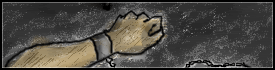
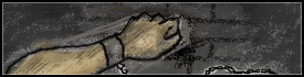
Aaaanywho, the reason I've come here. Anyone willing to rate my October set? (I made it two weeks ago and only let a few people see, just didn't bother to use it till now cause Rikio made me such a nice set...and Spira and Rune forced a Pochacco set on me. *glares* ;P)
Blah, the text on the av is blurry. ;_; Two sigs, I'm using the second one, but I'll put both up anyway. Yes, these were drawn as usual, but were more Photoshopped than other sets.
Fri Oct 01, 2004 12:08 am
Yoshi : You never cease to amaze me. I absolutely love the set. I like the second signature better. The first one just doesn't have the same appeal. I don't think the text on the avatar looks all that blurry either. I love the "scratchiness" on the hand/arm. It's a nice touch. I'm so envious of you! >.< 10/10
As for my set. It does have my name on it. That is what the Japanese is. As for what I did to the original image, I flipped it, adjusted the contrast, and cut out majority of the background. I was going for that whole.. minimalistic look that I love so much. I'm actually in the process of redoing it. I decided that I don't like it anymore. Well, I do. Just.. not the way it is. Expect to see something different in a few days.
As for my set. It does have my name on it. That is what the Japanese is. As for what I did to the original image, I flipped it, adjusted the contrast, and cut out majority of the background. I was going for that whole.. minimalistic look that I love so much. I'm actually in the process of redoing it. I decided that I don't like it anymore. Well, I do. Just.. not the way it is.