Mon Dec 06, 2004 3:29 am
Yoshi:
Just beautiful. I've always been jealous of your artistic style, because it's always been so much better than mine rofl. The snowman is so unbelieveably cute! A very very good set ^_^
Can someone rate this set I did for YesItIsh? It seems so bright to me rofl


Edit: Just as a note in case anyone else rates: This set was requested...the blue background is there for that reason. Thank you!
Just beautiful. I've always been jealous of your artistic style, because it's always been so much better than mine rofl. The snowman is so unbelieveably cute! A very very good set ^_^
Can someone rate this set I did for YesItIsh? It seems so bright to me rofl
Edit: Just as a note in case anyone else rates: This set was requested...the blue background is there for that reason.
Last edited by meowth1982 on Sat Dec 11, 2004 5:53 pm, edited 1 time in total.
Mon Dec 06, 2004 6:36 pm
Meowth: Yum! I really like the set, but I don't like the way the text bar is in the middle. I think if didn't have it and had a border around the text it may look better. I also don't like the colour of the main text. The red doesn't go with the blue background and one last thing: the devilish muffin on the av is pixelly.
Yoshi: Aah! It's so cute! They're all so realistic, especially the night sig. Maybe in Spring you could make the snowman melting. XD I see nothing wrong with it.
Fzun: I haven't seen you in a long time, girl! Welcome back! I love your new style. The font is cool too, but the "F" looks too much like a "P". I like the glow on the text though.
------------------------------
I joined a Denver and the Mile High Orchestra forum and decided to make a sig for it, but decided that I wanted to use the set here, I decided to make a av (they don't allows sigs.)


Programs: PSP 8 and Paint for resizing
Images: http://thoiathoing.250free.com/DATMHOBandShot.jpg (main pic), http://thoiathoing.250free.com/DATMHOActTheScat.jpg (album cover for the album Act the Scat, background image)
Oh, and incase you're wondering about the main text font, it has to do with their album Stand. And also, I colourized Denver's face for the BG image myself. That was fun.
Yoshi: Aah! It's so cute! They're all so realistic, especially the night sig. Maybe in Spring you could make the snowman melting. XD I see nothing wrong with it.
Fzun: I haven't seen you in a long time, girl! Welcome back! I love your new style.
------------------------------
I joined a Denver and the Mile High Orchestra forum and decided to make a sig for it, but decided that I wanted to use the set here, I decided to make a av (they don't allows sigs.)
Programs: PSP 8 and Paint for resizing
Images: http://thoiathoing.250free.com/DATMHOBandShot.jpg (main pic), http://thoiathoing.250free.com/DATMHOActTheScat.jpg (album cover for the album Act the Scat, background image)
Oh, and incase you're wondering about the main text font, it has to do with their album Stand. And also, I colourized Denver's face for the BG image myself. That was fun.
Tue Dec 07, 2004 3:19 am
Yoshi wrote:Ratings Board Rules:
2. You must give/get ratings at a ratio of at least 1:1, that means for every graphic you ask for ratings on, you must rate at least one other. And I mean a meaningful, well-thought out rating, not just a number or "that's good."
Tue Dec 07, 2004 6:09 am
Meowth:
Awesome, attack of the muffins! lol, great set, but a little bit plain. 8.5/10 ^_^
DM:
Oooo, I likey the red, and how the pictures looks all pixely. The only thing I could say that would make it better IMO is to maybe make the pictures more pixely; if that makes sense..lol 9/10 :0)
Can anyone rate my current Winter Pop themed set please? Sanae Chan rocks my socks.
Tue Dec 07, 2004 6:40 pm
+Phantom- : Very nice set, cute pics and all! I don't like the vertical text in the av though, vertical text seldomly works out anywhere for that matter. Nice background, to add something
Can someone please rate my current set I made for myself, just for the fun of it? Thank you
Can someone please rate my current set I made for myself, just for the fun of it? Thank you
Wed Dec 08, 2004 3:17 am
Aiye... I didn't follow the rules. ToT I'm such a... w.e. -o- Anyways...
Silja - I like the picture you used. It looks like something from a fairy tale of some sort. In my opiion, the sub-text for the sig is a teensy weency bit hard to read. I like the flowery thingy at the bottom left corner of your set. ^^ It's pretty. :]
+Phantom- - Hmm... *doesnt know what to say* The faded image of the girl(left) seems a bit blurry, even though the opacity is low. The main text for the signature seems a bit pixely. I like the shades of blues though. ^~^
Can someone rate this set? ^^ Thank you! I would appreciate comments that would tell me what's wrong with the set and what I need to work on. 2-3 months without using PS makes you really bad. :/ Nice comments are allowed too....
Thu Dec 09, 2004 11:08 pm
magikwishez: Wow...that's lovely^^ The colors work so well together, along with the design and everything:D My only complaint is that the text seems a little squished...
Any ratings for my set?
Any ratings for my set?
Sat Dec 11, 2004 1:04 am
Amethyst :: Is that some kind of texture you used for his face? Simple and clean. ^^ I don't really like the main text placement. The A in Amethyst seems a bit cut off. I highlighted it and saw red. O_O; Is it just me or.... uhh... o-O I like how your placed the sub texts. :3 Nice job ^^
DM :: Nice pixely effect. ^^ The background is very simple. Very nice. Hmm... I'm not a fan of celebrity stars so... bleh. But nice job!
Can someone rate this set?


Is the text too small? :/
DM :: Nice pixely effect. ^^ The background is very simple. Very nice. Hmm... I'm not a fan of celebrity stars so... bleh. But nice job!
Can someone rate this set?
Is the text too small? :/
Sat Dec 11, 2004 5:25 pm
*rates as far back as I can see*
Yoshi: Absolutely amazing. Of course, coming from you, it couldn't be anything less
Meowth1982: Ahh lotsalotsa muffins. It's ok, but personally I wouldn't have done it on a blue backround. The text seems a bit plain but it's ok.
DM Ooh very cool. I like how you went and curved the text on the av. The pixelly effect on the image is a bit weird but I like it.
Magikwishez: Ooh I like this. The text on the sig where it says "where" is a bit messed up. It's the first time I've seen someone use that font in a while. But I like the backround a lot.
Magikwishez: (again): Again, pretty backround! But the text is kinda smal and illegible. If you're looking for a smaller pixel font I recommend the 04b ones (04b.com i think). You also kinda went heavy on the border of the text but it's ok. Nice job though!
-------------
I just want two headers rated.
http://img.photobucket.com/albums/v57/x ... nahead.gif
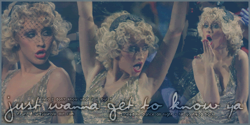
The 3 pics are Christina Aguilera from her performance with Nelly at the VMAs.
Original pics: here here and here
and
http://img.photobucket.com/albums/v57/x ... qblend.gif
t'was a request.
Original pics: here here and here
Yoshi: Absolutely amazing. Of course, coming from you, it couldn't be anything less
Meowth1982: Ahh lotsalotsa muffins. It's ok, but personally I wouldn't have done it on a blue backround. The text seems a bit plain but it's ok.
DM Ooh very cool. I like how you went and curved the text on the av. The pixelly effect on the image is a bit weird but I like it.
Magikwishez: Ooh I like this. The text on the sig where it says "where" is a bit messed up. It's the first time I've seen someone use that font in a while
Magikwishez: (again): Again, pretty backround! But the text is kinda smal and illegible. If you're looking for a smaller pixel font I recommend the 04b ones (04b.com i think). You also kinda went heavy on the border of the text but it's ok. Nice job though!
-------------
I just want two headers rated.
http://img.photobucket.com/albums/v57/x ... nahead.gif
The 3 pics are Christina Aguilera from her performance with Nelly at the VMAs.
Original pics: here here and here
and
http://img.photobucket.com/albums/v57/x ... qblend.gif
t'was a request.
Original pics: here here and here
fzun
Sat Dec 11, 2004 9:22 pm
Wow fzun those are good. THough i am not a huge fan of christina it is still a great blend. every time i try one they always look stupid  good work. and as for the second one the colors all blend nicely. great work. 7.5/10 on both.
Now I did this set a few days ago and basicly it was just to try doing some fading with my colors. Not my best work bot it could be worse. What do you think. P.S. i am gonna make myself a new one soon so dose anyone have any suggestions?
Now I did this set a few days ago and basicly it was just to try doing some fading with my colors. Not my best work bot it could be worse. What do you think. P.S. i am gonna make myself a new one soon so dose anyone have any suggestions?
Sun Dec 12, 2004 2:45 am
magikwishez - I like the colors and the backround, but the font seems too small 7/10
meowth1982 - I like the colors and it seems very plain 9/10
Culd anybody rate my sig ,I am currently making an avatar but thi is finishd

meowth1982 - I like the colors and it seems very plain 9/10
Culd anybody rate my sig ,I am currently making an avatar but thi is finishd
Sun Dec 12, 2004 11:41 am
Firefox - Nice for starters, but I think the sig is awfully plain and empty. The image in the corner is nice though. You could use a border around it all, with something filling up the space to the right. Enlarge fonts maybe? 5/10
Fzun (first image) - The blends themselves are awesome, putting Christina in the middle with her arms stretched up dividing the two other images was really smart Though I'm missing life in the pic, more exactly colors. Though I don't know what other colors it was put with on the webpage, so it might be good as it is. Just saying that by itself it needs more color, in my opinion, and also the text could be a tinsy winsy it clearer. 8/10
Fzun (second image) - Yet again the blends are good, maybe a bit "weaker" in this one than the first. I really don't like the text, in my eyes it doesn't fit in that much at all. I know fonts an be the hardest part though. 7/10
(Edit: adding the set in my post as I use another one right now)
There, really just wanted to do some ratings, but if anyone feels like it they can still rate the following set


Fzun (first image) - The blends themselves are awesome, putting Christina in the middle with her arms stretched up dividing the two other images was really smart
Fzun (second image) - Yet again the blends are good, maybe a bit "weaker" in this one than the first. I really don't like the text, in my eyes it doesn't fit in that much at all. I know fonts an be the hardest part though. 7/10
(Edit: adding the set in my post as I use another one right now
There, really just wanted to do some ratings, but if anyone feels like it they can still rate the following set
Last edited by Silja on Thu Dec 16, 2004 7:16 am, edited 1 time in total.
Sun Dec 12, 2004 6:10 pm
Firefox: High five, mah friend! Firefox rocks. (I'm a Linux user. WHO WANTS TO DOWNLOAD OUT OF THE CNR, PEOPLE! Stupid downtime. <__<)  What's really going to be confusing is I think there was still some people on PPT who remember me as FyreFox. XD Anyway, it's saved in a JPG, so it's really fuzzy. But I do like the effect on the picture. It needs a border, though, the subtext is a bit too big, so I suggest a font like Redensek or Slikscreen. And there's too much empty space. If you resize it down, change fonts and add a border, it'd be really good. Overall, nice job!
Cyborg771: I've always thought faders were cool. But the main text on the sig is pixelly and so is the Christmas Zafara. You're good at fading though, but those two problems are the only ones I see.
Silja: Aah! That is sooo cute! Great cutouts, the image is beautiful, however, I don't like the subtext over the main text. That's just me, however.
----------------------------------
Need two things rated. I'm still taking ratings on my Denver and the Mile High Orchestra set:
(I realized yesterday that I misinterpreted the lyrics of Act the Scat, as usual. <__<)
And my Winx Club set. Two different images, two days to make, two different haircolours for Bloom. Argh.
 <img src="http://pictures.greatestjournal.com/userimg/2709923/57408">
Cyborg771: I've always thought faders were cool.
Silja: Aah! That is sooo cute! Great cutouts, the image is beautiful, however, I don't like the subtext over the main text. That's just me, however.
----------------------------------
Need two things rated. I'm still taking ratings on my Denver and the Mile High Orchestra set:
(I realized yesterday that I misinterpreted the lyrics of Act the Scat, as usual. <__<)
And my Winx Club set. Two different images, two days to make, two different haircolours for Bloom. Argh.
<img src="http://pictures.greatestjournal.com/userimg/2709923/57408">
Sun Dec 12, 2004 6:25 pm
DM: 1st set: i like the background, but the sig could be a little thinner, leaving out a little bit of open space. and the pictures aren't that clear either, on the other hand, nice work on the texts!
2nd set: it's always risky to use 2 different images, but you got it just right. if i could give bad comment... there would be 3 small things. the texts on the ava is a little diffecult to read, the subtext on the sig is too small and lastly the opacity of the lines on the picture could be a little less. but those are only opinion differences. very good work!
---
rate my new set?
Wed Dec 15, 2004 3:38 am
Jen: I love the funky squares! It looks awsome on the sig, but the ones on the ava is a bit bland. The colors fit the whole evil-guy look. Good work.
DM: I like the blend on the first av and the curved text looked great! The subtext on the sig looks a bit dull, maybe it could be spiced up with some lines and bars?
I must say the scan-lines looks great on the second set. The choice of font was very fitting to the image as well. Well done.
DM: I like the blend on the first av and the curved text looked great! The subtext on the sig looks a bit dull, maybe it could be spiced up with some lines and bars?
I must say the scan-lines looks great on the second set. The choice of font was very fitting to the image as well. Well done.