Mon Sep 06, 2004 5:45 am
Dragonfire wrote:Chaud: I like how the set is small, although the red seems a little out of place. Looks good though.
You mean the boarders? Or the avatar text? The text Iagree isn't fitting well, but the boarder seems fine to me.
shinigamisrevenge wrote:Chaud: I think the set is a interesting. I'll admit I don't know what "Alex Rider" is. I like how you blended the images together. The only compliant I have is that there is a very stark contrast between background, text, and border. I don't know if that was the effect you were looking for, but it bothers me a little. Nice job thought. 7/10
He's a charachter in a fictional series about MI6. Stark? I don't have THAT big vocabulary.
Mon Sep 06, 2004 6:24 am
Chaud : The set is decent. It's a bit plain and the text alignment seems a bit odd. I like the style of border, but the color seems out of place. The avatar is very nice, but I think that it might look nicer if you made it just a bit bigger with more of the background showing so that the text didn't overlap the person's shadow{?} quite so much. 6/10
moogie : I love the set. I saw it in your request thread earlier. The borders are wonderful and I love the thin show signature. The subtext is a bit hard to read, but I think I like it that way. 9/10
-- rate my current set, please.
moogie : I love the set. I saw it in your request thread earlier. The borders are wonderful and I love the thin show signature. The subtext is a bit hard to read, but I think I like it that way. 9/10
-- rate my current set, please.
Mon Sep 06, 2004 6:39 am
robot: Nice, very original, I love it! The only problem I have with it, is the weird blob thingy, it looks kind of weird compared to the detailed background. Oh and also the text "robot" could be darker because its not really noticiable. 
Can anyone rate my set?


Can anyone rate my set?
Mon Sep 06, 2004 8:59 am
robot: i have already praised you for this origional set, but i'll re-iderate. the contrast you created with the two different styles of image is wonderful, something i've never seen done. the set is nice, but stays light-harted at teh same time, great. 9/10
darklegendary: i really like this set. the colors perfectly contrast against eachother, and your font choice reaks of perfection. stellar. 9/10
rate my pinktastic set? i sampled the stylings of our wonderful robot on the avatar.


darklegendary: i really like this set. the colors perfectly contrast against eachother, and your font choice reaks of perfection. stellar. 9/10
rate my pinktastic set? i sampled the stylings of our wonderful robot on the avatar.
Mon Sep 06, 2004 2:54 pm
Darklegendary: I love small avatars, and so I love the avatar. The sig is equally excellent, I love the fading effect on the text. 9/10
moogie: Great choice of color for the text in the avatar and sig. 9/10
------------
Rate this set? It's the first one I've made for myself. xD


moogie: Great choice of color for the text in the avatar and sig. 9/10
------------
Rate this set? It's the first one I've made for myself. xD
Mon Sep 06, 2004 4:09 pm
Darklegendary : I really like this set. It's simple, but very well done. The border fits nicely. The font you used for "dark" is great{What font is it? ;P} and is a nice contrast against the small pixel font. 9/10
moogie : I'm not a huge fan of the color pink, but I love this set, none the less. The curved text along the tail is very nice. I also love the flowing leaves/flowers in the background. Great job. 9/10
moogie : I'm not a huge fan of the color pink, but I love this set, none the less. The curved text along the tail is very nice. I also love the flowing leaves/flowers in the background. Great job. 9/10
Mon Sep 06, 2004 5:37 pm
Dragonfire: Interesting set  The font you used on the sig is a bit weird, I do like it though. I like the placement of the picture, the thing - whatever it is -_- - is just to the left, so you can see the lightening and on the av you've managed to get it right in the centre!!
Improvements .... I think you should do something extra just to spice it up a bit - like a grid or animation or something?? 7/10
Moogie: Great! You've kept the colour scheme really well with the picture, background and text - I like the fonts you've used, what is it for the sub-text????
I really like it the more I look at it!! I also love the flowery swirl in the background.
10/10!!!!!!!!!!!!!!! (I can't find anything wrong or any way to improve on the theme with it!
 )
)
Darklegendary: I like this set too! There's lots of colours in there to make it cheerful, and I like the timge of pink on the girls hair (not sure whether you actually did that - but I like it anyway!!). Err, cool leafy background, nive avatar size .... I like the font and the glow you've made around the 'dark', it really makes it stand out ------ how do you get glows like that by the way??
10/10 again!!!!!!!!!!!!!!!!!!!!!!!!!!! I'm feeling kind today - or maybe just stupid 'coz I can't find ways to improve ..?? Or MAYBE your all just good at making sets!!!!!!!!!!!!!!


Please rate this set ...

I know it's another boring one again, I just used a few brushstrokes and tried to make it look fancy with animation!! =P But does it look ok?
Improvements .... I think you should do something extra just to spice it up a bit - like a grid or animation or something?? 7/10
Moogie: Great! You've kept the colour scheme really well with the picture, background and text - I like the fonts you've used, what is it for the sub-text????
I really like it the more I look at it!! I also love the flowery swirl in the background.
10/10!!!!!!!!!!!!!!! (I can't find anything wrong or any way to improve on the theme with it!
Darklegendary: I like this set too! There's lots of colours in there to make it cheerful, and I like the timge of pink on the girls hair (not sure whether you actually did that - but I like it anyway!!). Err, cool leafy background, nive avatar size .... I like the font and the glow you've made around the 'dark', it really makes it stand out ------ how do you get glows like that by the way??
10/10 again!!!!!!!!!!!!!!!!!!!!!!!!!!! I'm feeling kind today - or maybe just stupid 'coz I can't find ways to improve ..?? Or MAYBE your all just good at making sets!!!!!!!!!!!!!!
Please rate this set ...
I know it's another boring one again, I just used a few brushstrokes and tried to make it look fancy with animation!! =P But does it look ok?
Mon Sep 06, 2004 6:43 pm
robot - I forget if that little creature has a name...Eh. I like it, except the creature looks a little odd against the detailed background because of it's simplicity and color. It stands out a little too much. I also usually like how you run text along the main image, but it doesn't seem to work so well in this one. It just looks...weird.
Darklegendary - It makes me happy to see that people seem to be using advice from PPTTG. ^_^ I love this set. It's a very soft, elegant looking set. I love the main font. The only thing I'd maybe do in the sig would be to less the height slightly. (That's just a personal preferance though. I don't like higher sigs.)
moogs - It's cute. I love how the text is placed in the av. It looks really good following the tails. I love the little trail of white, er, whatever in the background. I'd maybe have added that to the av too.
Dragonfire - The av it a little too empty. I'd maybe have lessed the height of it. There's no reason you have to make it the full 80x80 PPT allows. In the sig, it's a little too 'boxy'. I'd lessed the height or make it wider. Also, the main font just looks odd... Choose a different font with a simliar look.
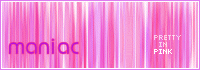
maniac - (Aren't you the one who made the blue stone set?) Okay. I love the animation in the av. I don't think I've ever seen it done that way before. But slow it down. Or leave your full name showing longer. For the sig, 'in' needs to be centered more under 'pretty', and 'pink' under 'in.' This set isn't anything too special, but I like it. I'd also maybe make the main text in the sig have a fill color of white, and maybe it's border the dark purple. ^_^
Darklegendary - It makes me happy to see that people seem to be using advice from PPTTG. ^_^ I love this set. It's a very soft, elegant looking set. I love the main font. The only thing I'd maybe do in the sig would be to less the height slightly. (That's just a personal preferance though. I don't like higher sigs.)
moogs - It's cute. I love how the text is placed in the av. It looks really good following the tails. I love the little trail of white, er, whatever in the background. I'd maybe have added that to the av too.
Dragonfire - The av it a little too empty. I'd maybe have lessed the height of it. There's no reason you have to make it the full 80x80 PPT allows. In the sig, it's a little too 'boxy'. I'd lessed the height or make it wider. Also, the main font just looks odd... Choose a different font with a simliar look.
maniac - (Aren't you the one who made the blue stone set?) Okay. I love the animation in the av. I don't think I've ever seen it done that way before. But slow it down. Or leave your full name showing longer. For the sig, 'in' needs to be centered more under 'pretty', and 'pink' under 'in.' This set isn't anything too special, but I like it. I'd also maybe make the main text in the sig have a fill color of white, and maybe it's border the dark purple. ^_^
Mon Sep 06, 2004 7:41 pm
Maniac: You used the Aurora preset brush, right? No...the 2nd animal fur generator! Blah, I don't know. You've gotten better ever since you ditched paint. I think the subtext would look better if it was bordered. I think that you should also make your subtext just one line, and make it a little shorter, width wise. Overall, great set!
Dragonfire: The first set you've ever made for yourself? I'm dissapointed in you! XD I love the border, and the font you used is nice. You're good at centering stuff. I'm jealous now.
Moogie (heh, typed 'moggie' at first. *laughs*): What's the thing below the "G"? I'm not sure. o.o It's perfect, beside's the little "G" thing.
------------------------------------
Care to rate the set thanks to Adam because if it wasn't for him I would've never known Get a Clue? Oh, I'm babbling incoherently. And which avatar looks better?


Dragonfire: The first set you've ever made for yourself? I'm dissapointed in you! XD I love the border, and the font you used is nice.
Moogie (heh, typed 'moggie' at first. *laughs*): What's the thing below the "G"? I'm not sure. o.o It's perfect, beside's the little "G" thing.
------------------------------------
Care to rate the set thanks to Adam because if it wasn't for him I would've never known Get a Clue? Oh, I'm babbling incoherently. And which avatar looks better?
Mon Sep 06, 2004 8:01 pm
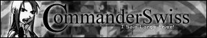
DM: answer to your question: the thing below the "g" in the avatar is an "s".
rating: i like this set, simple and clean. i like the second avatar, where the text is on the bottom. i also like all of the different fonts. kudos. 8/10
rate this set for swiss?

rating: i like this set, simple and clean. i like the second avatar, where the text is on the bottom. i also like all of the different fonts. kudos. 8/10
rate this set for swiss?
Mon Sep 06, 2004 8:05 pm
moogie wrote:DM: answer to your question: the thing below the "g" in the avatar is an "s".
rating: i like this set, simple and clean. i like the second avatar, where the text is on the bottom. i also like all of the different fonts. kudos. 8/10
rate this set for swiss?
I was thinking that was what it was, but I wasn't sure. I guess the italic thing fooled me. Thanks though.
Mon Sep 06, 2004 9:14 pm
Flame wrote:maniac - (Aren't you the one who made the blue stone set?)
Yup, it's me!!!!!!!!!!!
DM was on fire! wrote:Maniac: You used the Aurora preset brush, right? No...the 2nd animal fur generator! Blah, I don't know. You've gotten better ever since you ditched paint.
Aurora
Rating .... moogie! : The background is kinda weird, but I think it goes with the overall black-and-white-ness of the set! You've done a kinda glowy thing around the main font on the sig which I think looks good, but the sub-text is a bit hard to read and see. Maybe you could use a larger or different font - or maybe add a border to make it stand out?
I like your pink one better though
Gah - sorry I haven't been very helpful, my brain is overloading after being worked too much at school
PS - I like the length of the sig moogs!
Mon Sep 06, 2004 9:14 pm
Flame wrote:Dragonfire - The av it a little too empty. I'd maybe have lessed the height of it. There's no reason you have to make it the full 80x80 PPT allows. In the sig, it's a little too 'boxy'. I'd lessed the height or make it wider. Also, the main font just looks odd... Choose a different font with a simliar look.
Yeah, I just noticed that it was a little empty. I went ahead and resized, and I changed a little bit on the signature. There really wasn't any way I could have made it wider because that's the widest the image went, and if I made it smaller height-wise, the ship would've been cut off.
Here's the new version:


Mon Sep 06, 2004 9:48 pm
DM - Um, personally, I don't really think either avatar is better than the other. Maybe because I don't like them...Eheh. Okay. But I'd go with the second one. First off, your cutout job around the zafara isn't very great. It's pretty jaggedy. (Though neopets images can be hard to work with. Bor the sig, I like the subtext, though it's just a tad hard to read. Overall, the sig is a bit empy. And for this, I'd maybe add a double border. White on the inside, with the same brown you already have as the outer border.
moogie - I like the shape of the avatar. Very different. I like the main text in the sig. The subtext is a little too hard to read though. I have no idea what the last two words are exactly...But overall, it's not bad.
Dragonfire - The av is perfect. But I'm still not liking the sig. And I'm saying resize the height of the sig to make the ship smaller, which in turn would lessen the width. Then, to increase the width, blend some colors to imitate the background that is already there.
Mon Sep 06, 2004 11:32 pm
DM was on fire! wrote:You've gotten better ever since you ditched paint.
Paint rocks, man. *Points at current set.*
DM: I like the second av better. My main problem is that the pixel text is really hard to read. In the sig, same problem with the subtext. I like how 'get a clue' is in big letters, though. And the background looks really nice.
Current set, please? Made in *coughtoDM*MS Paint*/coughtoDM*. A browser program called SparkleAdded was used for the background.