Wed Jan 12, 2005 1:30 pm
Jens wrote:rate this set for Bridgette pretty pweaz?

Nice. You should put the background's color same as the color of the Ice Bori, because I find it doesn't match, at all. Other than that, it's nice, I like cutouts. o_O
Wed Jan 12, 2005 4:52 pm
Jens wrote:rate this set for Bridgette pretty pweaz?
I really like that set.
The cut-outs are creative, it matches well.
Not sure if "Smurf" fits for the text though.
Silja- That set is great, colours fit well.
Looks very good!
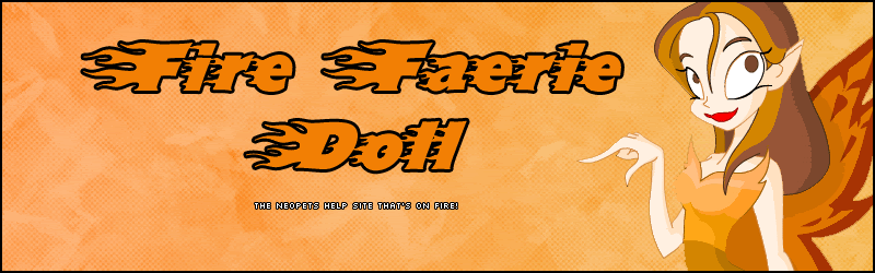
Since my friend bought me FireFaerieDoll.com I made a layout.
http://img.photobucket.com/albums/v235/ ... -1copy.gif
Well part of one.
It isn't too good.
Wed Jan 12, 2005 4:59 pm
Adam wrote:Jens wrote:rate this set for Bridgette pretty pweaz?
I really like that set.
The cut-outs are creative, it matches well.
Not sure if "Smurf" fits for the text though.
Silja- That set is great, colours fit well.
Looks very good!
Since my friend bought me FireFaerieDoll.com I made a layout.
http://img.photobucket.com/albums/v235/ ... -1copy.gif
Well part of one.
It isn't too good.
It's simple but great! You could add red autumn leaves/fiery haze on the background for the red-ness.
Wed Jan 12, 2005 5:13 pm
Scholastic wrote:Adam wrote:Jens wrote:rate this set for Bridgette pretty pweaz?
I really like that set.
The cut-outs are creative, it matches well.
Not sure if "Smurf" fits for the text though.
Silja- That set is great, colours fit well.
Looks very good!
Since my friend bought me FireFaerieDoll.com I made a layout.
http://img.photobucket.com/albums/v235/ ... -1copy.gif
Well part of one.
It isn't too good.
It's simple but great! You could add red autumn leaves/fiery haze on the background for the red-ness.
Find brushes like that and I will.
Wed Jan 12, 2005 6:08 pm
Adam wrote:Scholastic wrote:Adam wrote:Jens wrote:rate this set for Bridgette pretty pweaz?
I really like that set.
The cut-outs are creative, it matches well.
Not sure if "Smurf" fits for the text though.
Silja- That set is great, colours fit well.
Looks very good!
Since my friend bought me FireFaerieDoll.com I made a layout.
http://img.photobucket.com/albums/v235/ ... -1copy.gif
Well part of one.
It isn't too good.
It's simple but great! You could add red autumn leaves/fiery haze on the background for the red-ness.
Find brushes like that and I will.
Google can solve anything. :P
Wed Jan 12, 2005 9:08 pm
Scholastic wrote:Adam wrote:Scholastic wrote:Adam wrote:Jens wrote:rate this set for Bridgette pretty pweaz?
I really like that set.
The cut-outs are creative, it matches well.
Not sure if "Smurf" fits for the text though.
Silja- That set is great, colours fit well.
Looks very good!
Since my friend bought me FireFaerieDoll.com I made a layout.
http://img.photobucket.com/albums/v235/ ... -1copy.gif
Well part of one.
It isn't too good.
It's simple but great! You could add red autumn leaves/fiery haze on the background for the red-ness.
Find brushes like that and I will.
Google can solve anything.
And when I milk all the good stuff from Google, I go to Altavista.
Wed Jan 12, 2005 9:10 pm
Jens: I love the colors and the cutouts! The text going behind the bori looks really wierd...maybe you could make it smaller or move it so they didn't run together. 9/10.
Can I get a few ratings for my new sprite?
Can I get a few ratings for my new sprite?
Thu Jan 13, 2005 1:47 am
Amethyst : I'm assuming that you are referring to the ipod? It's adorable. It's actually quite realistic. I had to learn forward a bit to read the bottom part of the text, though. Nice job. {I wish I could make sprites and such. Oh the Domokun and Manjusang sprites I would create. *sigh*} 9/10
Rate my current set, if you'd like. {not much was done to it, though.}
Rate my current set, if you'd like. {not much was done to it, though.}
Thu Jan 13, 2005 3:16 am
Adam wrote:Scholastic wrote:Adam wrote:Jens wrote:rate this set for Bridgette pretty pweaz?
I really like that set.
The cut-outs are creative, it matches well.
Not sure if "Smurf" fits for the text though.
Silja- That set is great, colours fit well.
Looks very good!
Since my friend bought me FireFaerieDoll.com I made a layout.
http://img.photobucket.com/albums/v235/ ... -1copy.gif
Well part of one.
It isn't too good.
It's simple but great! You could add red autumn leaves/fiery haze on the background for the red-ness.
Find brushes like that and I will.
Dunno what program you use, but a quick google turned this up: http://members.tripod.com/~Katherine_L/ ... eaves.html
Thu Jan 13, 2005 3:17 am
DM was on fire! wrote:Scholastic wrote:Adam wrote:Scholastic wrote:Adam wrote:Jens wrote:rate this set for Bridgette pretty pweaz?
I really like that set.
The cut-outs are creative, it matches well.
Not sure if "Smurf" fits for the text though.
Silja- That set is great, colours fit well.
Looks very good!
Since my friend bought me FireFaerieDoll.com I made a layout.
http://img.photobucket.com/albums/v235/ ... -1copy.gif
Well part of one.
It isn't too good.
It's simple but great! You could add red autumn leaves/fiery haze on the background for the red-ness.
Find brushes like that and I will.
Google can solve anything. :P
And when I milk all the good stuff from Google, I go to Altavista.
To be honest, babelfish sucks. Sometimes it translates into bad words. :o
Thu Jan 13, 2005 3:29 pm
Alex wrote:Adam wrote:Scholastic wrote:Adam wrote:Jens wrote:rate this set for Bridgette pretty pweaz?
I really like that set.
The cut-outs are creative, it matches well.
Not sure if "Smurf" fits for the text though.
Silja- That set is great, colours fit well.
Looks very good!
Since my friend bought me FireFaerieDoll.com I made a layout.
http://img.photobucket.com/albums/v235/ ... -1copy.gif
Well part of one.
It isn't too good.
It's simple but great! You could add red autumn leaves/fiery haze on the background for the red-ness.
Find brushes like that and I will.
Dunno what program you use, but a quick google turned this up: http://members.tripod.com/~Katherine_L/ ... eaves.html
Those aren't really brushes.....
And I use Adobe Photoshop 7.0.
Thu Jan 13, 2005 8:01 pm
adam, if you insist on using brushes, PS7 has alot of stock brushes, play around with them
Fri Jan 14, 2005 2:43 am
robot wrote:Amethyst : I'm assuming that you are referring to the ipod? It's adorable. It's actually quite realistic. I had to learn forward a bit to read the bottom part of the text, though. Nice job. {I wish I could make sprites and such. Oh the Domokun and Manjusang sprites I would create. *sigh*} 9/10
Rate my current set, if you'd like. {not much was done to it, though.}
Kwoot. :D
Sat Jan 15, 2005 3:12 pm
Robot: I like it! You always have great sets! I can't decide whether I would prefer your name to be on the av or not - ... hm. I think its lovely as it is.  What are those strange symbols above your name on the sig though?
They kinda fit the picture, so it doesn't look odd, but I'm just curious!
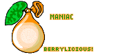
Would you rate this set I just made please? I know its not very good, but I'd like some comments so I can improve. I know its too pixely - but its hard when I'm making the rest transparent!

(And if you have the time could you go back a page and rate my set there as well? No one rated it... thanks )
)
They kinda fit the picture, so it doesn't look odd, but I'm just curious!
Would you rate this set I just made please? I know its not very good, but I'd like some comments so I can improve. I know its too pixely - but its hard when I'm making the rest transparent!
(And if you have the time could you go back a page and rate my set there as well? No one rated it... thanks
Sat Jan 15, 2005 3:29 pm
maniac wrote:Robot: I like it! You always have great sets! I can't decide whether I would prefer your name to be on the av or not - ... hm. I think its lovely as it is. :D What are those strange symbols above your name on the sig though?
They kinda fit the picture, so it doesn't look odd, but I'm just curious! :)
Would you rate this set I just made please? I know its not very good, but I'd like some comments so I can improve. I know its too pixely - but its hard when I'm making the rest transparent! :roll:
(And if you have the time could you go back a page and rate my set there as well? No one rated it... thanks ;))
I like it, just reduce the size of the berry, and it will looks better. o_O