Thu Oct 21, 2004 9:25 pm
Can someone please rate the set that I made for Mystikals set contest:


I know its not great because this is the very first set that I ever made.
I know its not great because this is the very first set that I ever made.
Fri Oct 22, 2004 4:43 am
Shortin : Adorable.  For your first set, it is very nice. Only problem that is very important is the text is hard to read. Also, might be a good idea to learn transparency. 7.5/10.
Fri Oct 22, 2004 4:55 am
Kitten Medli wrote:Shortin : Adorable.
What do you mean by transparency? Oh, and thanks for the compliment.
Fri Oct 22, 2004 5:45 am
shortin wrote:Kitten Medli wrote:Shortin : Adorable.
What do you mean by transparency? Oh, and thanks for the compliment.
No problem.
Transparency is making a certain part of your image the same color as the background. Like for the white area around your kitty set, you could turn it lime green or any other color not in the image and go to http://www.gifworks.com , (easiest way) click "Open File" in the first drop down menu, pick your image, click "Trnasparify" under the "Edit" drop down list, click the color you want to be transparent.. and.. ta da!
Of course, transparency is not something you cannot live without, because its a nice set either way and you can hardly tell on this light background..
Fri Oct 22, 2004 5:49 am
Kitten Medli wrote:shortin wrote:Kitten Medli wrote:Shortin : Adorable.
What do you mean by transparency? Oh, and thanks for the compliment.
No problem.
Transparency is making a certain part of your image the same color as the background. Like for the white area around your kitty set, you could turn it lime green or any other color not in the image and go to http://www.gifworks.com , (easiest way) click "Open File" in the first drop down menu, pick your image, click "Trnasparify" under the "Edit" drop down list, click the color you want to be transparent.. and.. ta da!
Of course, transparency is not something you cannot live without, because its a nice set either way and you can hardly tell on this light background..
Cool thanks for the tip
BTW...can someone rate this button I made for the PPT Divas quilt:

I know its to big....thats because Charisma made it smaller after I made it.
Sun Oct 24, 2004 1:23 am
The button is quite nice...and the grid looks great. Everything else is great, except the text is too hard to see. 8/10
Tue Oct 26, 2004 2:35 am
Hmm, nice, nice. Again, *sounding like a parrot*, the text is a little tricky to read, but otherwise a very nice job with it! 8/10. *claps*
Any ideas to improve mine? (Current ones)
EDIT: They aren't really a set, just a couple that I slapped together.
Any ideas to improve mine? (Current ones)
EDIT: They aren't really a set, just a couple that I slapped together.
Tue Oct 26, 2004 11:18 pm
cat1205123: Meep, pretty decent...although I do suggest you follow some basic "guidelines" for sets. Border, background, clear/concise text- border being more of a priority, in my opinion. The av is good, I see you put a little white grid effect on it which seems to fit in nicely, but the main problem is, your text doesn't really match...and there's no border. Same for the sig on the border issue- and the text, you chose a font that looks smushed when enlargened. Try another font or shrink it a little. The greyscaling of everything but the stick in the sig was really creative. ;P
shortin: Mm, the effect of the opposite-grid on the image is great- it gives kind of a embossed look. Only things I see that could use some improvement are the text and to define the edges more (they seem kinda defined already, but a border's useful). The font you chose doesn't seem to show up too clearly, and looks blurry when small. Furthermore, because the image is being shrunken, it turns pretty much illegible. I'd suggest to put the text after shrinking...but it's a little late for that now, haha.
As for your set, it looks pretty good, I like the border. Again, you might want to work on making the text more clear. Contrary to what Medli said though...I don't suggest transparency. It's awfully difficult to do that with such a border with intricate edges. Maybe a colour fill instead of the white, or adding a border at the edge of the white.
<hr>
Ratings on my current set would be much appreciated. Entirely handdrawn with the exception of the use of Liquify, Clouds, and Average. XP
Av here, sig here, alternate sigs here, here, and here.
Wed Oct 27, 2004 4:06 am
Yoshi wrote:cat1205123: Meep, pretty decent...although I do suggest you follow some basic "guidelines" for sets. Border, background, clear/concise text- border being more of a priority, in my opinion. The av is good, I see you put a little white grid effect on it which seems to fit in nicely, but the main problem is, your text doesn't really match...and there's no border. Same for the sig on the border issue- and the text, you chose a font that looks smushed when enlargened. Try another font or shrink it a little. The greyscaling of everything but the stick in the sig was really creative. ;P
Hmm...I edited in that it isn't really a set. Just a couple that I slapped together. So what you're suggesting is that I:
1. Tack on a border
2. Maybe find a better font?
(and perhaps make a set out of each?)
*thinks and runs off to try it*
Yoshi wrote:...but the stick...
*coughs* Heh. That's a broom. (Harry Potter)
EDIT: Well, I added another avatar, to make this a set, and I think it looks good. I changed it around a bit, added a border, etc. What do you think?
Last edited by cat1205123 on Wed Oct 27, 2004 11:50 pm, edited 1 time in total.
Wed Oct 27, 2004 9:42 pm
Cat1205123: Thats quite a nice set ya got there!, but Like Yoshi said, ya should add a border and stuff
can someone please rate my good charlotte - predictable set please? i made this set, then looked though the set request, and I saw a set similar so please dont think I copied
  anyway - I saved my first post just so I could rate something
also the fader - it was kinda by me, but kinda by Knando (from here, i dont know if some may know him as Aura)
can someone please rate my good charlotte - predictable set please? i made this set, then looked though the set request, and I saw a set similar
also the fader - it was kinda by me, but kinda by Knando (from here, i dont know if some may know him as Aura)
Wed Oct 27, 2004 11:53 pm
Rylon:
Wowwww....that's niiiiice. I dunno If I can find anywhere where you can improve! The text is readable, the border is simple, but nice; as a set, they work well.
*grumbles and thinks harder*
Well, I daresay if you went into buisness, you'd get some money from that.
Heh, but what do I know, I'm new at this!
Wowwww....that's niiiiice.
*grumbles and thinks harder*
Well, I daresay if you went into buisness, you'd get some money from that.
Heh, but what do I know, I'm new at this!
Last edited by cat1205123 on Wed Oct 27, 2004 11:56 pm, edited 1 time in total.
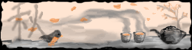
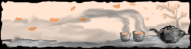
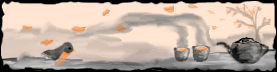
Wed Oct 27, 2004 11:54 pm
Yoshi : I love the set. I'm not sure if I like the set with or without the bird, though. I suppose I love them equally. You chose great colors for the set. The tea pot looks a little crooked, though. The Chinese{?} symbol is a great addition. The jagged borders are nicely done. I like how they add an antique feel to the set. {I saw the set in a random thread and I decided that I really wanted to rate it. I'm strange. >.<} 9/10
Please rate this set :

{I suppose I should make something new, but I'm lazy and still in love with my Mizuki set. ;P}
Please rate this set :
{I suppose I should make something new, but I'm lazy and still in love with my Mizuki set. ;P}
Thu Oct 28, 2004 9:31 am
Cat1205123: thanks for the comment
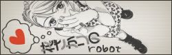
Robot: thats really nice - i like that a lot! the colors work well together, and the red heart contrats REALLY well - 9/10 would be a 10, but i think the BG is a little plain, but it is jazzed up a wee bit with the scanlines
Robot: thats really nice - i like that a lot! the colors work well together, and the red heart contrats REALLY well - 9/10 would be a 10, but i think the BG is a little plain, but it is jazzed up a wee bit with the scanlines
Thu Oct 28, 2004 5:02 pm
Rylon: Hey! You're from IGG, aren't ya? I recognize you! Anyway, I really don't see much wrong, but the picture is...strange. It looks like Benji's (or is that Joel?) arms are spreadeagled. But, I love the brushes!
Robot: You do love that thing, dontcha?! Anyway, I love the Japanese font, but I don't get 'b-thmp' on the avatar. Might just be me, but...I also noticed that the BG on the av is lighter than the sig. There's nothing you can do to make the BG more...iunno, exciting. I love it, though!
-----------------------------------------------
I made me a Illusen set yesterday, and yes, there are two things I know of:
1: the purple in her hair
2: The fact it's pixelly.
So...pwease rate?


I've been trying more and more to use cutouts, and I think I'm doing better.
Robot: You do love that thing, dontcha?! Anyway, I love the Japanese font, but I don't get 'b-thmp' on the avatar. Might just be me, but...I also noticed that the BG on the av is lighter than the sig. There's nothing you can do to make the BG more...iunno, exciting. I love it, though!
-----------------------------------------------
I made me a Illusen set yesterday, and yes, there are two things I know of:
1: the purple in her hair
2: The fact it's pixelly.
So...pwease rate?
I've been trying more and more to use cutouts, and I think I'm doing better.
Thu Oct 28, 2004 5:39 pm
DM was on fire! wrote:
So...pwease rate?
I've been trying more and more to use cutouts, and I think I'm doing better.
Well, the set looks good. I like the colours that you used and the text sticks out. Her head is cute off in the avatar, so maybe you could try and improve that or something... Anyways, I give the set a 7.5/10.
Can someone rate this blend that I made, please and thanks?
http://img.photobucket.com/albums/v168/tropikalprincess18/JakeGblend.jpg