Sun Oct 10, 2004 7:59 pm
For a new roleplay I'm joining, could anyone rate this Splash image and two blogs?
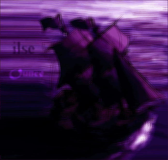
Graphic: http://img.photobucket.com/albums/v87/S ... e/menu.gif
Original Image: http://www.lucidcomics.com/PirateShip.jpg
I had some problem with the image stretch, and I think it looks slightly
out of place, but otherwise, it was simple to make. I used facet and
mosaic to change the lookof the image, stretch as I said before to fill
some space, and I changed the colours, darkened it a bit. Text was
simple aswell, larger text with Gausien Blur and filters, smaller just filters.
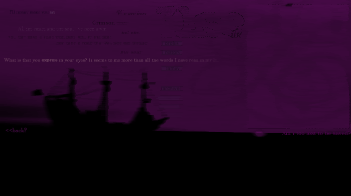
First blog (If it stretches the page, I'll change to link):
http://img.photobucket.com/albums/v87/S ... seblog.gif
Original Image: http://sessums.net/richard/gallery4/pir ... water2.jpg
One again I used mosaic and faceted. I changed the darkness and tones,
and changed the colour by changing the hue and saturation. I borrowed
all the spiffy quotes from Alex's site 'Lost Thoughts' (which is cool
btw ) For the large text, I used a grunge brush as an eraser, and the
smaller text was just normal. The brushes in the background were mosaiced and faceted aswell,
and the blog border was grunge brush erased and the center I think overlayed. Menu buttons were easily done,
handmade with normal text and some opasity changes.
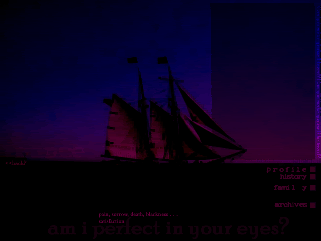
Second Blog:
http://img.photobucket.com/albums/v87/Shadowfare/ounceblog.gif
Original Image: http://steve.annex.com/rick/image32.jpg
This is my favourite. I borrowed the quotes from Alex (again) and
Jade_Ems MSN screen name, Faceted and Mosaiced, duplicated the layer
and used a filter then used Water Paper. Buttons handmade, text just
normal, with the two larger ones having change in opacity and an overlay
filter used.
Blog, same border as the last and overlay with a reddish
pinkish original colour for center.
And my ratings:
r4che1--
Its nice, and the subtext is nice. But the sig (it may have looked bad if
you did try it, but I dunno) I have this thing about borders, so maybe a
simple 1px black border?
I think a grayer/brownier text would have mixed in better with the overall
image, but the cutouts are well done (better than mine ever are anyway).
Overall, 8/10
bluehawaii19--
OOO, its sooo pretty ^^; I love it, I like the colours, and the font goes well with the overall style of the layout. The brushes around the edges
look good, but slightly overdone, and I like the texture in the actual
images. Overall:
9/10
Dawn2:
Aww, thats soo cute! I am always amazed with your sets, because you
only have MS Paint to work with, and they always turn out nicely. The
only thing I have against it is that the cutout is very jaggedy around the
edges, but both the texts you used are nice, and go well with the image.
Overall: 8/10
Graphic: http://img.photobucket.com/albums/v87/S ... e/menu.gif
Original Image: http://www.lucidcomics.com/PirateShip.jpg
I had some problem with the image stretch, and I think it looks slightly
out of place, but otherwise, it was simple to make. I used facet and
mosaic to change the lookof the image, stretch as I said before to fill
some space, and I changed the colours, darkened it a bit. Text was
simple aswell, larger text with Gausien Blur and filters, smaller just filters.
First blog (If it stretches the page, I'll change to link):
http://img.photobucket.com/albums/v87/S ... seblog.gif
Original Image: http://sessums.net/richard/gallery4/pir ... water2.jpg
One again I used mosaic and faceted. I changed the darkness and tones,
and changed the colour by changing the hue and saturation. I borrowed
all the spiffy quotes from Alex's site 'Lost Thoughts' (which is cool
btw
smaller text was just normal. The brushes in the background were mosaiced and faceted aswell,
and the blog border was grunge brush erased and the center I think overlayed. Menu buttons were easily done,
handmade with normal text and some opasity changes.
Second Blog:
http://img.photobucket.com/albums/v87/Shadowfare/ounceblog.gif
Original Image: http://steve.annex.com/rick/image32.jpg
This is my favourite. I borrowed the quotes from Alex (again) and
Jade_Ems MSN screen name, Faceted and Mosaiced, duplicated the layer
and used a filter then used Water Paper. Buttons handmade, text just
normal, with the two larger ones having change in opacity and an overlay
filter used.
Blog, same border as the last and overlay with a reddish
pinkish original colour for center.
And my ratings:
r4che1--
Its nice, and the subtext is nice. But the sig (it may have looked bad if
you did try it, but I dunno) I have this thing about borders, so maybe a
simple 1px black border?
I think a grayer/brownier text would have mixed in better with the overall
image, but the cutouts are well done (better than mine ever are anyway).
Overall, 8/10
bluehawaii19--
OOO, its sooo pretty ^^; I love it, I like the colours, and the font goes well with the overall style of the layout. The brushes around the edges
look good, but slightly overdone, and I like the texture in the actual
images. Overall:
9/10
Dawn2:
Aww, thats soo cute! I am always amazed with your sets, because you
only have MS Paint to work with, and they always turn out nicely. The
only thing I have against it is that the cutout is very jaggedy around the
edges, but both the texts you used are nice, and go well with the image.
Overall: 8/10
Mon Oct 11, 2004 2:59 am
Dawn: I like the giraffe set. Its very simple, yet very nice. The only thing I see is that the edges are a bit pixelated. I love the unusual shape. 8/10
Blue hawaii: I think you did a great job at blending the images. The only things to points out are that you cut the top of the head off on the image in the upper left corner, its seems a bit askward. Also the subtext is a little hard to read, I can see "aka Charlie" the rest is too hard to see. 8/10
Shadowfare: I think these are all interesting. The only thing is, and it might just be my computer, they are all very dark. The graphic is alright, but the blogs are so dark I cannot see the boxes where any text would go. 8/10, 7/10, 7/10
Still taking ratings on this set:


Please rate my new and current set. Thanks.
Blue hawaii: I think you did a great job at blending the images. The only things to points out are that you cut the top of the head off on the image in the upper left corner, its seems a bit askward. Also the subtext is a little hard to read, I can see "aka Charlie" the rest is too hard to see. 8/10
Shadowfare: I think these are all interesting. The only thing is, and it might just be my computer, they are all very dark. The graphic is alright, but the blogs are so dark I cannot see the boxes where any text would go. 8/10, 7/10, 7/10
Still taking ratings on this set:
Please rate my new and current set. Thanks.
Wed Oct 13, 2004 9:57 pm
Shinigamisrevenge - Nice set, it is a little pixily however, so you may want to blend it a little more 7/10
Rate my beauty? Made by none other than..ME!
Rate my beauty? Made by none other than..ME!
Thu Oct 14, 2004 12:15 am
Xalaxracer: Nice set, I think Garfield is great. Only two things that I see. One it is very hard to read the main text on your sig. The other is that the animation is a bit fast. Its a little hard to read what it says in the short time that it is up. 8/10
Thanks for the suggestion, I made a few adjustments and sped up the animation on the tweening, I felt it was a little slow. So still taking ratings on current set.
Thanks for the suggestion, I made a few adjustments and sped up the animation on the tweening, I felt it was a little slow. So still taking ratings on current set.
Thu Oct 14, 2004 4:27 pm
Shingamisrevenge (KH set): I really don't like how pixelly the main image is. I learned a trick: if you resize it up and then resize it back down to a lower size, it won't look as bad.  I also don't like that the subtext border on the sig is fatter than the one on the av. I was going to point out the fading thing where it stops and starts again, but you seem to have learned how that works.
Shingamisrevenge (current set): The only things that I see wrong is on the sig, the image is kind of pixelly near the cutout and that the animation is kind of slow. Otherwise, good job!
Xalaxracer: I didn't know you made sets! Two things. The main text is kind of hard to read and the animation on the sig is too fast. Basically what Shingami said.
Thu Oct 14, 2004 7:36 pm
DM was on fire! wrote:Shingamisrevenge (KH set): I really don't like how pixelly the main image is. I learned a trick: if you resize it up and then resize it back down to a lower size, it won't look as bad.
Shingamisrevenge (current set): The only things that I see wrong is on the sig, the image is kind of pixelly near the cutout and that the animation is kind of slow. Otherwise, good job!
Xalaxracer: I didn't know you made sets! Two things. The main text is kind of hard to read and the animation on the sig is too fast. Basically what Shingami said.
Thanks, I have been trying to fix that siggy speed, and the font is supposed to be graffiti like.
Fri Oct 15, 2004 7:53 am
Xalaxracer:
I have a really hard time reading your name on that sig. I like the font and everything, but it makes my eyes cross. But that's been covered. Other than that the color blending was done SUPER WELL, I'm quite impressed with it. 8/10
Shingamisrevenge:
I really like your current set. The cut out is done very nicely...and it looks spooky 9/10
Now, this may seem weird, but I've never ever done a lookup before. Can someone rate mine?
http://www.neopets.com/randomfriend.pht ... meowth1982
I just got done with the graphics tonight in honor of the first pet I ever owned and still have, Froggy_82 ^_^ Thanks!
I have a really hard time reading your name on that sig. I like the font and everything, but it makes my eyes cross. But that's been covered. Other than that the color blending was done SUPER WELL, I'm quite impressed with it. 8/10
Shingamisrevenge:
I really like your current set. The cut out is done very nicely...and it looks spooky
Now, this may seem weird, but I've never ever done a lookup before. Can someone rate mine?
http://www.neopets.com/randomfriend.pht ... meowth1982
I just got done with the graphics tonight in honor of the first pet I ever owned and still have, Froggy_82 ^_^ Thanks!
Fri Oct 15, 2004 6:21 pm
meowth1982 -- Overall I think you did an okay job with the layout. I like the colours and design of it. The text sticks out and you made it look a bit interesting. Maybe you could have the background be more colourful or something... Anyways, I give it a 7/10.
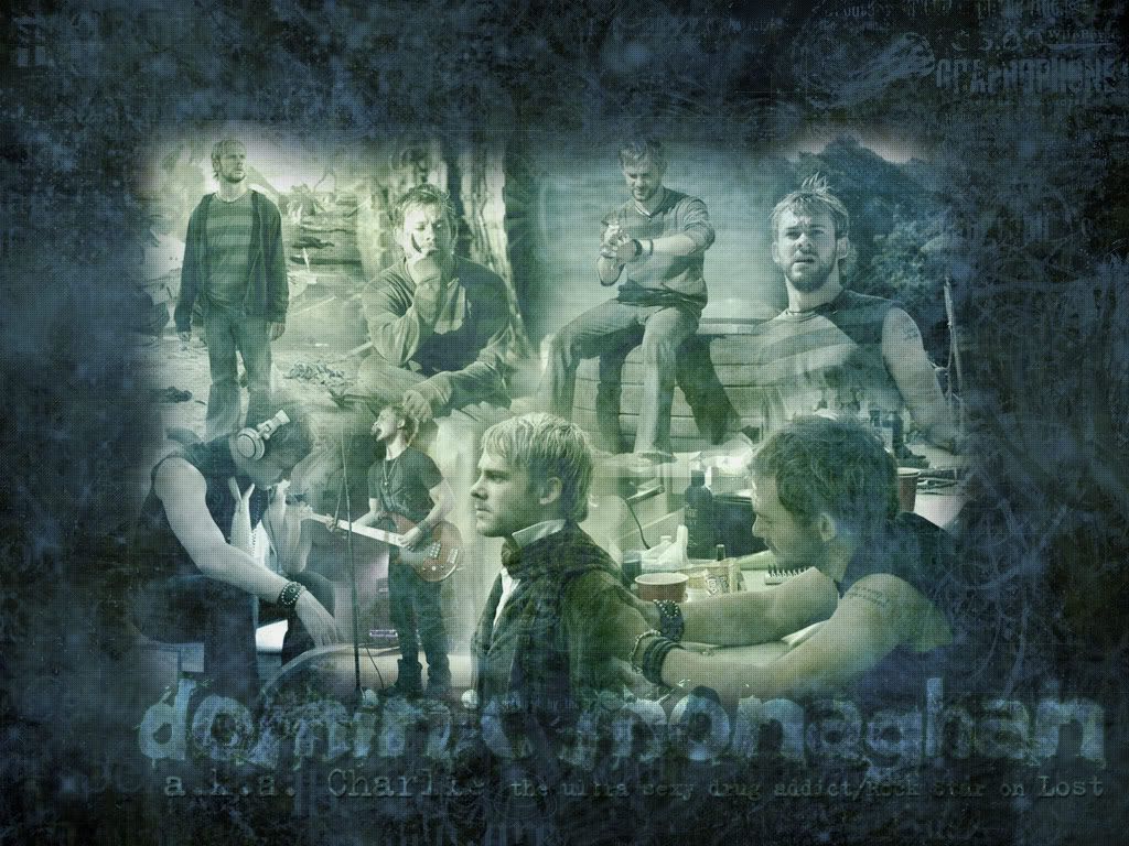
Can someone rate this wallpaper that I made today for a challenge over at Star Gaze, please and thanks?
Dom/Charlie Wallpaper/Blend
I posted the link because the blend is 1024x768.
Can someone rate this wallpaper that I made today for a challenge over at Star Gaze, please and thanks?
Dom/Charlie Wallpaper/Blend
I posted the link because the blend is 1024x768.
Fri Oct 15, 2004 8:01 pm
bluehawaii19 - Overall I think you've done a great job with that wallpaper, the images blend into it nicely. Though I think you could have moved the images a bit furher away from each other and also the background might seem a bit too messy, but still I think it's good as you've chosen good colors. 7/10
Can someone rate my current set please?
Can someone rate my current set please?
Sat Oct 16, 2004 12:22 am
Silja- It looks a bit plain, but I like it. The fonts are awesome-eristic and I love how the color fades. I like how the text posistion also. The only thing I see wrong with it, as stated before, it looks a bit plain. 8/10
Rate, please? I'm trying to see if I have any good enough sets for PPT's Top Graphician. SUGGESTIONS ARE GREATLY APPRECIATED.
Edit by Marissa:
Rate, please? I'm trying to see if I have any good enough sets for PPT's Top Graphician. SUGGESTIONS ARE GREATLY APPRECIATED.
Edit by Marissa:
Flame wrote:Additional RULES
...
-You are not permitted to ask for ratings in the PPT Art Tech Ratings Board for any graphic you are entering in this contest.
Last edited by Bangel on Sat Oct 16, 2004 2:23 am, edited 2 times in total.
Sat Oct 16, 2004 2:22 am
Meowth- Very cute. I absolutely adore the custom toolbar. The colors of the lookup also go well. My only problem is that the quiggles in the toolbar and the quiggle in the background are painted different colors.
bluehawaii19 - A beautifully done blend. You've improved. I don't have any major complaints about this. I'd maybe only have the images blend into the blueish border you have around the images less quickly.
Silja- Very pretty. It has a very dreamy sort of feel to it. The text is places well, though something bothers me about the colors of the subtext in the sig. (I can't place what it is.) Also, I'm not fond of more 'boxy' sets, but that's just a personal preference.
Sat Oct 16, 2004 10:20 am
Flame wrote:Meowth- Very cute. I absolutely adore the custom toolbar. The colors of the lookup also go well. My only problem is that the quiggles in the toolbar and the quiggle in the background are painted different colors.
Yeah, that bothered me too, so I replaced it with the Sketch version of the quiggle. I eventually want to get a drawing of a Quiguki Male up there, but right now I don't have a scanner. :/ I did change that though, and put up my FAQ page (which is located on Froggy_82's page if anyone's intrested
Mon Oct 18, 2004 10:27 pm
Mary- I love, I love, I love it! The top picks are from Lost. Anyways you did a great job blending them. The background just brings it out. I love the text's font. All around great job. I'd never enter a blend contest. I usally mess up my self. 9.5/10
¤Please Rate¤


It's been a while. Go easy.
¤Please Rate¤
It's been a while. Go easy.
Wed Oct 20, 2004 10:44 pm
noelle- 9/10 love the image and the font!
I just made a new hannah lookup, and was looking for rates, critics, comments, and specially ideas, about what looks best and what doesn't.
I didn't know what to do with the background, and it probably has too much hannah images. If you got any idea on how to make it better, then lets hear it!
lookup
Thu Oct 21, 2004 1:04 am
Jens
Avatar - Try not to always center the picture, and try to side it off stylistically, because it looks way too big and in-your-facish when it's smack dab in the center. I don't like the yellow border, because it doesn't stand out very well, and it's a little plain. The font's stroke looks way too chunky. Space the font so that each letter is exactly one pixel away from the next, so the stroke effect won't look so wonky. But, I do think you did a great job on making the image (Austin Powers) uniffy so that it looks clean and well cut. 7/10
Signature - The shape, behind the big text "Jens" shouldn't have borders if it's going to overlap with the text, because it makes Jens look cut off and blunt. Same comment above about the stroke effect. And, the stroke effect on Jens looks too thick, try to make it just a bit less. Once again, I love what you did with Austin Powers by making the main picture actually look a good quality. 7.5/10