Wow, it's been forever since I've done this. Maybe that's because I haven't regularly made sets in forever, so yes...moving on.
Silja: Muy bien! Very good quality, the only thing I'm iffy about is the excessive use of the butterfly brush. I see what you're trying to do with it, but perhaps setting the brush spacing a little higher would make it less crowded looking. I like it, though.
Alex: Mmm, it's very nice. The simplicity of it works very well, too.

The only things I would adjust are the quality and the text. It's a little too grainy. Also, the border of the text looks greenish; if you made it orange or something similar to the picture, it would look fantastic. Bravo, especially for just starting with PS!
Anubis: It's nice, but really plain. The font is very boring, and is pixellated. What I would suggest doing is adding something to the center and/or right, change the subtext font to something else, and on the av, align the text to something. It looks really randomly placed. Good start, and just a few modifications would make it better.
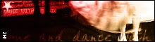
 Phantom:
 (Your set) That's really cute.
The resizing didn't work too well in the av, the characters look really squished in it. In the sig, the text looks a bit too small, try making the subtext a little larger. Also, the menus are a cute idea, but way too small. Make them bigger!

Cute though, I like it!
(Denae one) Another really cute one! The colors are a bit crazy though. The text is rainbow, the monkey has a rainbow xylophone, but the background is...green? What I would do for this one is change the background to be more fitting with the rest of the image/text. But again, this is adorable, and I love it.
Maniac: (Dawn) I like the simplicity of it, it's very nice! And I was just looking at the subtext, that's really entertaining to watch! Hehe. The text in the av is a little misaligned, move it over to the right a click and down two. I don't know if that would make it right in the center, but if you use Photoshop, Ctrl+A-->Layers-->Align-->Horizontal Selection. It centers things. I really like this set; however, 'Dawn' in the sig seems bland (font- and color-wise) compared to the bg. Try changing that around.
(Maniac) The quality of this one is a bit iffy. I don't like the choice of font in the sig, it doesn't match with the flowerness at all. You did well with the simplicity though. Nice work! Also, move the 'Maniac' on the av down a click or two. I'm an aligning nutcase, sorry. :p
DM: This is nice, but really inconsistent. What I would suggest doing is making the doll above the grid in both the av and sig, for some reason it looks weird how it is now. I'd also do the same for the actual snow faerie on the side. The subtext also looks a bit big. Other than that, nice work!
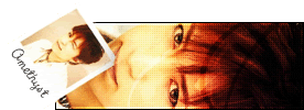
Amethyst: Ooh, pretty! First thing I notice though is that the av doen't have a border. Add one, now.
Another thing is that the text on the sig (subtext, that is), is a bit too close to the border. Push it over a few pixels, and that would make it look a bit better. Also, like I told Maniac, moving the text in the av over so it's aligned would make me happy. Unless you're going for an abstract effect...or something. I like this set though.
Apricus: I approve! I'm not sure if it's supposed to be anything in the background, but I like it! The dots add a good texture, too. The one thing I would change is the text in the av, it doesn't seem to match the abstractness of the rest of the set. Perhaps you could make it the same font as used in the sig, and just...yeah. I really like this set though. Nice work!
Now, for my secret underlying reason for rating...I made a set today, and I was wondering if anyone liked it. I haven't made anything in ages, and I wanted an opinion or several on it. So could someone please rate this? Thanks!