Moogie -
http://img.photobucket.com/albums/v438/ ... ound4b.jpg
The one big problem I have with this is the scanlines. I think they should be at a much lower opacity and it looks really funny over purple. I also feel that the 'Neopets' text should somehow differ from everything else, and not just in size. It's mostly the scanlines that bother me, other than that though, I really like the background and everything.

-
8/10
Iath-em -
http://img506.imageshack.us/my.php?image=ppttg422bf.jpg
I like this one. It isn't drop-dead gorgeous like your last round's entry, but it's still nice. A few things that I noticed though, one is that I think you should erase the dot/pixel texture over the dark faerie. I think it looks really bad. Secondly, I think it would look uber-awsome if the faerie's wings extended over the border, and didn't just get cut off. I do like how you do your text though. -
9/10
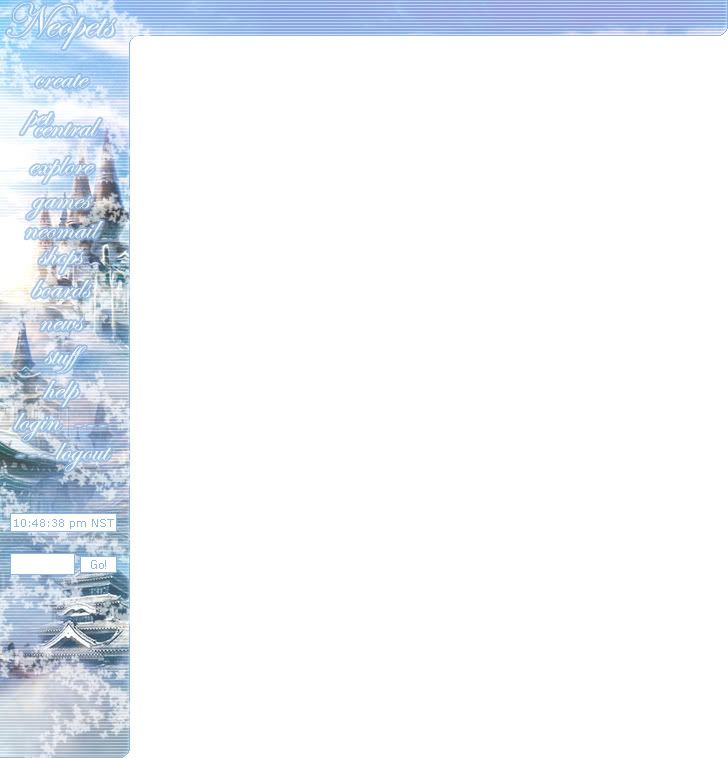
LAQ -
http://xs74.xs.to/pics/06136/sidebar4.png
This is really pretty! However, the softness of it all doesn't really go with Dr. Sloth. Resist the urge to make things blurry! >_< The background is really nice, but the main problem I have is that I think it's too blurry for this particular image and I dont like how his hair fades. I do like the stars in the background and I like the text though. -
8.5/10
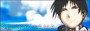
stinkyllama -
http://img50.imageshack.us/img50/8181/n ... ar23ee.jpg
I like how you've stuck to the original Neopets style. The background is simple and it looks great. I think it would be cool if the characters at the bottom were larger, and extended over the borders. However, your cut-outs are nice, but it still leaves a minimal amount of residue. I think in some cases, (not all) a dropshadow would be extremely effective. -
8.5/10
Bangel -
http://img306.imageshack.us/img306/29/s ... ttg4vo.png
Ahh, I'm sorry. But I dont see that much done to the original image except perhaps more contrast. The text is nice, and you've stuck with the neopian font. However, the "Journey To Maraqua" would be in the place of where your Username and Neopoints are. Lastly, this is saved as a PNG, but why do I still see GIF compression Diffusion in the sidebar? I think you could've done much better.

-
6.5/10
Kiay -
http://img222.imageshack.us/img222/5023/sidebar9ti.jpg
The background looks nice, however, the text is my main and very big problem. I like the shadow behind it, but I think the font and the colors you used looks really bad. Because the background is gradient like, the text should also follow it. It still looks okay at the top, but as the background got lighter the text looked more awkward. The dropshadow behind Neopets is also very neony and stands out. Also, what's with Log In, Log Out, and the background? It's a purple block with a stripe of lighter purple. There's also a little purple thingy at the bottom right corner where the rounded edge is. The background may be absolutely stunning, (which it is, by the way), but the text really takes away from it all. -
7/10
Neko -
http://img.photobucket.com/albums/v199/ ... idebar.jpg
It's not the colors that get me, even though they do a little, but the flowers in the background really gets to me. They look stretched and of really bad jpeg quality. Also, the "Neopets" at the top I think was cut out from a screenshot and just pasted on there with a blend mode. You can still see a freehand outline which meant that you didn't even blend it properly. Some of the corners and edges also look very wierd, as if you saved that part in very poor jpeg quality. Sorry, but I think you did so much better last round. -
6/10
--
I pick
Neko and
Bangel. Sorry guys!
Also, sorry if I sounded harsh, this was a hard round.


