Round 3 Gradings:
Round Note: I will be providing two seperate ratings for blog functionality. Each is out of five, and total is out of ten. But I don't want to weigh this too much against the graphic itself, so the minimum score you can get is 2/5 for both categories, although I don't think anybody will get that score. Let me explain how the two ratings work.
Blog Area Shape:
2: Completely irregular or non-exisitant. 100% Unfunctionable.
2.5: Somewhere between 2 and 3
3: Very irregular, small blog area. Very unfunctionable and unappealing with text.
3.5: Somewhere between 3 and 4
4: Somewhat irregular shape (might have some things going into the blog area) Functionable, but unappealing with text.
4.5: Somewhere between 4 and 5
5: Almost perfect, or perfect rectangular shape (may have small things going into the blog area, but doesn't interfere with text). Very functionable, and appealing with text.
Blog Area Background:
2: Very contrasted, no color of text will stand out or look appealing. 100% Unfunctionable.
2.5: Somewhere between 2 and 3
3: Very contrasted, text will have trouble showing up in some places. Very unfunctionable.
3.5: Somewhere between 3 and 4
4: Somewhat contrasted or distracting background. Text will show up, but background distracts from text.
4.5: Somewhere between 4 and 5
5: Almost perfect, or perfect. Very faint, or undistracting background. Text shows up perfectly or almost perfectly, and stands out. Text is appealing on background.
Your complete blog mark will be out of ten, and averaged with your main graphic's standalone grade. However, this will be weighed! This means when averaged, your main graphic will stand for 2/3 of your mark, and your blog will stand for 1/3. Your final mark will also be rounded to the nearest .25 (The rounding will not be mathematical, but will be tilted towards how much I like the graphic)
Also, as a repeat offender. Some of you may have parts of your main image going into your blog area for aesthetic reasons. However, don't forget that a sidebar will appear on the right! Most of the time it blocks or cuts off the image. This can be easily fixed by simply horizontally flipping your blog, and fixing the text. Remember to plan these things ahead!
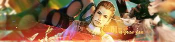
DM was on fire!
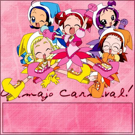
Very appealing blog, and pleasing to the eye.

Most of the image is cleanly extracted, and there aren't any stray pixels. The background is faint and the pink color scheme works surprisingly well. The text placement behind the main image is good, and you can make out what it says. (At least for me) The text seems a little un-anti aliased though. I feel the blog is lacking a special "Oomph", but good job overall.
Blog area works perfectly.
Graphic Score: 7.25/10
Blog Area, Shape: 5/5
Blog Area, Background: 5/5
Total: 8/10
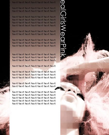
Ethics
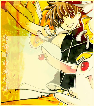
The colors of the image and the background are adjusted nicely to fit a color scheme. That texture thingy, which I'm going to assume you made looks like a stain, and works nice enough with the image. However, the scrollbar will be blocking part of his arm and the creature's ear, which kind of disrupts the image. Chinese text works well with the image, and is placed nicely.
Graphic Score: 7.5/10
Blog Area, Shape: 5/5
Blog Area, Background: 4.5/5
Total: 8.25/10
JellyFish72
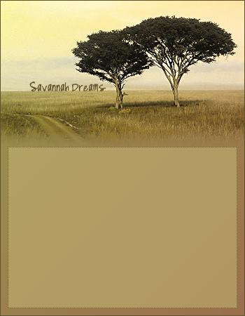
I like the simplicity of this one. The re-colored graphic looks nice and nolstalgic. The text is good here, also. It is placed nicely on the horizon and it looks pleasing that way, although I would have chosen a lighter text color to match the grass below it. You have a very nice blog area

but perhaps it's a little TOO tall for the graphic? I think it wouldn't hurt to cut about 100 pixels of the blog area in height. I would have also preferred if the blog background had just a tiny little bit of texture. Perhaps some really faded grass, or something. It's little things like that that would have pulled this blog together.
Graphic Score: 7/10
Blog Area, Shape: 5/5
Blog Area, Background: 5/5
Total: 8/10
kentieness
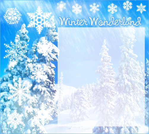
First of all, I really like the light effect you did near the top of the blog. It looks nice.
The text is fairly well done as well. However, I personally think the snowflakes are really tacky. =\ Perhaps one or two, or a group of small ones in a corner somewhere, or placed stragically along the blog area or text would have looked nice, but I don't think they look very good like this.

I'm pretty sure Paint Shop Pro has a very hard to use, and confusing "Brush Variance" function. If the snowflakes are a brush, then try to fiddle around with the brush variance tool to get the snowflakes to scatter and distort at an angle so it looks like they're falling, instead of just pasted there. The blog area also looks a little sudden and awkward, perhaps it would look better if you had moved the text just a tiny bit down so that a part of it is on the blog area. Rounded corners or a faint border wouldn't hurt, either.
Graphic Score: 6.25/10
Blog Area, Shape: 5/5
Blog Area, Background: 5/5
Total: 7.5/10
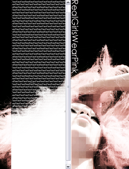
Kitten Medli

I don't know about this one... =\ The blog seems really messy to me, and I think it could have been executed much better. The background is nice, but some of the brushes you used in the corners seem like they're resized above their preset size, which gives them a weird blurry look. Or even if they're at their preset size, I would reccommend making those stripes in the bottom left corner a bit smaller anyways. The text doesn't seem very fitting and is rather boring as well. But I think the biggest problem is the main image. It seems very awkward and "stuck there". The colors don't exactly match the background, and the edges look rather rough and odd, I assume it was because the image was rotated. I would reccommend touching up the main image a bit more so that it blends in more with the background, perhaps a few color adjustments here and there will improve upon this blog.
Graphic Score: 5.75/10
Blog Area, Shape: 5/5
Blog Area, Background: 4/5
Total: 6.75/10
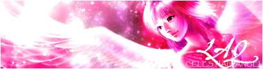
LAQ
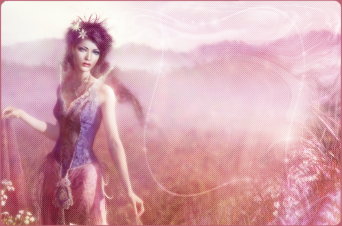
You've manipulated the colors to a very nice pink/lavender, and the blog looks very pleasant.
I also like the rounded flowers, and it's nice that you took the effort to edit in some flowers from the original image to the corners. I don't quite like the distortion in the top right corner, though. It seems messy to me and messes up the "flow" of the blog. The text area is creative, and I like the wavy effect, but perhaps it can be toned down a bit, as the text will look funny if there is too much space in the techinically given text area around it. The little glows on the lines are subtle, but look really nice. Good job overall.
Graphic Score: 8/10
Blog Area, Shape: 4.5/5
Blog Area, Background: 5/5
Total: 8.5/10
moogie
This is very creative. However, there are some obvious techincal aspects of the blog. But as the examples you gave have shown, it works better than I expected. However, there are still issues with text showing up in the complete blog area. (Perhaps it should have been presented as two seperate blogs, on blog area in black and one in white, though I imagine that will still look somewhat awkward). The graphic itself, is very creative. The mosaic effect, however, I feel could have been toned down and erased in some places. For example, I think it would have looked better if the mosiac effect was erased from the hair to black transition. Text is simple but appealing, and so is the blog, and the whole thing feels very sophisticated. However, I think this blog would benefit from being flipped horizontally, so the scrollbar does not go through the eye.
Graphic Score: 7.5/10
Blog Area, Shape: 5/5
Blog Area, Background: 3.5/5
Total: 8/10
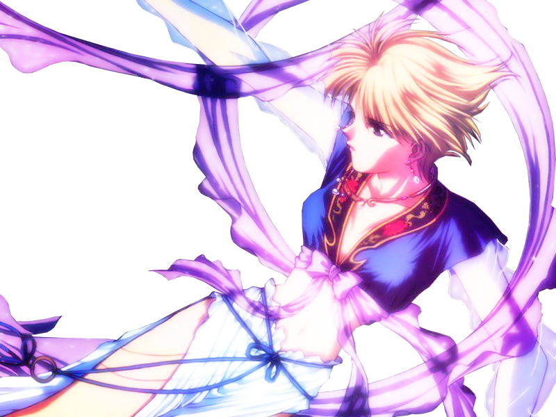
Neko
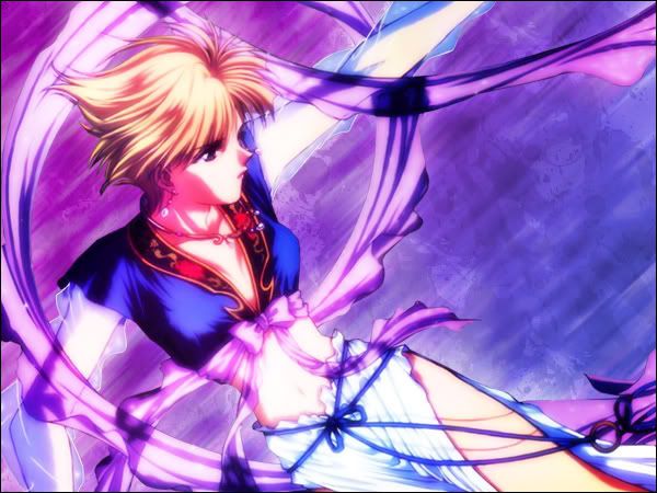
Very nice blog.
Colors work well together with the image you chose (I'm assuming it's a transparent PNG?) The background is very, very nice, yet subdued enough that text will show up on it. The motion blur effect works superbly in this situation. Despite that, though, I feel that there are little things that could have added to the blog as a whole. For example, the border could have been a gradient from purple to blue instead of just black. A little text placed on paths curved around the ribbons, or a little bit of sparkles or white circles or dotted lines (etc.) around the ribbons, I think, could have looked nice. Also, I think you could have taken a soft brush at a low opacity, and erased a little bit of her sleeves so that they look transparent (as they should be) instead of opaque. The blog area is nice as it's un-restricted, yet the scrollbar wouldn't look weird because it would be next to the border. However, like LAQ, the shape of the text area will look a little odd seeing as how no matter how you code it there will always be a lot of empty "blog space" or ribbon going into the blog area. However, overall, excellent job!
Graphic Score: 8.5/10
Blog Area, Shape: 4.5/5
Blog Area, Background: 5/5
Total: 9/10
Pixa
I think this is really sloppy, graphicwise. As in, the whole graphic seems really messy to me, and unappealing. I rather dislike the background, as it is too busy, and I wish you had simplified it with some filters (motion blur, etc...) or just used it as a texture for your own background. The white glow around the person is quite distracting, and out of place. I assume it was to hide some of the particles that clung to the person when you cut her out? Overlay text and border doesn't quite work here, as it seems way too strong compared to the rest of the blog, and the background is so busy that the overlay text looks very odd. The blog area, though, unlike some others that tried to do somewhat the same thing (LAQ's and Neko's) wouldn't look as weird with text there because the area is rectangular and large enough for text to show up without looking too weird.
Graphic Score: 6/10
Blog Area, Shape: 5/5
Blog Area, Background: 4.5/5
Total: 7/10
spiral_star

Very nice colors for the blog, good color scheme.
The background you've created isn't distracting, but looks good. However, watch out because it seems to go over your main image, which is perfectly fine, but you might want to take a soft brush and erase some parts so it doesn't look too odd. For example, I would have erased the texture over her face and hair, but kept it on her clothes and wings. And you also have to watch out, that even though this is a transparent PNG, a lot of the times they aren't extracted perfectly, or very well at all. If you look closely, you can see white edges all along your image. They aren't as noticible in this situtation, but please remember to watch out for those.

The text is simple, but it works, perhaps it could have been placed over the blog area a little bit. I don't quite like the arrows for the blog though, it is a good idea, but I don't think PSP's preset lines are very good.
Graphic Score: 7.75/10
Blog Area, Shape: 5/5
Blog Area, Background: 4.5/5
Total: 8.5/10
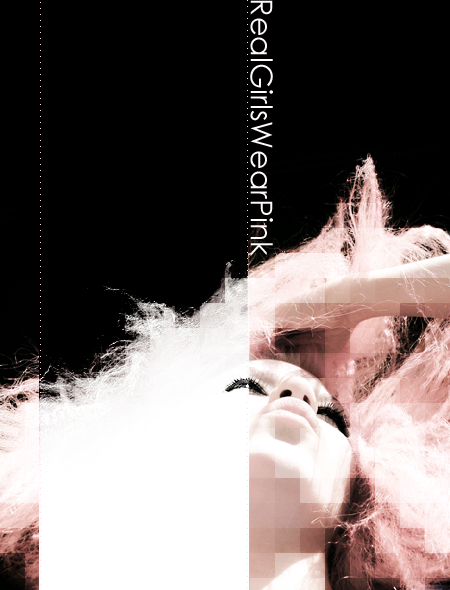
YesItIsh:
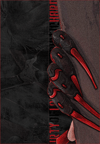
I really, really like this blog.
The whole blog is composed very nicely, and the elements mesh together. It is very appealing as a graphic, and the simple color scheme makes the red stand out, and emphasizes the whole thing. The blog background is very subdued, but complex at the same time as you used parts of the original image. The noise and the texture you added works very well in this situation, and everything just comes together.

You did an excellent job with the text, and I know text is very hard to do.
You did a nice job extracting the claws and surroundings as well. I love how a little bit of the hand extends into the blog area, but it is only a few tiny pixels or so and wouldn't interfere with the text at all. The dotted borders are lovely and work well too! One small complaint I have is that the scrollbar will be blocking the little bit of the fingers that extend into the blog area. I reccommend simply flipping the blog horizontally, so the scrollbar ends up on the other side. Other than that though, excellent job!
Graphic Score: 9.5/10
Blog Area, Shape: 5/5
Blog Area, Background: 5/5
Total: 9.75/10
Zilary
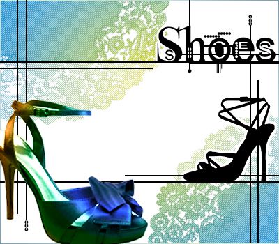
Very creative idea. I particularily like the black shoe on the right. The lines from the text, and the text (surprisingly) work well in this situation. The background lace is pretty, but I wish there was more to the background than two doilies. Try using the cloud render, and then using various distortion filters and go from there for backgrounds. I feel the border could be a thick, black line, seeing as how you were using the black lines everywhere else. As a whole, the blog kind of seems scattered and inconsistant in places, though.
But of course, the biggest problem is the text area. There are too many things going into the text area, and way too much at that. If text were to be placed in the rectangular box given, it would look awkward with the many things behind it. Although it might be aesthetically more pleasing to the eye, it isn't nearly as practical.
Graphic Score: 6.5/10
Blog Area, Shape: 3/5
Blog Area, Background: 4.5/5
Total: 7/10


