Tue Oct 25, 2005 9:07 pm
Tue Oct 25, 2005 11:19 pm
Flame wrote:WIS wrote:Whoo! I'M FINALLY DONE!
If anyone's interested...
Clicky!
Btw, my sig is .98 kbs over the limit... X_X hope that wouldn't matter.
...
Transparency is only visible in firefox... =[
Don't worry about the file size. I won't kill you for it.
As for the transparency, could you please save your av and sig as.gif files and post them here? That way I can actually see for myself how well the transparency works.

But Gif doesn't have the alpha transparency thingy I used (Cause it only has 256 colors), would it be alright if I just showed a screenshot?
(Also works in Netscape and Opera... incase you have those)
[EDIT]
If you cant judge on the screenies, then I'll try to make some sort of GIF opaque border thingymabob. I dont think it would look as good though.
Wed Oct 26, 2005 12:47 am
WIS wrote:Flame wrote:WIS wrote:Whoo! I'M FINALLY DONE!
If anyone's interested...
Clicky!
Btw, my sig is .98 kbs over the limit... X_X hope that wouldn't matter.
...
Transparency is only visible in firefox... =[
Don't worry about the file size. I won't kill you for it.
As for the transparency, could you please save your av and sig as.gif files and post them here? That way I can actually see for myself how well the transparency works.
But Gif doesn't have the alpha transparency thingy I used (Cause it only has 256 colors), would it be alright if I just showed a screenshot?
(Also works in Netscape and Opera... incase you have those)
[EDIT]
If you cant judge on the screenies, then I'll try to make some sort of GIF opaque border thingymabob. I dont think it would look as good though.
The screenshots are fine.
Wed Oct 26, 2005 4:55 pm
WIS = gonna kick my butt
Nikita = gonna kick my butt
Ammy = gonna kick my butt
Pixa (THAT'S who I was forgetting in my journal entry! ^^') = gonna kick my butt
Can I just say everyone's gonna kick my butt? Either way, good luck everyone and congrats to everyone to made it! I didn't think I would, for sure.


(I tried to slow down the animation, but everytime I did it would be like 100kb and using the Optimization Wizard made it look bad. So, I had to make it fast. Anyone curious on my unanimated version: here)
Programs: PSP 8 and Animation Shop 3
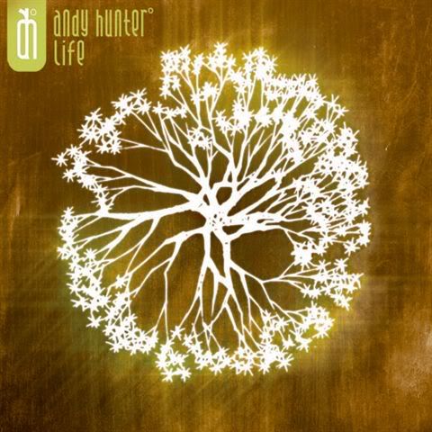
Images: Andy, Andy, Andy's Tree <s>of</s> from Life
Nikita = gonna kick my butt
Ammy = gonna kick my butt
Pixa (THAT'S who I was forgetting in my journal entry! ^^') = gonna kick my butt
Can I just say everyone's gonna kick my butt? Either way, good luck everyone and congrats to everyone to made it! I didn't think I would, for sure.
(I tried to slow down the animation, but everytime I did it would be like 100kb and using the Optimization Wizard made it look bad. So, I had to make it fast. Anyone curious on my unanimated version: here)
Programs: PSP 8 and Animation Shop 3
Images: Andy, Andy, Andy's Tree <s>of</s> from Life
Thu Oct 27, 2005 7:46 pm
woohoo, and here is the FINAL ROUND!
Judges know the drill. Give a rating out of 10, whatever you decide it may be, for each set. And rate as normal too.

DM was on fire!
Programs: PSP 8 and Animation Shop 3
Images:
http://img.photobucket.com/.../ppttgstu ... ulpic1.jpg
http://img.photobucket.com/.../ppttgstu ... ulpic2.jpg
http://img.photobucket.com/.../ppttgstu ... ulpic3.jpg
Pixa


Programs: Photoshop CS2 and Illustrator CS2
Images:
http://www.channel4sales.com/.../desper ... ewives.jpg
http://images.tvnz.co.nz/.../desperate_ ... her2_d.jpg
Nikita


Image:
http://www.animegalleries.net/albums/us ... terfly.jpg
Program: PSP 7
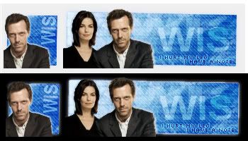
WIS


Image:
http://www.housetv.org/imgs/laurie_ward.jpg
Program: PSPX
Amethyst


Image:
http://img.photobucket.com/albums/v31/l ... 59/380.jpg
Program: Photoshop Elements
Judges know the drill. Give a rating out of 10, whatever you decide it may be, for each set. And rate as normal too.
DM was on fire!
Programs: PSP 8 and Animation Shop 3
Images:
http://img.photobucket.com/.../ppttgstu ... ulpic1.jpg
http://img.photobucket.com/.../ppttgstu ... ulpic2.jpg
http://img.photobucket.com/.../ppttgstu ... ulpic3.jpg
Pixa
Programs: Photoshop CS2 and Illustrator CS2
Images:
http://www.channel4sales.com/.../desper ... ewives.jpg
http://images.tvnz.co.nz/.../desperate_ ... her2_d.jpg
Nikita
Image:
http://www.animegalleries.net/albums/us ... terfly.jpg
Program: PSP 7
WIS
Image:
http://www.housetv.org/imgs/laurie_ward.jpg
Program: PSPX
Amethyst
Image:
http://img.photobucket.com/albums/v31/l ... 59/380.jpg
Program: Photoshop Elements
Fri Oct 28, 2005 1:49 pm
DM was on fire! - Generally I have to say this looks pretty nice. Small irritating details though, for example the border around your subtext which could use some anti-alias as well as the insanely fast animation. Good colors and choice of font. 7/10
Pixa - I just don't get the feeling that I really like this set aesthetically. You've got a good start for something, but the placement of the text is no good when it goes over the border and both avatar and signature look incredibly empty. The face on the signature stands out way too much compared to the rest. 5/10
Nikita - As far as the avatar goes I'm satisfied, it is very good except for the faded out "Nik" you've put in it, I think it could have done without it. The signature is a bit weaker though. While you've got some wicked shades of purple going on the text looks very much out of place. I don't think it was the best idea to choose that font in particular and tint the whole thing. 6/10
WIS - Very nice. Overall I like this set very much, you got some nice color combinations with matching effects and nice image usage. When it comes to the more practical part the sig is too big (>50KB) and .png transparency isn't visible in IE, but then again IE sucks so I won't blame you for it. 9/10
Amethyst - You've definitely not done the best you could have regarding the colors, the image quality looks actually bit worse than in the original image and the main appearance of the whole set is very plain. 5/10
Sat Oct 29, 2005 6:05 pm
Just a little note, I can't rate this round, sorry.
Sat Oct 29, 2005 7:16 pm
Aww. Sorry to hear that, Marissa. 
Now three judges will decide my fate instead of four. ;_;
Now three judges will decide my fate instead of four. ;_;
Tue Nov 01, 2005 12:13 pm
DM was on fire!: This is a pretty sound set you've made! I love how the colours just come together perfectly and I like how you've manipulated the snowflake to match the background. The animation, I understand, that you don't have enough space so I'll let it slip. If it was slowed down a little, it'll be wonderful. I don't know about anyone else, but the second face seems a little "out of the picture". It would be great if you focus on one picture for this set. 7/10
Pixa: This isn't a bad set, yet not too good either. Firstly, the text placement seems a little random; it seems like you're trying out a new style to place the text, it's not too good though. I do love the choice of font though. I also feel that you can do better than this! You must have put in quite an effort in this, but I'm really, really sorry to say, it doesn't appeal to me especially compared to some others. Nonetheless, good job on the effects. 6/10
Nikita: I absolutely love this set. You've manipulated the original picture to a purple-toned set and it works very well in this set! However, I don't think the choice of font is the best one. This set actually gives me a feeling that it could be more elegant. The text placement and the font size are two other points that you may want to consider. On the avatar, there's faded text; it's not a bad thing, but don't try to complicate the simplicity. It's fine with just "nikita" in pixel font. 8/10
WIS: Okay. As much as I like the colours for the background, this set really, really don't appeal to me very much. I see the use of transparency and tilting, but it just lacks something special that will make your set stand out among the rest. I don't like the way the subtext is placed, in terms of blending. There isn't much I can say about this set, it a very "whole" set, nothing too bad, yet nothing exceptional. 5/10
Amethyst: Love this. Very much so. It must have taken you helluva long time to create that dark effect. I really like how the set suits what the subtext suggests, the effect is awesome. I think the overlay of text on the set works quite well on this set. The only thing you may want to consider is the length of the signature. I actually think it could be a little shorter and the subtext/text can be moved to the right a little too. 8/10
Wed Nov 02, 2005 12:37 am
Oo! This is close! =o
Wed Nov 02, 2005 5:19 pm
I know! ;_; Someone else judge, because I'm starting to shake!
Wed Nov 02, 2005 6:41 pm
Looong ratings. lol And please inform me if anything doesn't make sense...I really can't type today.
DM
Let's see...I think the second smaller image of the guy should be a bit more faded into the background. Two images of him is sorta...strange. Creative use of that tree image in the background. Not a common choice, but it works. I like that you can still see the pink shirt. The animation is a bit quick, but you've explained that. However, I think one line of text repeating with a slower fad in and out would've looked better. Part of the sig background looks a little too empty, around the words 'was' and 'dm' because there's not that tree detail. (wow, that was long. lol.) 8/10
Pixa
This set makes sense, provided a person knows about desperate housewives. The place where you've placed 'pix' in the sig looks a little strange. It's sort of dull to look at it, especially the av. I think the picture of teri would've gone better. I think the intricate little border you've done looks nice. 5.5/10
Nikita
This is definitely eye catching. The placement is good, and it's a good choice for colorization. I like the font in the sig. The av text looks a little boring though. Might've been cool to use something other than a pixel font. This set would've also probably looked better with a more interesting border. The regular old rectangle is sort of dull, and too sharp against the smooth lines of the image. 7.5/10
WIS
I think the background and text and everything is cool, but it really doesn't go with the image. You cut the two people out a little messily. I can see some jagged edges. The subtext needs to have a different glow around it, as the bright blue looks sort of odd. Honestly, the image and the rest of the set don't really fit together. 7/10
Amethyst
You did a pretty cool job with this. The only think I'd change is to actually make the black, well, blacker, without losing the brightness of any of the other colors. I think it would make them 'pop' a bit more. The sig is a bit long, and I think it's because of how you wanted to place the subtext. The empty left corner doesn't bother me, surprisingly. The white text is a little bright and out of place though. Maybe make it yellow like Ed's hair? 8/10
Wed Nov 02, 2005 7:26 pm
So, uh. Is that the last of the ratings then? *jumpy* Sorry if I'm butting in.. but...
Wed Nov 02, 2005 9:22 pm
DM 8 7 7 =22
Pixa 5.5 6 5 = 16.5
Nikita 7.5 8 6 = 21.5
WIS 7 5 9 = 21
Amethyst 8 8 5 = 21
This was very very very close. Meep! I don't think it's ever been such a close call...But, a win is a win.
So...
CONGRATULATIONS TO DM WAS ON FIRE!
Pixa 5.5 6 5 = 16.5
Nikita 7.5 8 6 = 21.5
WIS 7 5 9 = 21
Amethyst 8 8 5 = 21
This was very very very close. Meep! I don't think it's ever been such a close call...But, a win is a win.
So...
CONGRATULATIONS TO DM WAS ON FIRE!
Wed Nov 02, 2005 9:25 pm
YAY MY MATH WAS RIGHT!
CONGRATULATIONS SISTER ASHTRAY!!!! *a splode*
CONGRATULATIONS SISTER ASHTRAY!!!!