Sun Nov 12, 2006 12:46 am
Aw man, I just got pwn'd'd!
Sun Nov 12, 2006 5:09 am
Doesn't really look like a wallpaper but rarrghhh... I'm tired of working on it. XD

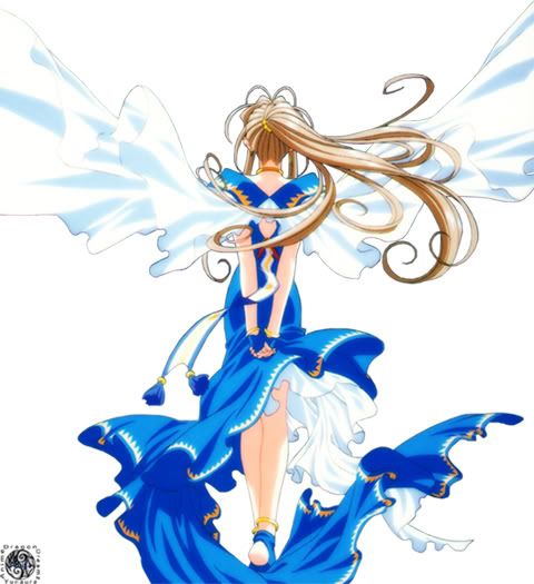
Original Image: Courtesy of aethereality.net =)
Program Used: GIMP 2.2
Not too bad... I hope...
Yours is really pretty Dawn. ;D

Original Image: Courtesy of aethereality.net =)
Program Used: GIMP 2.2
Not too bad... I hope...
Yours is really pretty Dawn. ;D
Sun Nov 12, 2006 6:29 am
Bangel, I cant see your original image. 
Sun Nov 12, 2006 7:16 am
-phew- I have literally been working on this since I got up at 9 this morning, and it's now 2 AM.
http://i88.photobucket.com/albums/k174/ ... d_desk.jpg
Main images (Warning, they're HUGE): 1, 2.
Background images (I'm too lazy to draw my own hexagons, so thank you Google image search^^): 1, 2.
Program used: Photoshop Elements
I'm pretty sure it's some sort of Masamune Shirow heresy to use lyrics from a Ghost in the Shell theme song with images from Appleseed, but Rise immediately sprang to my mind when I started putting the images together, so why not?
Sun Nov 12, 2006 1:19 pm
WIS wrote:Bangel, I cant see your original image. :(
http://img237.imageshack.us/img237/182/ ... agetr9.jpg
Weird. oO Maybe the server was down or something; I can still see it. I uploaded it to ImageShack, though, just incase. :)
Thu Nov 16, 2006 4:01 am
Just to warn you, the file is pretty huge because my screen resolution is huge. XD

Image Used: Click
Program Used: PS CS2
*yawns* Sooooo tired and soooo busy! *goes back to sleep*

Image Used: Click
Program Used: PS CS2
*yawns* Sooooo tired and soooo busy! *goes back to sleep*
Fri Nov 17, 2006 12:57 am
Week 5, Grading
Kitten Medli
http://www.geocities.com/forest_melody_saria/ham.html
Image used: http://img209.imageshack.us/img209/9875 ... o04zq1.jpg
Programs: Adobe Photoshop Elements
Bangel
http://img208.imageshack.us/img208/7767 ... perwq4.gif
Original image: http://img237.imageshack.us/img237/182/ ... agetr9.jpg
Program: Paint Shop Pro 9
LAQ
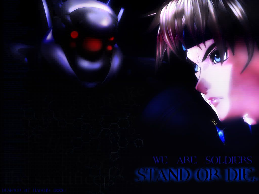
Original Image: Courtesy of aethereality.net =)
Program Used: GIMP 2.2
hakojo
http://i88.photobucket.com/albums/k174/ ... d_desk.jpg
Main images (Warning, they're HUGE): 1, 2.
Background images (I'm too lazy to draw my own hexagons, so thank you Google image search^^): 1, 2.
Program used: Photoshop Elements
Neko
Image Used: Click
Program Used: PS CS2
Grading is due November 20th
Kitten Medli
http://www.geocities.com/forest_melody_saria/ham.html
Image used: http://img209.imageshack.us/img209/9875 ... o04zq1.jpg
Programs: Adobe Photoshop Elements
Bangel
http://img208.imageshack.us/img208/7767 ... perwq4.gif
Original image: http://img237.imageshack.us/img237/182/ ... agetr9.jpg
Program: Paint Shop Pro 9
LAQ
Original Image: Courtesy of aethereality.net =)
Program Used: GIMP 2.2
hakojo
http://i88.photobucket.com/albums/k174/ ... d_desk.jpg
Main images (Warning, they're HUGE): 1, 2.
Background images (I'm too lazy to draw my own hexagons, so thank you Google image search^^): 1, 2.
Program used: Photoshop Elements
Neko
Image Used: Click
Program Used: PS CS2
Grading is due November 20th
Last edited by WIS on Sun Nov 19, 2006 7:39 am, edited 2 times in total.
Tue Nov 21, 2006 7:48 am
WIS is such a hypocrite.
Wed Nov 22, 2006 1:00 am
Kitten Medli
http://www.geocities.com/forest_melody_saria/ham.html
Well, I kind of expected a more bubbly and cute background for the hamster. The cyan kind of works with the orange in a strange way, but not really... if you get what I mean. The original image was so big, and I think you could have made a lovely orange & yellow background (Kinda like the starfox one) to suit the hamster. - 7/10
Bangel
http://img208.imageshack.us/img208/7767 ... perwq4.gif
Yes, the wallpaper is really pretty. I really like the simple concept and how you manipulated the image. However, I do feel that it was ruined a bit by the GIF, however, good job on compressing it though. I can hardly notice the dithering. - 8.5/10
LAQ
Firstly, I would just like to say that the background is simply superb! However, because the main image was an extracted PNG, it seems like you just pasted it on the background and set it at a blend mode, without too much thought. This is the problem with working with pre-extracted PNGs, I would rather use an image and blend it into the graphic itself. - 8/10
hakojo
http://i88.photobucket.com/albums/k174/ ... d_desk.jpg
I really like this one. I think the images are manipulated very wonderfully. However, I think that perhaps the scanlines are just a little bit too strong. Toning it down by just a smidge would be good. I must say though, I absolutely LOVE the text! I cant imagine how long it must have taken you to achieve such an effect! - 9/10
Neko
This is really pretty! The image is nicely blended and I like how centralized this image is. It's simply very pleasing to look at and everything fits nicely. Excellent job! - 9.5/10
http://www.geocities.com/forest_melody_saria/ham.html
Well, I kind of expected a more bubbly and cute background for the hamster. The cyan kind of works with the orange in a strange way, but not really... if you get what I mean.
Bangel
http://img208.imageshack.us/img208/7767 ... perwq4.gif
Yes, the wallpaper is really pretty.
LAQ
Firstly, I would just like to say that the background is simply superb! However, because the main image was an extracted PNG, it seems like you just pasted it on the background and set it at a blend mode, without too much thought. This is the problem with working with pre-extracted PNGs, I would rather use an image and blend it into the graphic itself. - 8/10
hakojo
http://i88.photobucket.com/albums/k174/ ... d_desk.jpg
I really like this one.
Neko
This is really pretty! The image is nicely blended and I like how centralized this image is. It's simply very pleasing to look at and everything fits nicely. Excellent job! - 9.5/10
Wed Nov 22, 2006 2:36 am
Yeah, I totally know what you mean. Your idea is so much cuter, too. :P Curse you, Swiss-Wis.
Sat Nov 25, 2006 3:20 am
I'm really tired, want to go to bed, and sleep.
WIS won't stop bothering about this.
He said I could do my comments in the morning though, so I will.
Medli: Interesting, Hamtaro. Cyan! 7/10
Bangel: Great work. A lot of effort is obvious. 9/10
LAQ: Kind of boring. Well done nonetheless. 8/10
Hakojo: I love this, great effect, well blending, great scanlines, fancy text. Amazing package. 9.5/10
Neko: Very pretty. The way you've made the image bigger is really good, and the background gives a dreamy, astral feel. 9/10
Hey! It's 3:20am...
WIS IS A LIAR!
Sat Nov 25, 2006 6:47 pm
ok....im sorry for being late....for 5 days...i had a lot of school work and tests and projects and endless ticking of an sound effect in my head.
what do we have here....wallpapers!...
Kitten Medli - 7/10
very cute, nice compisition of putting hamtaro there, and the swirls are nice on the nice too. but what bothers me is that the blue background doesnt fit with the orange hamtaro, and the fancy background doesnt fit with the simply cute hamtaro.
Bangel - 8.5/10
i really like the colours in this one, its very nice to look at, and it really
brings out the mood. and the little smaller version on the left is a nice touch too.
LAQ - 7.5/10
nice blending in the background and colour choice. but the compisition of the girl there is kind of, awkward, i dont know how to describe it, but its just kinda of....geah...(yes thats "geah" not "yeah")
hakojo - 8.5/10
i really like this one, its moody, dark, when it was suppose to be, and you did good on bringing out these moods.
Neko - 8.9/10
i really like this one, because it gives you a refreshing and positive feeling. i like what you did with the background, it fits with the image you used perfectly. but one thing that bothers me is, i dont know where to put my files and folders, its fancy and colourful every where, my files would be scattered all over the wallpaper on the blank blue spaces. but good job!
Sat Nov 25, 2006 8:58 pm
Kitten Medli - 8.5/10
I squee-d when I saw this lol! It's very cute and very enjoyable.... I love the combination of orange and blue, it looks warm and fun at the same time!
Bangel - 8.5/10
This background is very well made! I love it it meshes well, it has nice colors, all around a good background. However for next time I would probably use another image to contrast the horizontal one. I think it would make it stand out more, and made it work a lot better.
LAQ - 7.5/10
I like this background, but it kind of looks... Well, for lack of a better word, half done. It looks nice, fits nice, but it just looks half done. Sorry.
hakojo - 8/10
I like this one, but the text kind of sticks out a bit, almost to the point where it looks akward.
Neko - 10/10
TOUCHDOWN! My only concern is where my files and icons would go, but other than that, GOOD JOB!
(Sorry I'm soooooooooo late!)
Tue Nov 28, 2006 5:12 am
The results: http://pptga.awardspace.com/
Unfortunately, Kitten Medli and LAQ are eliminated.
--
FINAL WEEK ASSIGNMENTS:
You will need to make 2 graphics.
Graphic #1:
- Make a set
- No restrictions kb-wise
- Within PPT limits
Graphic #2:
- Pick a previous week of PPTGA (Except for the first one), and do the task again. However, there will be no restrictions. Please, however, do NOT make a 1000 by 3000 pixel blog. Obviously, restrictions that apply to the type of graphic itself are still in place.
- Think about your choice carefully, pick a graphic that is best suited for your talents
All graphics are due by December 4th.
Unfortunately, Kitten Medli and LAQ are eliminated.
--
FINAL WEEK ASSIGNMENTS:
You will need to make 2 graphics.
Graphic #1:
- Make a set
- No restrictions kb-wise
- Within PPT limits
Graphic #2:
- Pick a previous week of PPTGA (Except for the first one), and do the task again. However, there will be no restrictions. Please, however, do NOT make a 1000 by 3000 pixel blog.
- Think about your choice carefully, pick a graphic that is best suited for your talents
All graphics are due by December 4th.