Amarise's shop design contest!! *Winners announced!*
Sat Sep 18, 2004 4:25 am
Okay, seeing as how I'm now officially one item away from completing my gallery, I'm having a shop design contest! Basically, I just need shop stuff that looks like the Shadow Usul. There will prizes for individual artwork, as well as a big prize for the winning overall layout. Every prize will be a mystery item or items, the big prize being worth over 200k, and the little prizes being anywhere from 10-50k, depending on the category.
List of artwork
Background
Blog
Small Pic
Random artwork (Including fonts)
If you think of something that isn't included above, simply put it in the 'random artwork' category. Here are my requirements:
1. Post which category the art is in when you enter.
2. I cannot code blogs. It is not absolutely necessary that you code the blog for me, but if you are able to it would be a big help.
3. You may enter as many times as you wish, and whatever style of art you so choose.
4. You may use pictures provided, or you may find your own pictures to use.
5. The word 'Evil' cannot appear anywhere in my shop. You may use anything else (provided it's clean, of course) but not the word Evil.
6. You don't have to enter an entire shop's worth of artwork. But I can only award the Best Overall Shop prize if you do. If I don't get anyone who enters a full shop, then I will pick from the people who entered multiple pictures.
The contest will end on the 30th, so it should be enough time to enter. Any questions, clarifications, ect, just let me know.
Pictures
http://images.neopets.com/neopedia/131_shadow.gif
http://images.neopets.com/pets/closeattack/18_right.gif
http://images.neopets.com/new_shopkeepers/t_723.gif
http://images.neopets.com/items/book_shadowusul.gif
http://images.neopets.com/items/book_shadow.gif
http://images.neopets.com/items/tcg_0079_RV65.gif
http://images.neopets.com/items/food_sh ... llyadx.gif
http://images.neopets.com/items/tcg_0231_CI43.gif
http://images.neopets.com/games/tradingcards/97.gif
http://images.neopets.com/items/toy_shadowusul.gif
List of artwork
Background
Blog
Small Pic
Random artwork (Including fonts)
If you think of something that isn't included above, simply put it in the 'random artwork' category. Here are my requirements:
1. Post which category the art is in when you enter.
2. I cannot code blogs. It is not absolutely necessary that you code the blog for me, but if you are able to it would be a big help.
3. You may enter as many times as you wish, and whatever style of art you so choose.
4. You may use pictures provided, or you may find your own pictures to use.
5. The word 'Evil' cannot appear anywhere in my shop. You may use anything else (provided it's clean, of course) but not the word Evil.
6. You don't have to enter an entire shop's worth of artwork. But I can only award the Best Overall Shop prize if you do. If I don't get anyone who enters a full shop, then I will pick from the people who entered multiple pictures.
The contest will end on the 30th, so it should be enough time to enter.
Pictures
http://images.neopets.com/neopedia/131_shadow.gif
http://images.neopets.com/pets/closeattack/18_right.gif
http://images.neopets.com/new_shopkeepers/t_723.gif
http://images.neopets.com/items/book_shadowusul.gif
http://images.neopets.com/items/book_shadow.gif
http://images.neopets.com/items/tcg_0079_RV65.gif
http://images.neopets.com/items/food_sh ... llyadx.gif
http://images.neopets.com/items/tcg_0231_CI43.gif
http://images.neopets.com/games/tradingcards/97.gif
http://images.neopets.com/items/toy_shadowusul.gif
Last edited by amarise on Fri Oct 01, 2004 4:59 pm, edited 6 times in total.
Sat Sep 18, 2004 8:25 am
Hi Amarise!
First, congratulations on finishing the gallery I'll never be done mine.
Anyway, I've started a blog, but I need to know what the title should be - like the gallery name or something you want special there. Yes, I will try my best to code it...I'm practicing madly!
First, congratulations on finishing the gallery
Anyway, I've started a blog, but I need to know what the title should be - like the gallery name or something you want special there. Yes, I will try my best to code it...I'm practicing madly!
Sat Sep 18, 2004 2:58 pm
lol thank you.  Not quite finished, but since it's only one item I figure I might as well get my shop decorated.
  I don't care what the title is, it can be pretty much anything you can think of. (Except Evil. I don't want the word evil appearing anywhere in my shop, and I'm going to add that to my list of requirements) But as a backup, you can use 'Shadow', 'Mystery', or 'Usul', or any combination thereof.
Oh, and under Random Artwork, something that could be made is some kind of pic of the Shadow Usul Plushie, since it's the only item I don't have yet.
*Edit* And I've added two more requirements to my first post, just to clear things up a little.
Oh, and under Random Artwork, something that could be made is some kind of pic of the Shadow Usul Plushie, since it's the only item I don't have yet.
*Edit* And I've added two more requirements to my first post, just to clear things up a little.
Sat Sep 18, 2004 9:25 pm
OK, I've given this a shot ... the wide, short blog I messed up the code somewhere, but o _O (left the space for credit!) fixed it for me - somehow. All credit for the first blog code goes there. I'm also not entirely happy with the faded image on that blog, but couldn't get it any better. I did clean up some of the images so they'd show better and I did match all the colors to what's in the original images.
Anyway, this would be everything (I tried for a whole gallery ensemble) - background, plushie thing you need, welcome, and 2 blogs to choose from - there's a link at the bottom of this where you can look at everything together
 background
 the plushie you're missing
 a little welcome sign
 your blog
my blog code - which is wrong (I still don't know what, it just is) - just so people can see...
Edit! roses and cookies to o _O for helping me and figuring out the correct code for the blog above! Thank you SO much:D Here is a GOOD code for the wide, short blog:
Yes, I'm leaving the other bad code so everyone can see that I am kinda dumb with this stuff (this is the second blog I've ever made, let alone tried to code).
Here's a Different Blog:

This one I got the code to work ... amazing, huh?
You can see the whole thing together here, I did a kind of test "mock up" for you: http://www.geocities.com/dizzturbed/shadow.html Both blogs are on here - coded so you can see them = the bad and the good. So you'll see the short one twice - the first one (the coding) should be good for a laugh if nothing else.
Just in case you want one and don't have a code, here's a shop table code (this should work):
Hex colors:
74065E - dark "maroon" - on larger blog font color
CF009C - "pink" used in welcome, smaller blog and plushie image
FFD500 - the yellow I used
6E6C6E - a grey - look at the highlight on the usul's ear on the first blog
Anyway, this would be everything (I tried for a whole gallery ensemble) - background, plushie thing you need, welcome, and 2 blogs to choose from - there's a link at the bottom of this where you can look at everything together
 background
 the plushie you're missing
 a little welcome sign
 your blog
my blog code - which is wrong (I still don't know what, it just is) - just so people can see...
<div align="center"><table border="0" cellpadding="0" cellspacing="0" width="400" height="200" background="http://img72.exs.cx/img72/3743/shadowlblog2.gif"><tr><td width="400" height="6" colspan="3"></td></tr><tr><td width="180" height="185"></td><td width="200" height="140"><div style="width: 197; height: 110; overflow: auto; font-family: Verdana; font-size: 12px; color: #000000; scrollbar-arrow-color:#D500A1; scrollbar-track-color:#6E6C6E; scrollbar-face-color:#404040; scrollbar-highlight-color:#6E6C6E; scrollbar-3dlight-color:#404040; scrollbar-darkshadow-color:#6E6C6E; scrollbar-shadow-color:#404040;"><br><div style="padding: 4px;">
<b>THIS IS ONLY A TEST!
<p>
OK, this code is not right - I can't get the scrollbar to be the entire height of the inside blog text area! <p>
The correct code was done by o_ O
<br></div></div></td><td width="5" height="150"></td></tr><tr><td width="400" height="3" colspan="3"></td></tr></table></div>
Edit! roses and cookies to o _O for helping me and figuring out the correct code for the blog above! Thank you SO much:D Here is a GOOD code for the wide, short blog:
<div style="width: 400px; height: 200px; background: url(http://img72.exs.cx/img72/3743/shadowlblog2.gif)">
<div style="height: 35px"></div>
<div style="margin-left: 187px; width: 195px; height: 152px; font-family: Verdana, Arial, sans-serif; font-size: 10pt; color: #000000; padding-right: 3px; overflow: auto; scrollbar-arrow-color: #D500A1; scrollbar-track-color:#6E6C6E; scrollbar-face-color:#404040; scrollbar-highlight-color:#6E6C6E; scrollbar-3dlight-color:#404040; scrollbar-darkshadow-color:#6E6C6E; scrollbar-shadow-color:#404040;">
<b>TEXT HERE
<p>
does this code work?
<p>
do Yes! It works! thank you so much for your help! =)
<p>
you're an absolute genius
<p>
The directions I got before were obviously a little too technical or something for me...I'm just hopeless
</div>
</div>
Yes, I'm leaving the other bad code so everyone can see that I am kinda dumb with this stuff (this is the second blog I've ever made, let alone tried to code).
Here's a Different Blog:

This one I got the code to work ... amazing, huh?
<div align="center"><table border="0" cellpadding="0" cellspacing="0" width="325" height="325" background="http://img30.exs.cx/img30/9262/shadowtbl.gif"><tr><td width="290" height="120" colspan="3"> </td></tr><tr><td width="8" height="150"></td><td width="270" height="140"><div style="width: 300; height: 164; overflow: auto; font-family: Verdana; font-size: 12px; color: #000000; scrollbar-arrow-color:#D500A1; scrollbar-track-color:#6E6C6E; scrollbar-face-color:#404040; scrollbar-highlight-color:#6E6C6E; scrollbar-3dlight-color:#404040; scrollbar-darkshadow-color:#6E6C6E; scrollbar-shadow-color:#404040; "><br><div style="padding: 5px;">
<b>THIS IS ONLY A TEST!
<p>
Your Text goes here
<br></div></div></td><td width="6" height="145"></td></tr><tr><td width="270" height="6" colspan="3"></td></tr></table></div>
You can see the whole thing together here, I did a kind of test "mock up" for you: http://www.geocities.com/dizzturbed/shadow.html Both blogs are on here - coded so you can see them = the bad and the good. So you'll see the short one twice - the first one (the coding) should be good for a laugh if nothing else.
Just in case you want one and don't have a code, here's a shop table code (this should work):
<p><center><body link=FFFFFF><p>
<table cellpadding="30" cellspacing="30" border="0"><tr><td bgcolor="------" align="center" valign="middle" colspan="2">
Hex colors:
74065E - dark "maroon" - on larger blog font color
CF009C - "pink" used in welcome, smaller blog and plushie image
FFD500 - the yellow I used
6E6C6E - a grey - look at the highlight on the usul's ear on the first blog
Sun Sep 19, 2004 3:09 am
Gorgeous. Simply gorgeous.  I love it, especially the Shadow Usul Welcome sign and the first blog.
  I'm glad you got the coding to work, I'm just awful with that kind of stuff.
  Since that is most definately a full shop entry, I'm happy to include you in the Best Overall Design part of this competition.
  I love how it all fits together so nicely as a shop layout.
Thu Sep 23, 2004 11:05 pm
okay, I need some nps, so i entered ^_^
 Shop BG
 Shop blog
 small image...thing.
 shop welcome sign
 enjoy
enjoy
sorry there's no coding, I can't I've never done it in my life XD
 Shop BG
 Shop blog
 small image...thing.
 shop welcome sign
sorry there's no coding, I can't I've never done it in my life XD
Fri Sep 24, 2004 1:01 am
What dimensions are your monitor size (800x600, 1024x768, etc.)? Because I can make way better full-sized BGs than tiled ones.
Fri Sep 24, 2004 1:45 am
Ooooh.... quite nice!  I'll find someone to code it. (Hopefully) I'm glad I got more entires!!
My monitor is 800x600. I'd love to see a full-sized background as well as tiled, it'll give me plenty of options.
My monitor is 800x600. I'd love to see a full-sized background as well as tiled, it'll give me plenty of options.
Fri Sep 24, 2004 4:05 am
ok im entering, but, im only done with the bg for right now. i'll be editing this post with my complete entry soon.
-------------------------------------------------
three background choices: (click on the ex link for an example of what it would look like in your shop)
ex: http://img.photobucket.com/albums/v32/k ... /bbgex.gif
ex: http://img.photobucket.com/albums/v32/k ... /gbgex.gif
ex: http://img.photobucket.com/albums/v32/k ... /wbgex.gif
-------------------------------------------------
blog: (sorry, no dice on coding it, i tried though)
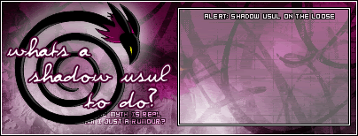
-------------------------------------------------
small image: (was unsure what it is suppose to be)

-------------------------------------------------
welcome sign: (^_^)

-------------------------------------------------
three background choices: (click on the ex link for an example of what it would look like in your shop)

ex: http://img.photobucket.com/albums/v32/k ... /bbgex.gif

ex: http://img.photobucket.com/albums/v32/k ... /gbgex.gif

ex: http://img.photobucket.com/albums/v32/k ... /wbgex.gif
-------------------------------------------------
blog: (sorry, no dice on coding it, i tried though)

-------------------------------------------------
small image: (was unsure what it is suppose to be)

-------------------------------------------------
welcome sign: (^_^)

Last edited by Knives on Wed Sep 29, 2004 1:25 am, edited 4 times in total.
Sat Sep 25, 2004 2:06 am
Background:
http://img.photobucket.com/albums/v37/M ... UsulBG.gif
Blog:

Image Dealie:

Welcome Banner:

Enjoy!
(and if you're wondering where I got the pic for the BG, I drew it)
http://img.photobucket.com/albums/v37/M ... UsulBG.gif
Blog:

- Code:
<div align="center"><table border="0" cellpadding="0" cellspacing="0" width="400" height="150" background="http://images.neopets.com/shopblogs/battlearmoury.gif"><tr><td width="400" height="6" colspan="3"></td></tr><tr><td width="182" height="138"></td><td width="212" height="138"><div style="width: 212; height: 138; overflow: auto;font-family: Verdana, Tahoma, Helvetica, sans-serif; font-size: 11px; color: #E6B4B4;  scrollbar-arrow-color:#FFFFFF; scrollbar-track-color:#CE2A86; scrollbar-face-color:#A0085D; scrollbar-highlight-color:#CE2A86; scrollbar-3dlight-color:#A0085D; scrollbar-darkshadow-color:#751149; scrollbar-shadow-color:#A0085D;">

THIS IS WHERE DA TEXT GOES WOAH AWESOME AINT IT

<br></div></div></td><td width="6" height="138"></td></tr><tr><td width="400" height="6" colspan="3"></td></tr></table></div>
Image Dealie:

Welcome Banner:

Enjoy!
(and if you're wondering where I got the pic for the BG, I drew it)
Sat Sep 25, 2004 4:13 am
Whoa.... love your work, Zero, especially that background. I'm impressed that you made it yourself, too.  Thank you for coding the blog for me, it's a big help.
Knives, since you mentioned about the small image thingie, it can basically be anything with some kind of Shadow Usul pic, but basically I was thinking something the general size and shape of an avatar. It doesn't have to be 80x80, but if you just think 'avatar' you should have the right idea.
Knives, since you mentioned about the small image thingie, it can basically be anything with some kind of Shadow Usul pic, but basically I was thinking something the general size and shape of an avatar. It doesn't have to be 80x80, but if you just think 'avatar' you should have the right idea.
lol
Sun Sep 26, 2004 4:58 pm
are we allowed to enter more then once?
Sun Sep 26, 2004 6:02 pm
Yep, you can enter as many times as you choose, but you can only win one time in each category.  (I'll be having runner-up prizes as well)
Mon Sep 27, 2004 2:50 pm
I decided to enter even if I had slight hesitations 
I'll post my entry here as soon as I'm finished.
I'll post my entry here as soon as I'm finished.
Wed Sep 29, 2004 1:23 am
ok, i kinda used some other images, but im finally done! gl everyone  .
.